La Joya Poly Clinic: Brand Identity for a Boutique Clinic in Mirdif, Dubai
Location: Mirdif, Dubai, UAEYear: 2026
Clinic brand identity Dubai patients trust and Dubai regulators accept: Kenania designed the La Joya Poly Clinic identity in 2026, from the four-point star mark to a guideline the receptionist can follow.
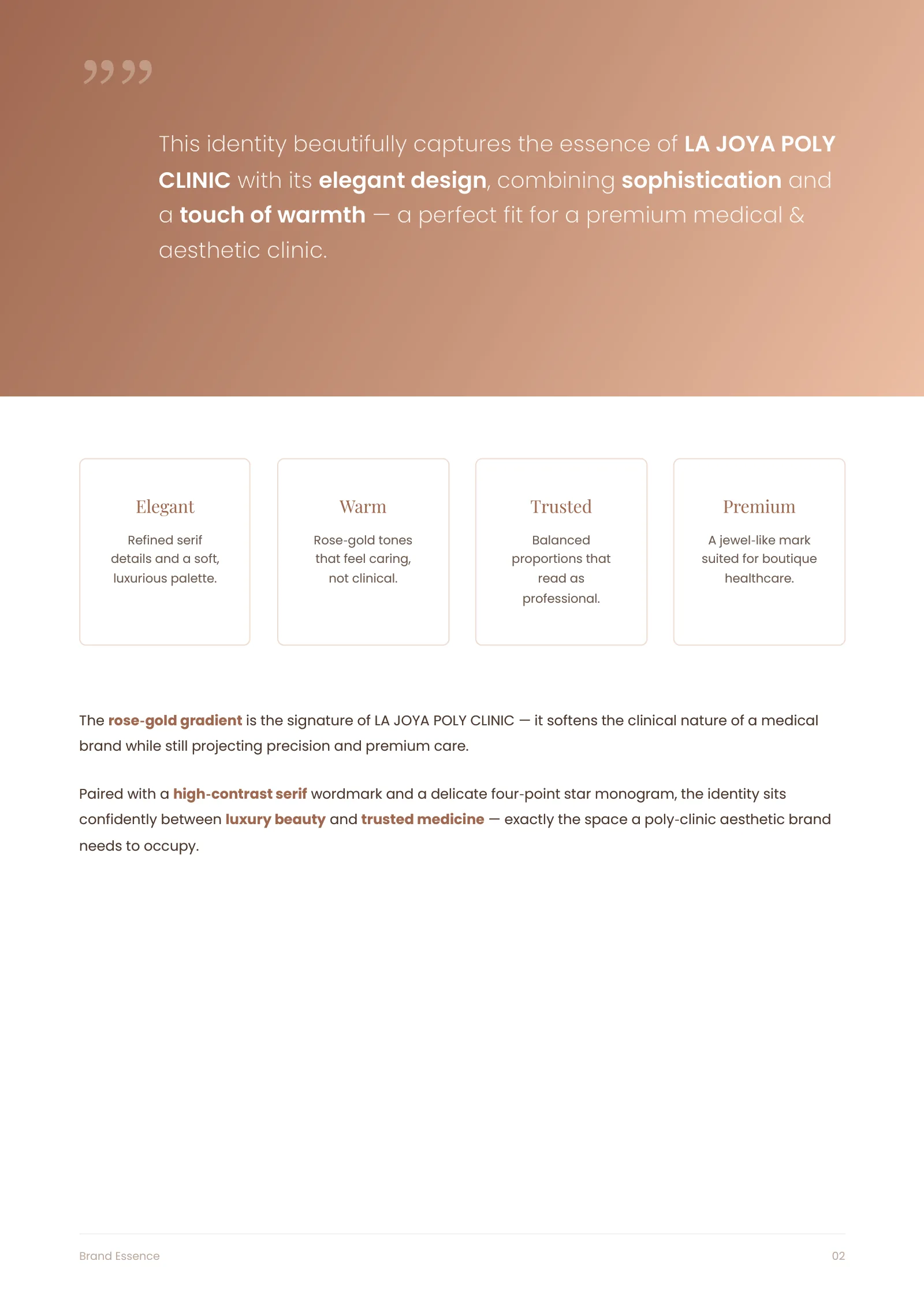
La Joya is a new poly clinic in Mirdif, Dubai, offering general medicine, dental, dermatology and aesthetic treatments under one roof. The owners wanted an identity that would look at home beside beauty and wellness brands and still carry the trust a medical practice needs. “Joya” means jewel, and the identity was built on that word.
Table of Contents
The four-point star
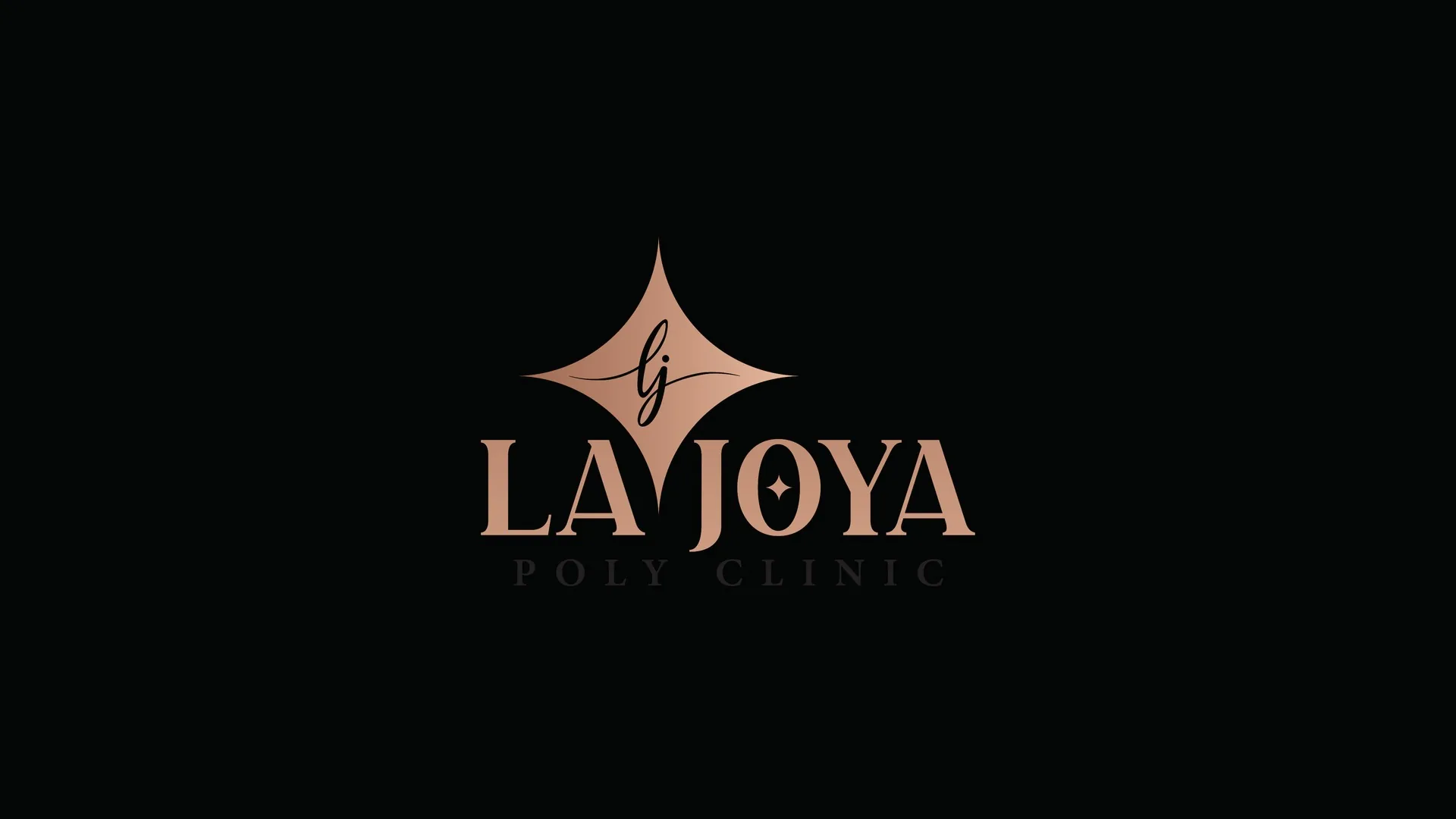
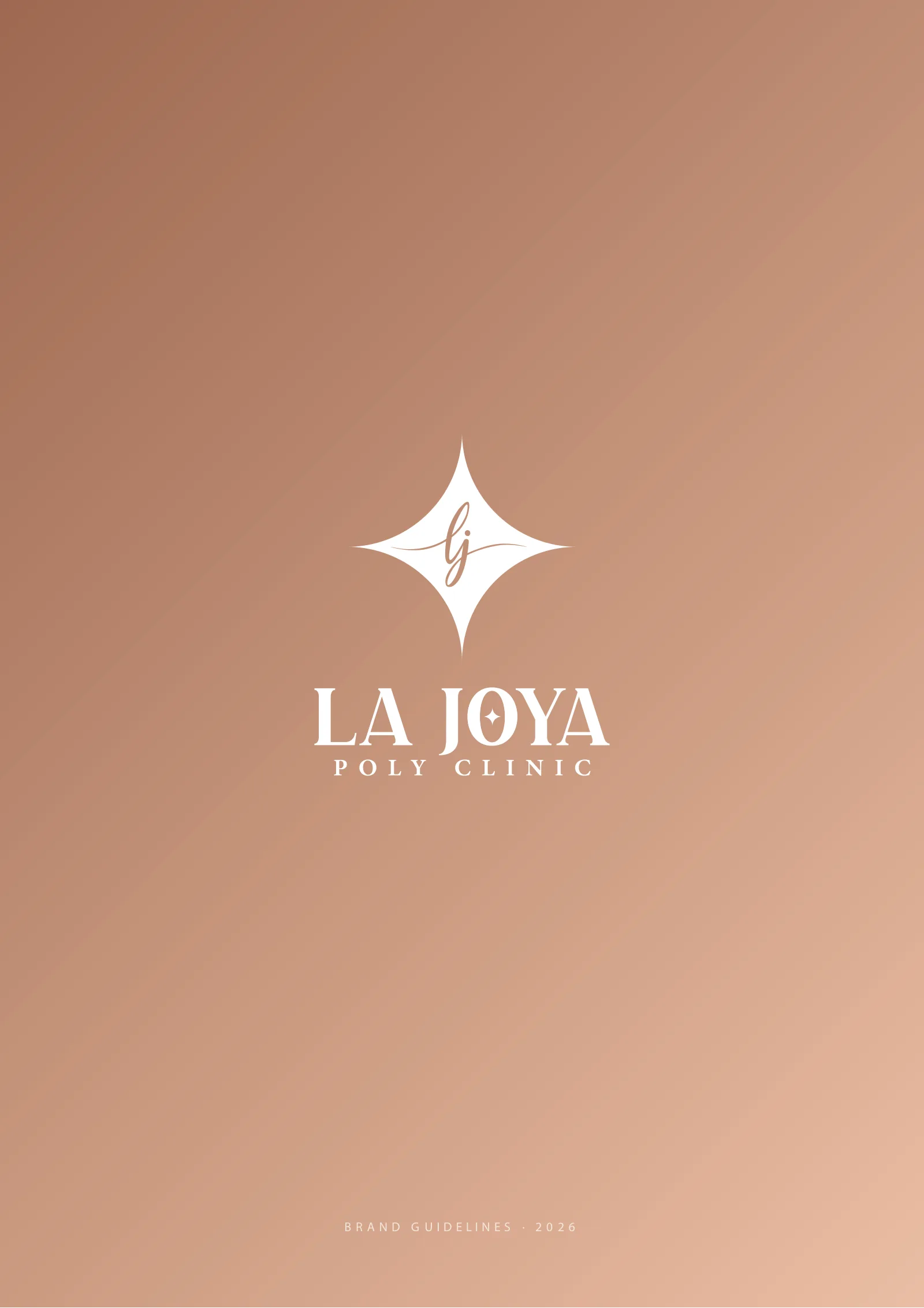
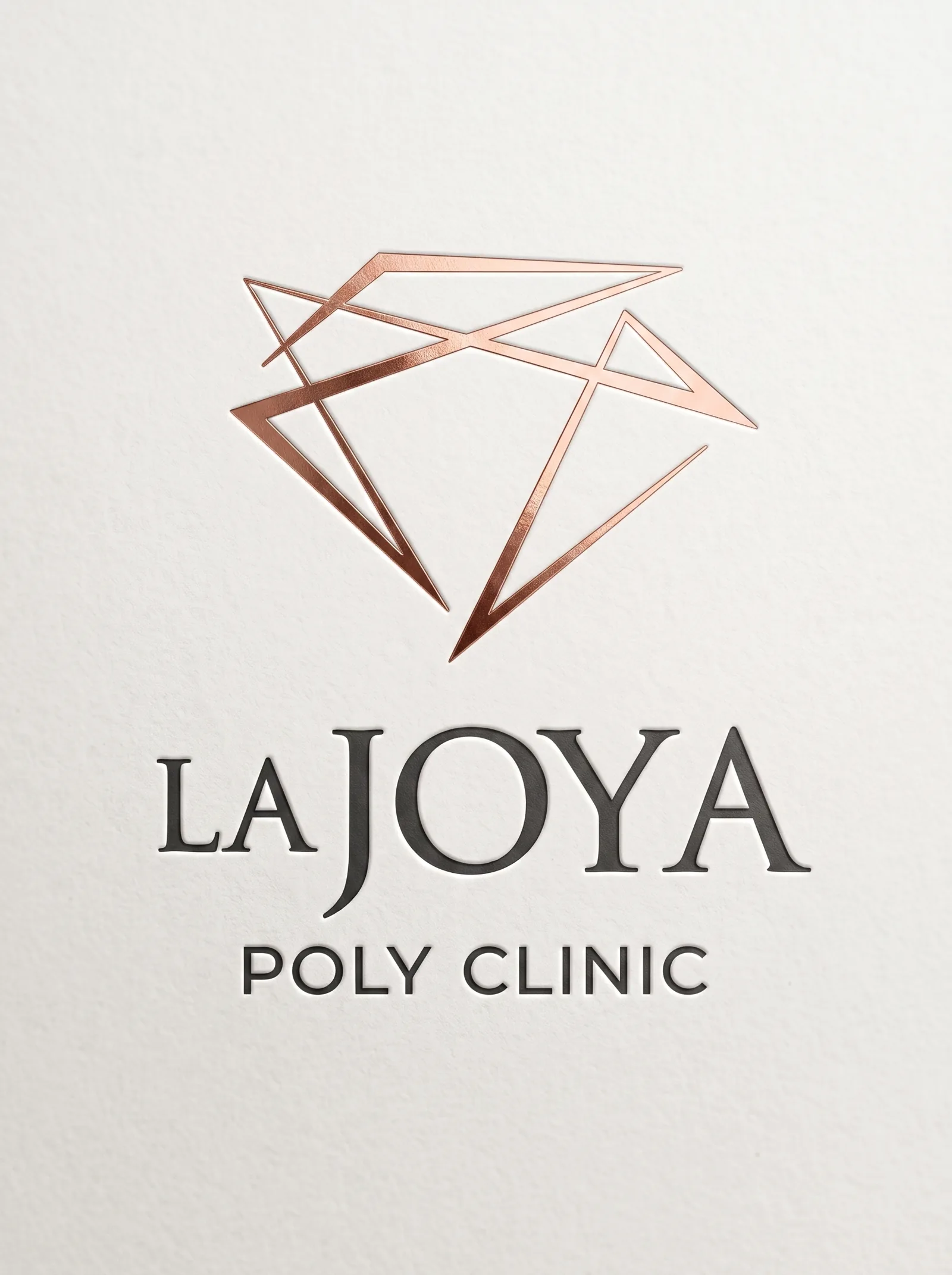
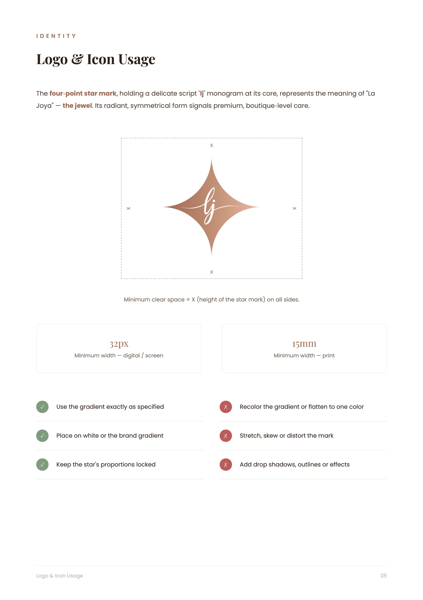
A four-point star, the classic jeweller’s sparkle, holds a delicate script “lj” monogram at its core. The star is symmetrical and radiant, which suggests precision and care, and the script softens it. We explored two other directions first: a faceted diamond outline and a pure wordmark. The star won because it scales better on signage, uniforms and the small medical stationery a clinic prints every day.
Have a project like this in mind? Message Kenania directly on WhatsApp.
Chat on WhatsAppColour and type
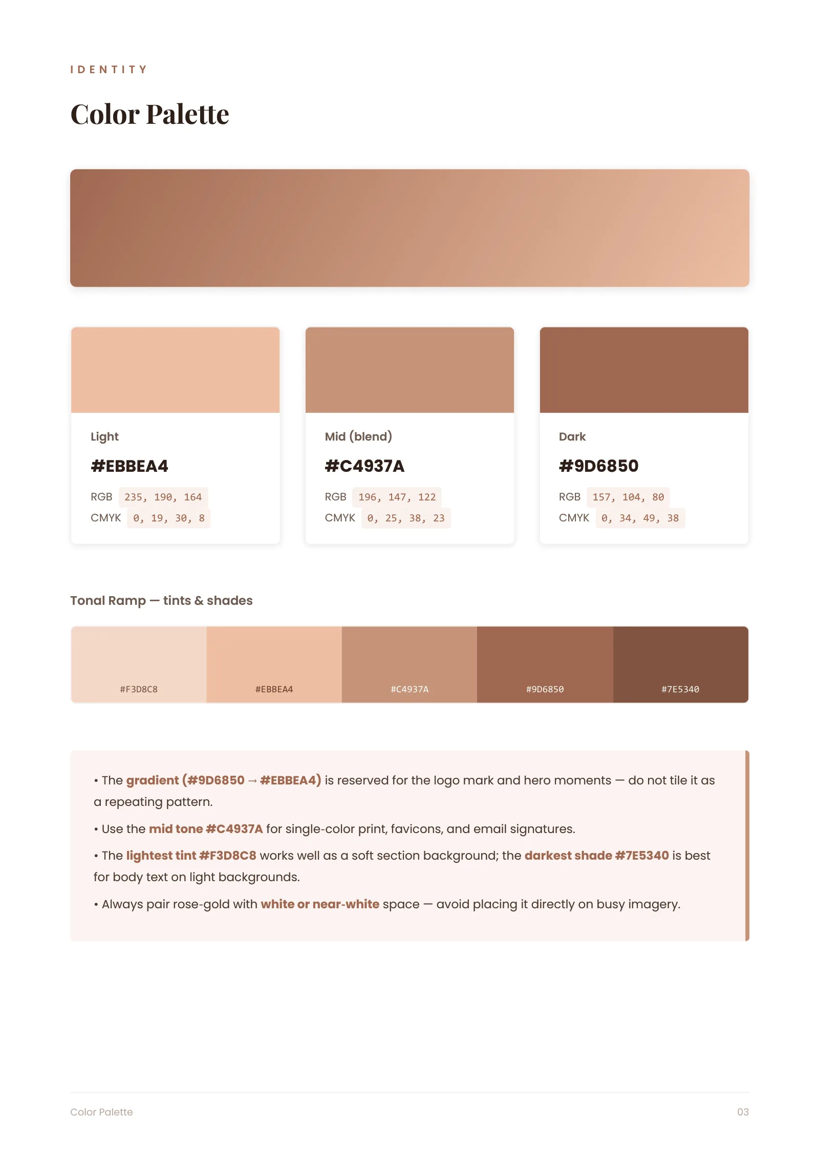
The signature colour is a rose-gold gradient, from deep copper to a soft blush, reserved for the logo mark and the most prominent brand uses. A mid tone carries single-colour print and favicons, and the darkest shade is used for body text on light backgrounds. The warm palette takes the edge off the clinical feel of the category and still reads as premium care.
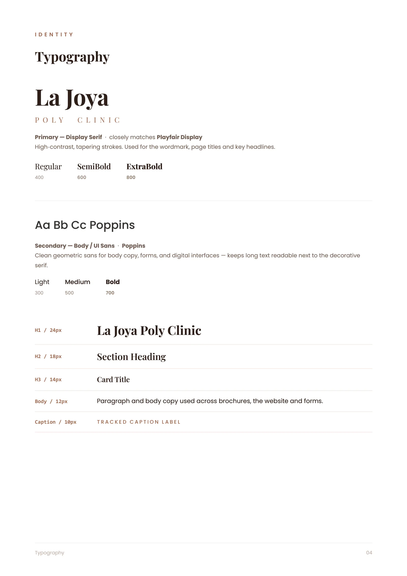
A high-contrast display serif carries the wordmark and headlines. Poppins handles body copy, forms and the digital interface, so long patient-facing text stays readable next to the decorative serif.
Guidelines a busy clinic can follow
Clinics print constantly: prescriptions, appointment cards, consent forms and window graphics. The guideline document sets the clear space and the minimum sizes for screen and print, lists what may and may not be done to the gradient, and shows how the mark sits on white or on the brand gradient. The identity stays consistent even when the printer, the sign maker and the social media manager are three different people.
Scope delivered
- Logo mark, wordmark and monogram in gradient, single-colour and reversed versions
- Colour system with tonal ramp and print/digital values
- Typography pairing and hierarchy
- Brand guidelines document
- Stationery, signage and social media templates on request
From its Dubai office, Kenania designs brand identities for clinics, restaurants and companies across the UAE and Saudi Arabia, and can carry an identity into the interior and fit-out of the space itself.
Clinic brand identity Dubai: related projects and services
- What a brand identity package contains: the deliverables list behind this project
- Casa Rio beauty salon branding in Dubai: a second Dubai identity carried into built signage
- Branding and creative design services: logo, guidelines and brand collateral
- Interior design company in Dubai: the clinic interior and facade from the same team
Clinic naming, signage and licensing in Dubai follow Dubai Health Authority rules, and the guideline for this clinic brand identity Dubai project reflects them in the naming lock-ups and signage sizes.
Opening or rebranding a clinic? Send us the name, the services and a short brief, and we will reply with a scoped proposal for your clinic brand identity Dubai project.
Questions about cost, timing or the next step? Ask Kenania on WhatsApp.
Chat on WhatsAppClinic brand identity Dubai: between beauty and medicine
A clinic in Dubai competes with beauty brands for attention and with hospitals for trust. If the identity leans too far towards beauty, patients start to doubt the medicine; if it leans too far towards medicine, the aesthetic clients go elsewhere. It also has to pass the practical tests of a licensed practice. The name and logo appear on the trade licence, the facade signage, staff uniforms, prescription pads, lab labels and the patient app, and each of those has its own size and material constraints.
La Joya handles that balance with a mark that is precise in its geometry and soft in its detail. The four-point star suggests sparkle and the script monogram suggests care. The rose-gold gradient is kept for the mark and its most visible uses, so it never overwhelms a medical document.
Clinic brand identity Dubai: palette and type on a lab label
The guideline fixes a five-step rose-gold ramp, a single dark shade for body text, and a display serif paired with Poppins for anything that has to be read quickly. The smallest permitted logo size was tested on a 30 mm label before it was written into the guideline. Signage, stationery, uniform embroidery and the reception wall are all mocked up in the document, so the clinic can brief its suppliers without a designer present.
From brand to building
The same mark became the centrepiece of the Mirdif facade, backlit in rose gold between two stone fins, and the reception interior follows the palette. Carrying the clinic brand identity Dubai signage rules into the interior helps a new practice look established on opening day.