What a Brand Identity Package Should Actually Contain
A brand identity package is what you actually receive at the end of a branding project, and most buyers never see the list before they pay for it. They ask for a logo, get a JPEG, and find out six months later that the printer cannot use the file, the sign maker guessed the colour, and the font on the website is not the font in the brochure. This is a buyer’s guide to the contents: what should be in the folder, what each item is for, and how to check it before you sign off.
None of it is exotic. Every item below is ordinary work for a competent studio. It goes missing because nobody asked for it in writing.
Table of Contents
The logo is a system, not a picture
You are not buying one image. You are buying a set that covers every place the name has to appear.
- Primary logo, in full colour, for the situations you control.
- A secondary or horizontal version, because a stacked logo dies in a website header and on a vehicle side.
- A standalone mark or monogram, for app icons, favicons, stamps, embroidery and anywhere the full name is unreadable.
- One-colour and reversed versions: black, white, and knocked out of a dark background.
- Lockups with a tagline or a sub-brand, drawn properly rather than typed next to the logo by whoever needs one.
- Clear space and minimum size, given as numbers, not as a vibe.
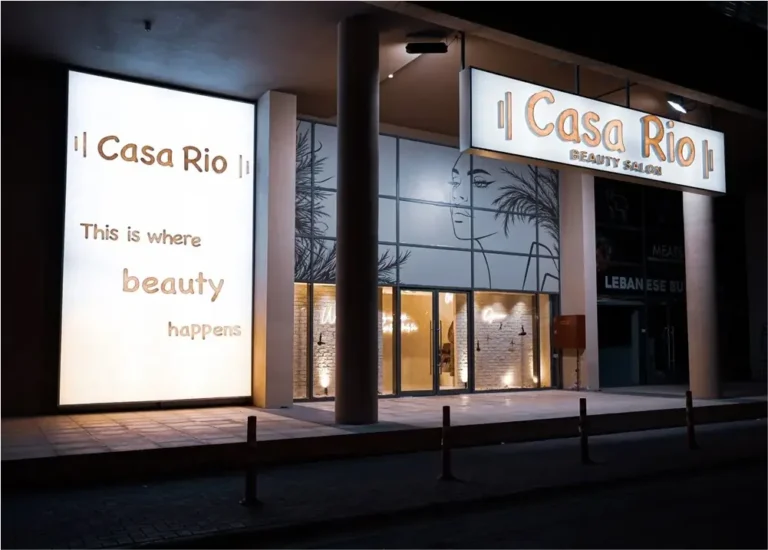
Clear space is the rule people skip and the one that gets broken daily. Without it, someone sets the logo 3mm from a photo edge and the whole thing reads as clutter. Minimum size fails the same way: a mark that holds on a business card turns to mush at 32 pixels. Test both before handover.
Have a project like this in mind? Message Kenania directly on WhatsApp.
Chat on WhatsAppFile formats, and which ones to insist on
Ask for these by name in the proposal, not after handover.
- Vector masters, AI or EPS, plus the editable source. Vector scales from a badge to a building without softening.
- SVG for the website. Small, sharp on every screen, and recolourable in code.
- Print-ready PDF with the fonts outlined, so a supplier who does not own your typeface still sets it correctly.
- PNG with transparency, exported at several sizes for slides and documents.
- Icon and favicon sizes, cut properly rather than squashed down from the primary logo.
JPEG is not a logo. It has no transparency, it degrades every time it is resaved, and it cannot be scaled up. If your whole identity arrived as JPEGs, you did not buy an identity, you bought a picture of one. Settle ownership in writing too: the working files should be yours, named to your company, not sitting on the agency’s drive as leverage. That belongs in the same conversation as how to choose a design agency, and the answer tells you who you are dealing with.
Colour has to be defined twice, at least
Screen and print are different systems and one value does not cover both. You need HEX and RGB for anything with a backlight, CMYK for anything printed on a press, and a Pantone reference for anything a supplier matches by hand: paint, vinyl, fabric, foil, powder coating, an acrylic sign face.
When only a HEX value exists, someone converts it automatically at the printer and the brand’s blue arrives grey. That is the most common colour failure, and it is entirely preventable.
A serious colour page also names coated and uncoated behaviour, gives a working text-on-background pairing for accessibility, and says which colour is primary and which are accents. Without that hierarchy, every designer uses all six at once.
Type licensing quietly stops a brand working
This is the least glamorous item on the list and the one that causes the most damage. A typeface is licensed, not owned, and licences have scopes: desktop, web, app, and sometimes advertising volume. A desktop licence does not cover the website. An agency licence does not cover your staff.
The package should state the foundry, the exact family and weights, the licence type, and whose name it is held in. It should also give a website fallback stack and a substitute for internal documents, because the brand font is rarely on the finance team’s laptops and Word will pick something ugly on its own.
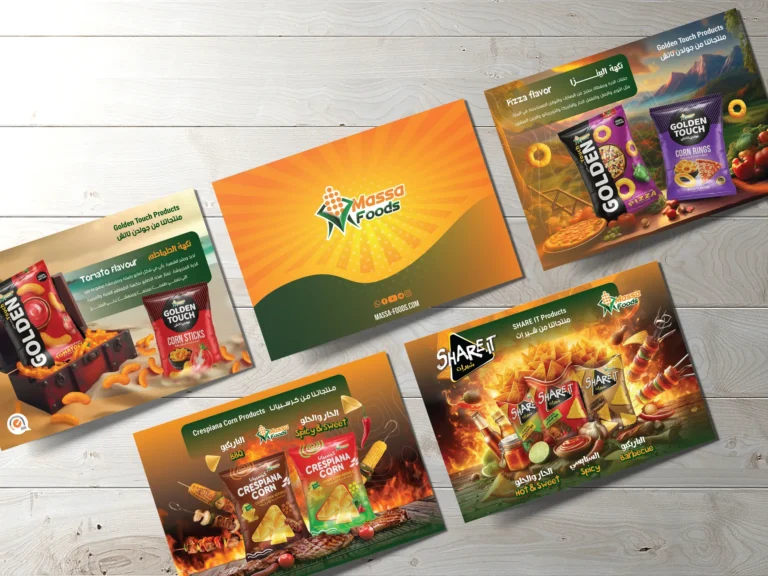
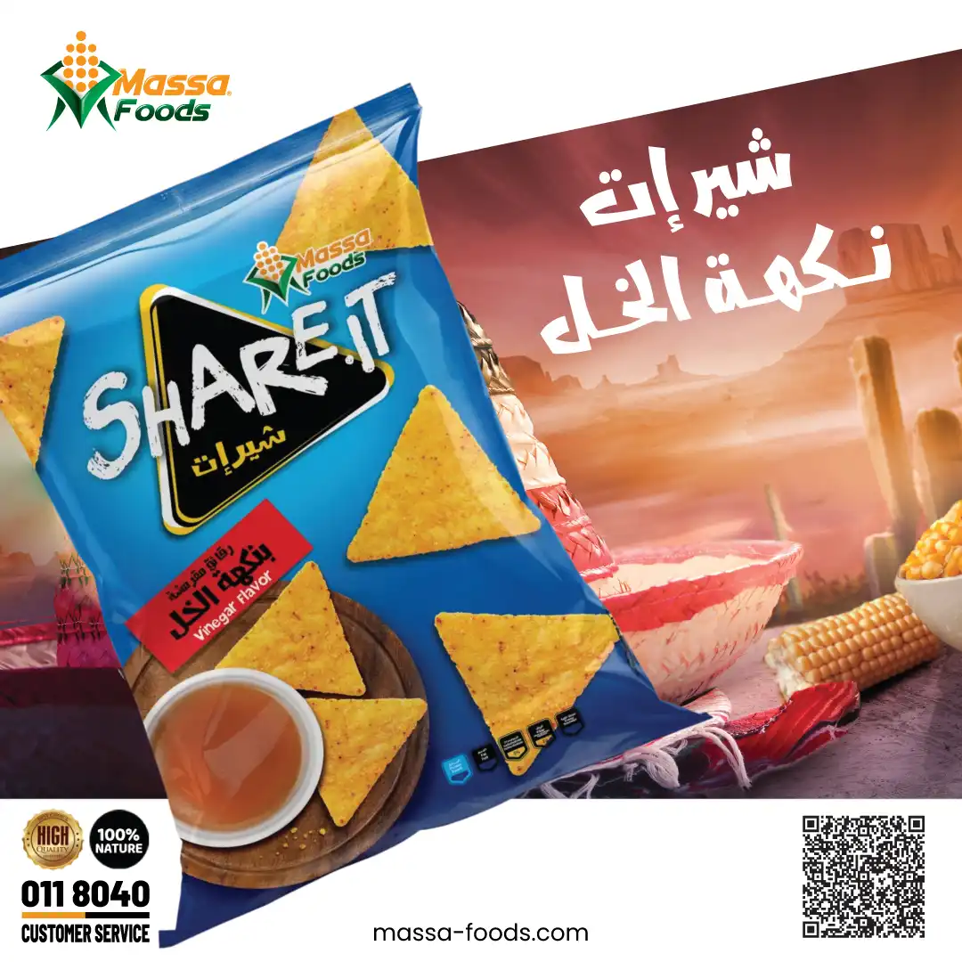
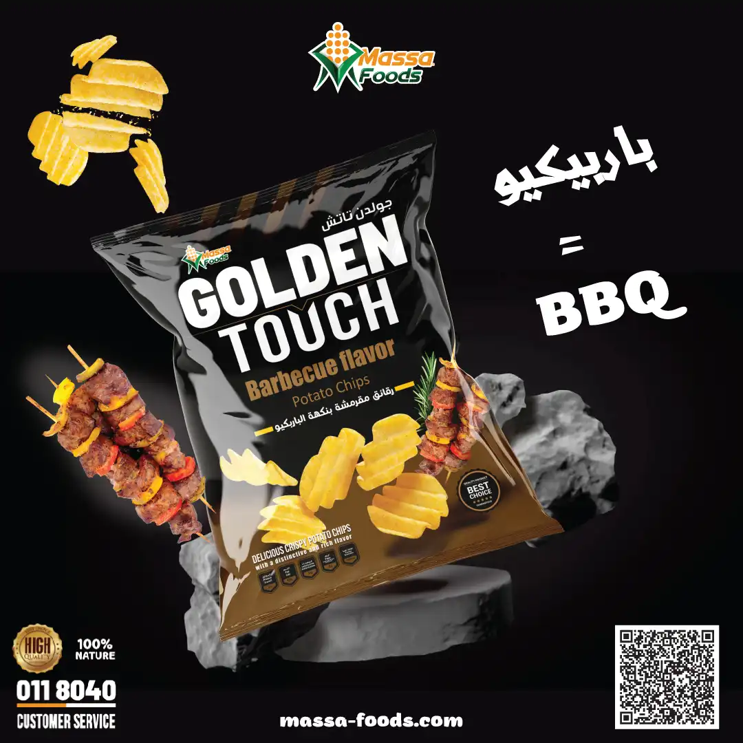
If the brand works in Arabic and English, this gets stricter. You need a family that carries both scripts, or two families deliberately matched for weight, height and colour on the page. Otherwise the Arabic and the Latin never sit together without one of them looking borrowed. The Massa Foods branding and digital marketing work runs bilingually across packs and posts, and it holds because the pairing was settled once and then applied, rather than re-chosen for every layout.
The rules document, and how long it should be
Not ninety pages. Nobody reads ninety pages. Fifteen to thirty that a supplier can follow without calling you beats a beautiful volume nobody opens.
It has to answer the questions that come up in real work: logo usage and misuse, exact colour values, a type scale, photography direction, tone of voice, and a short do-not list. The test is simple. Hand it to a supplier who has never worked with you and see whether what comes back is on brand. If it is not, the document is decoration.
Questions about cost, timing or the next step? Ask Kenania on WhatsApp.
Chat on WhatsAppSocial and template assets, because that is where the brand lives
Most of a brand’s daily output is not a logo on a wall. It is posts, decks, quotes and labels made by people who are not designers.
- Profile and cover images at the correct ratio for each platform.
- Post and story templates, built so the text can be swapped without the layout collapsing.
- A presentation template, a letterhead, an invoice, an email signature and a business card.
- Packaging or label masters where the product needs them.
- All of it editable in software the team already owns.
This is the difference between an identity that survives and one that decays in a quarter. A designed post system, of the kind we build as social media poster systems, keeps the brand recognisable at the sixtieth post, not just the first three.
How to test a brand identity package before you sign off
- Open every single file. Not a sample. Every one.
- Shrink the primary logo to a 32 pixel favicon and to about 20mm wide. If it fills in, ask for the mark version.
- Print the colour page on the office printer, then ask the real supplier for a proof on the real stock.
- Send the file pack to one supplier who was not involved and see what comes back.
- Give the rules document to a junior and ask for one social post and one A4 page.
- Check the font licence is in your company’s name and covers web as well as desktop.
- Confirm the editable source files are in your possession, not promised.
Two of those catch almost everything: the unfamiliar supplier, and the junior with the rules document. Both simulate what happens to the brand once the studio is out of the room. Working remotely changes none of it, and a remote graphic design company should be judged on exactly the same handover.
If you are commissioning an identity, or you already have one that came up short, tell us what you hold and what is missing. Our work starts from the deliverable list, not the mood board, and we reply within a day. Get in touch and bring the files you were given.
More brand identity package projects and services
More brand identity package work from Kenania, and the services behind it:
Ready to start? Send Kenania a photo, a plan or a short brief on WhatsApp.
Chat on WhatsApp