Brand Identity Portfolio: Logos, Stationery and Signage for Gulf Companies
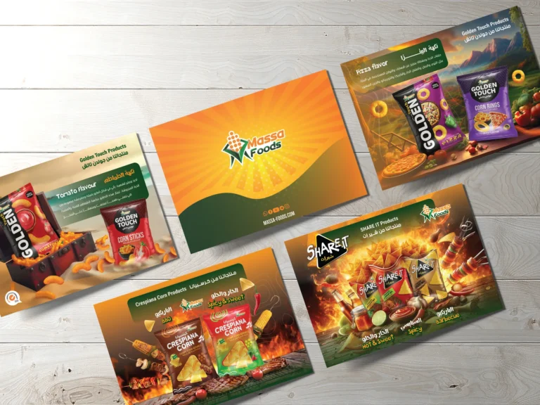
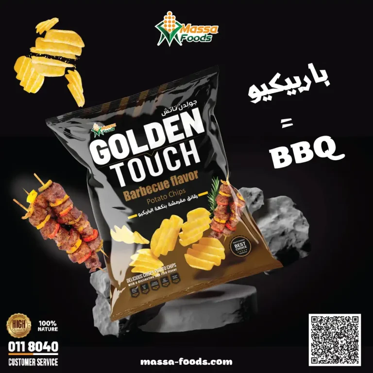
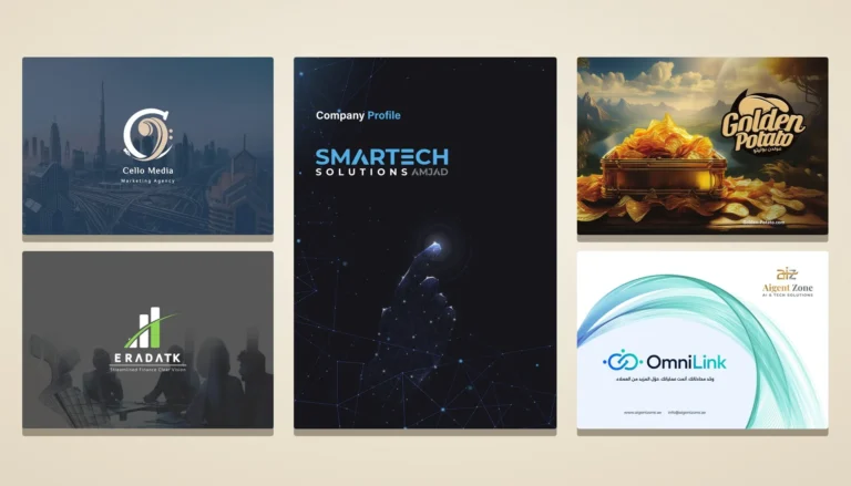
Brand identity design is judged on the sign, the card and the stamp more than on a presentation slide. Here is a selection of identities Kenania designed for companies in Saudi Arabia, the UAE and Egypt, followed through to the items they use every day.
A brand identity is finished only when it holds up in the hands of the sign maker, the printer and whoever posts for the company on social media. This selection shows brand identity design we did for companies in Saudi Arabia, the UAE and Egypt, followed through to the things that get used every day: signage, cards, letterheads, stamps and motion.
Table of Contents
Wakan Business Solutions
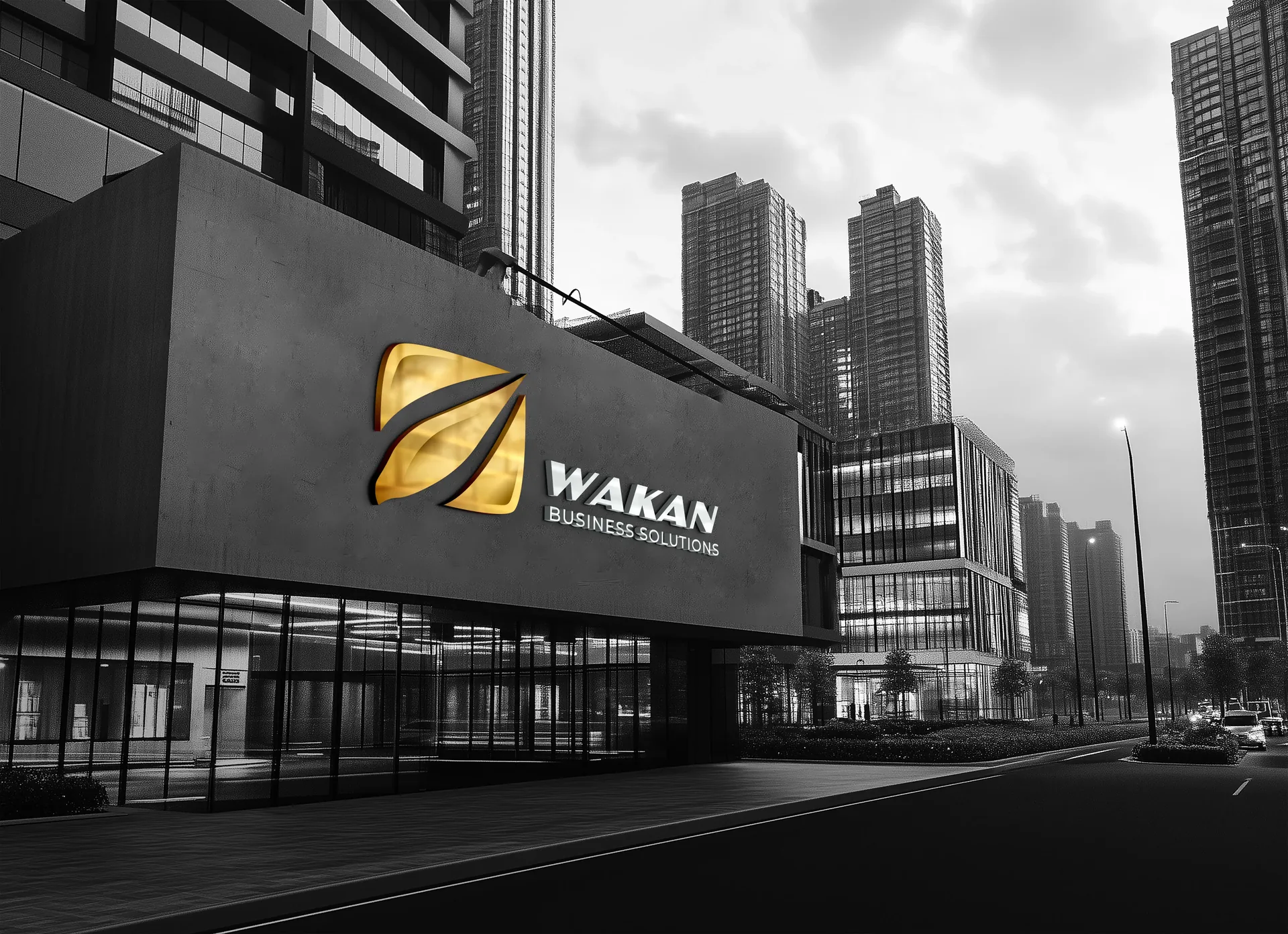
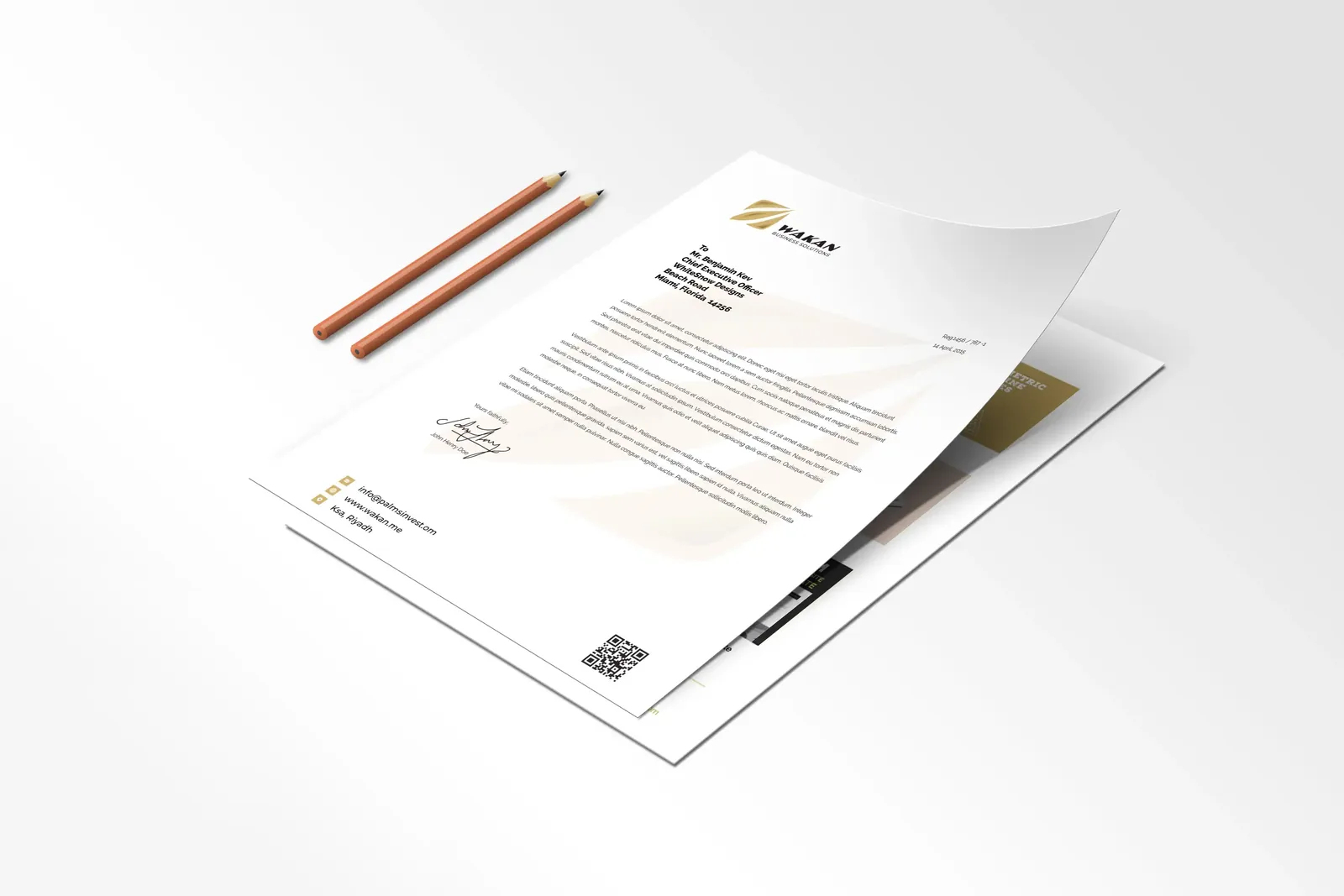
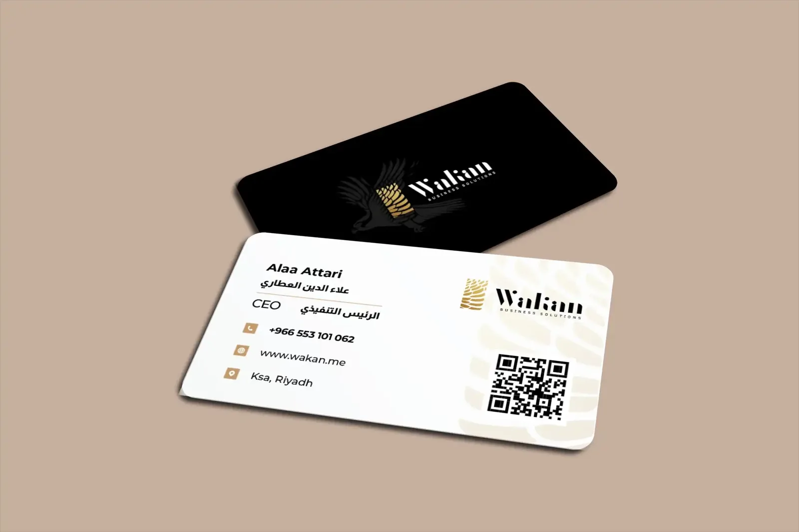
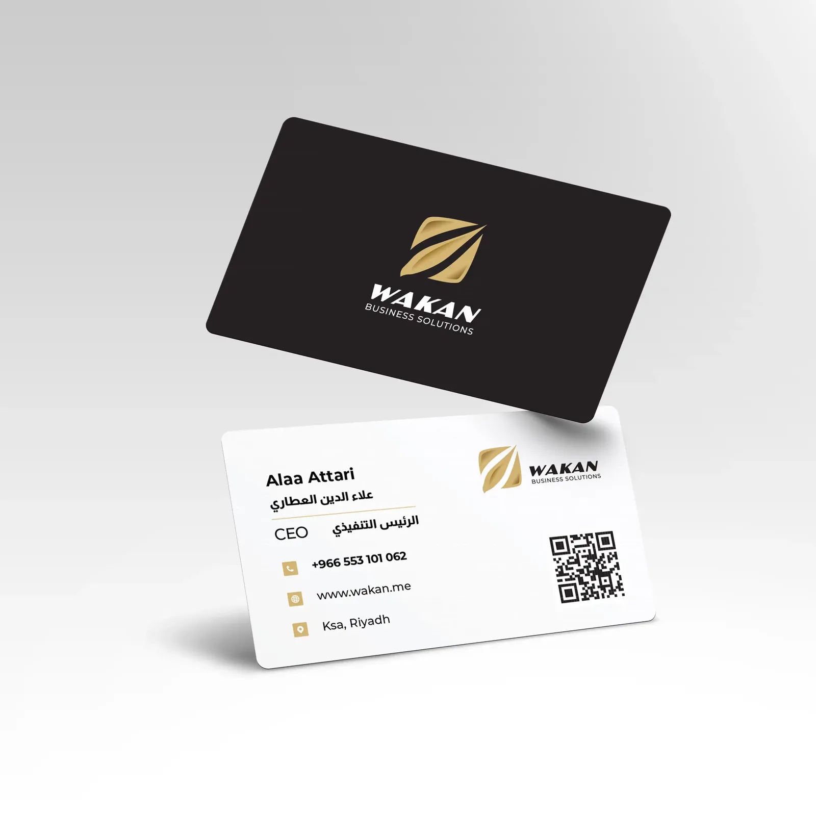
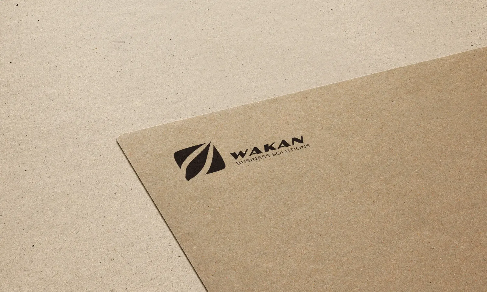
Wakan is a business-services company, and its mark is a gold leaf form. We drew it to work embossed on a leather wallet, cut in metal on the facade of a glass office tower and printed small on the company stamp. The stationery keeps to gold on charcoal with generous white space.
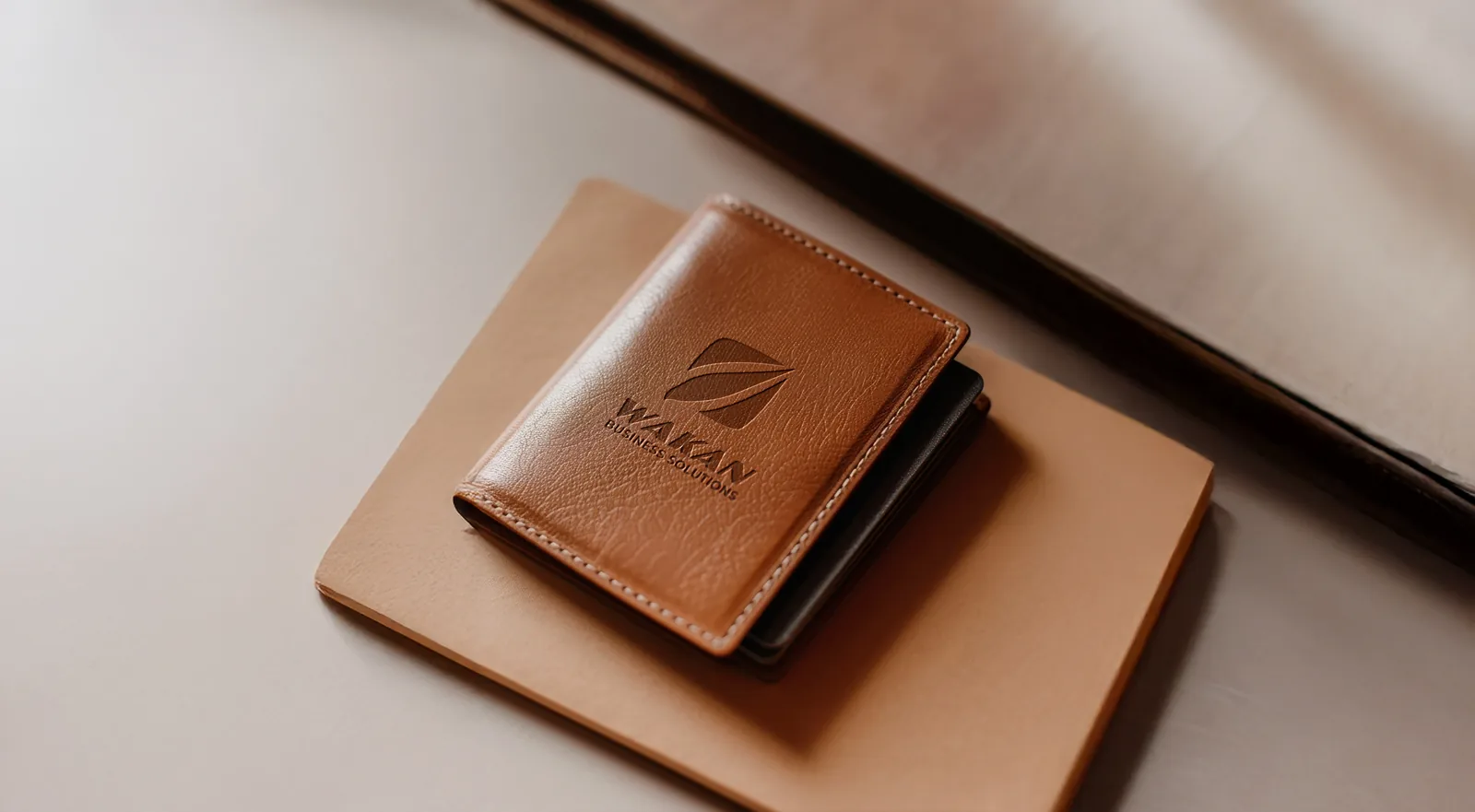
The set includes a letterhead, a business card, the stamp and a card with a QR code. The leaf has to read at every one of those sizes, from the tower facade down to the stamp, so its outline is simple and its stroke weight even. On the wallet the mark has no colour at all and is carried by the emboss alone, which shows whether a shape still works without its gold.
Have a project like this in mind? Message Kenania directly on WhatsApp.
Chat on WhatsAppPalms Investment
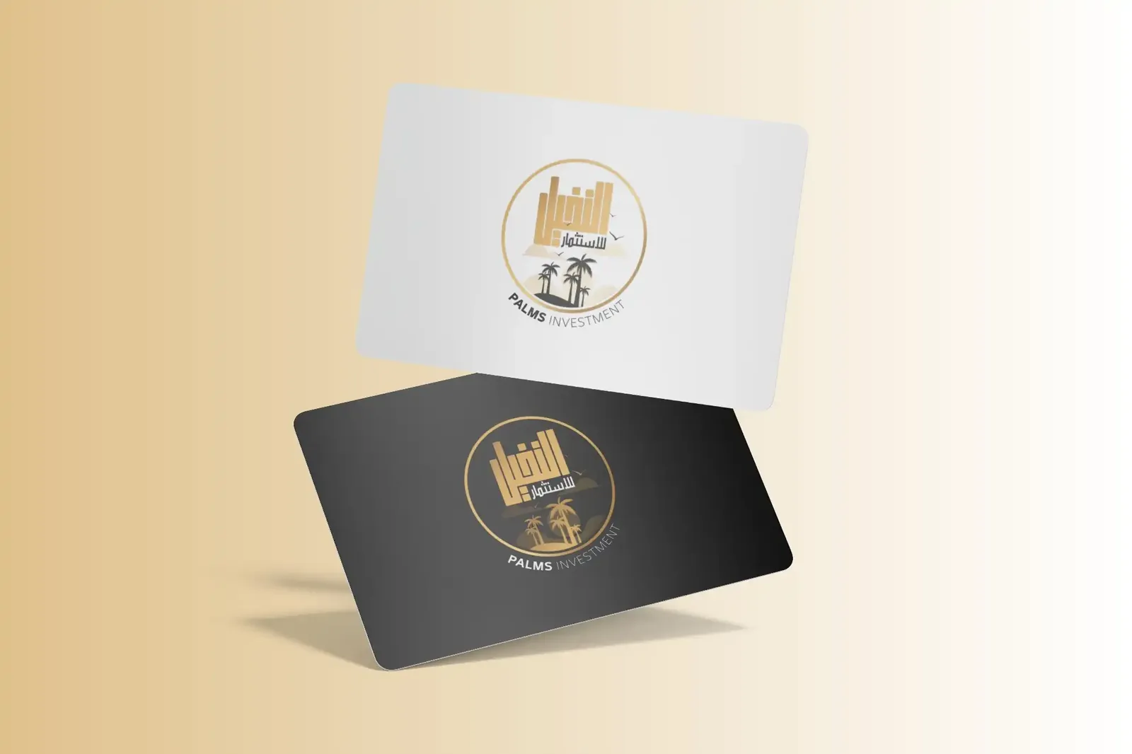
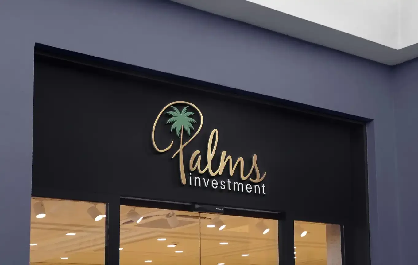
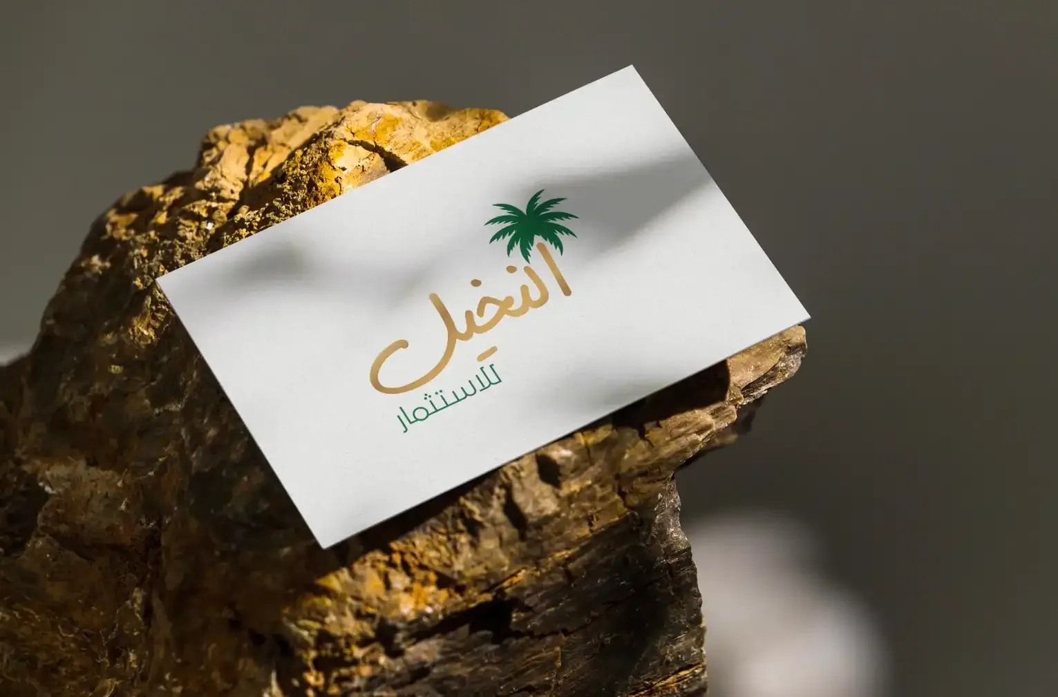
Palms Investment is an investment company in Riyadh. Its mark is a palm monogram in gold, with Arabic and English wordmarks drawn to the same weight so that bilingual cards and signage stay balanced.
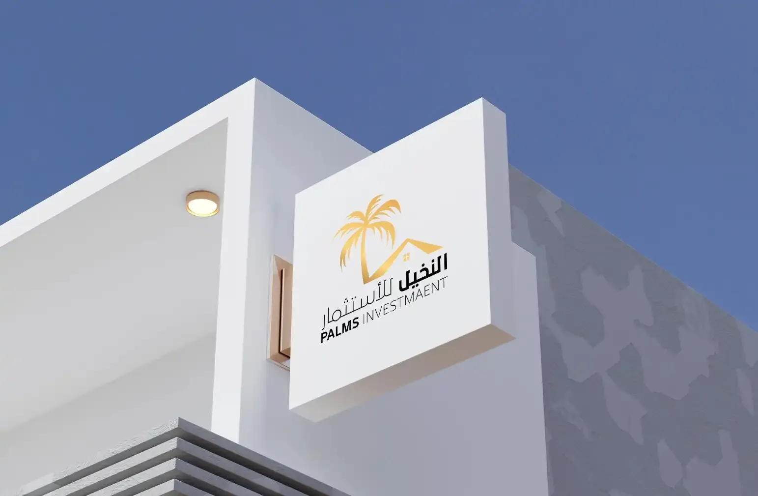
The identity appears on signage on a white building, on a shopfront sign, on cards printed in black and white, and as the Arabic logo on a card. The black-and-white cards show the monogram holding up without its gold. On the shopfront the two wordmarks sit side by side at building scale, where any difference in weight would be obvious from the street.
Kayan Avenues, Rawafed and Turbo Line
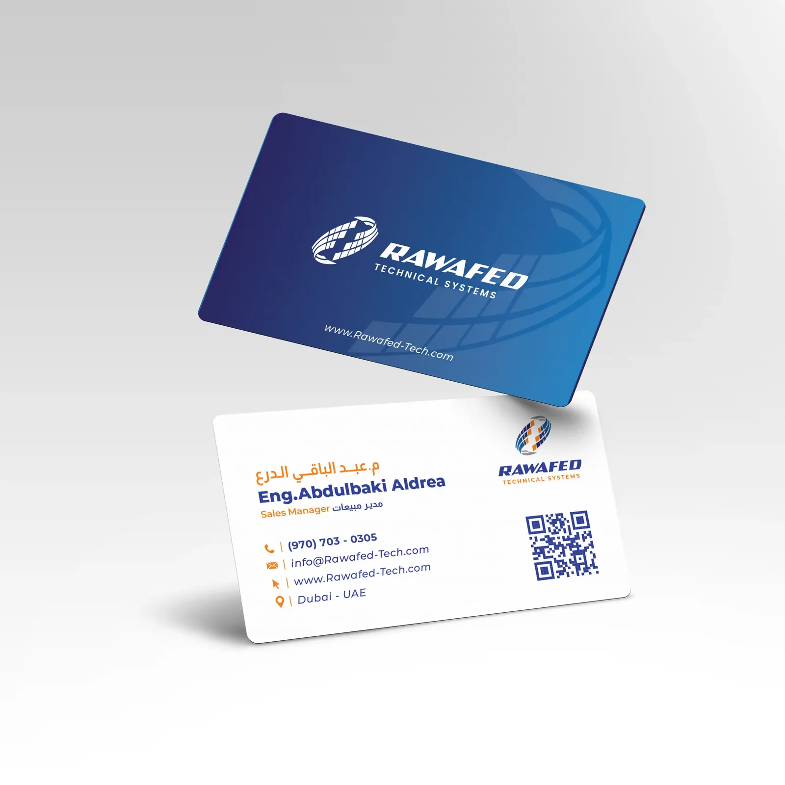
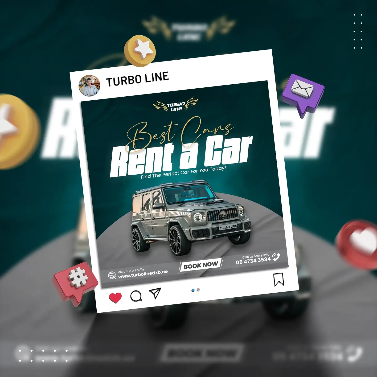
Kayan Avenues is a real-estate brand with a black-and-white architectural signage system, shown here on a black building. Rawafed works in an engineering blue that runs across its business cards. For Turbo Line car rental the identity extends into a social media template, so every post comes out in the same layout and colours.
Clinics and personal brands
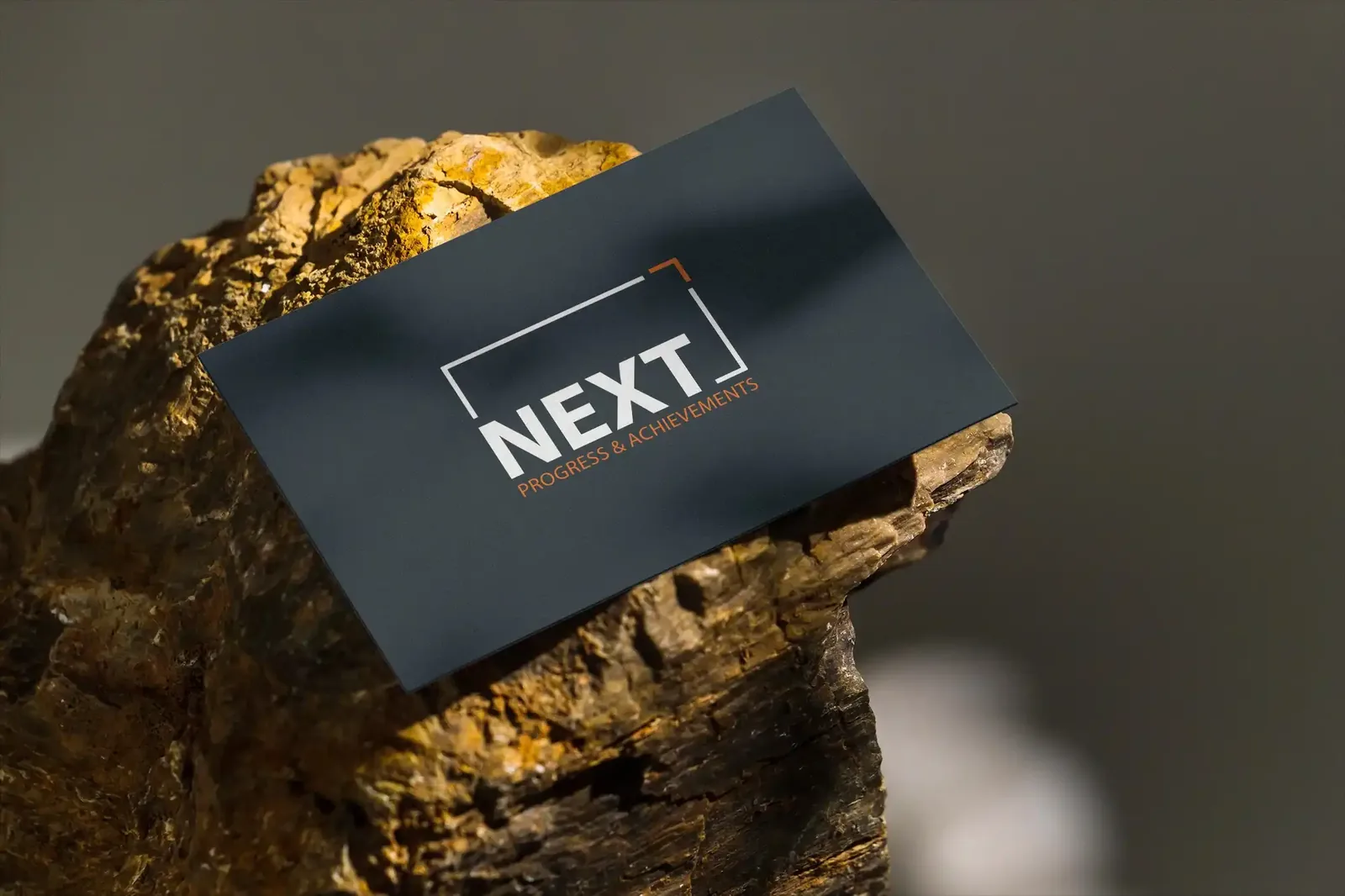
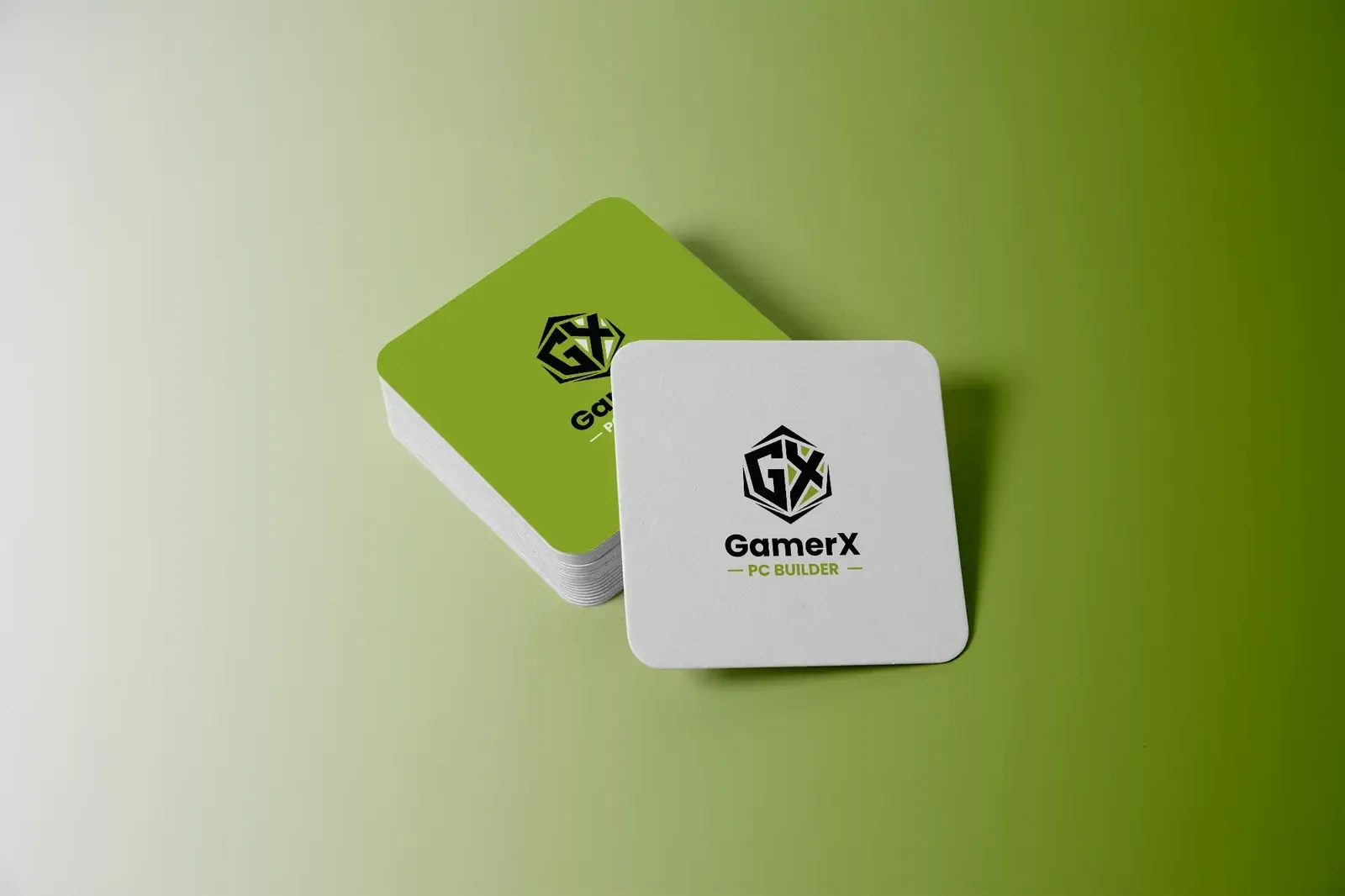
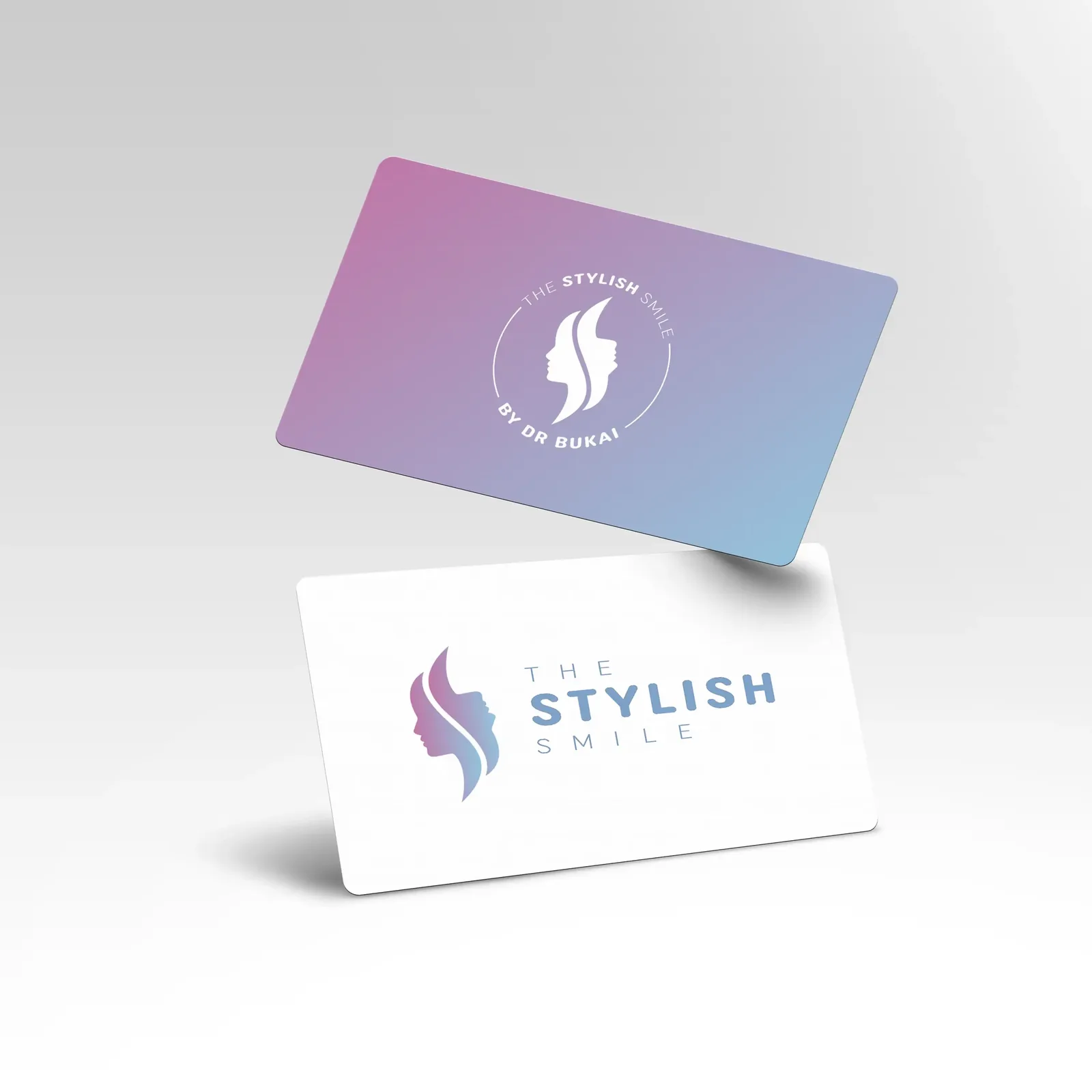
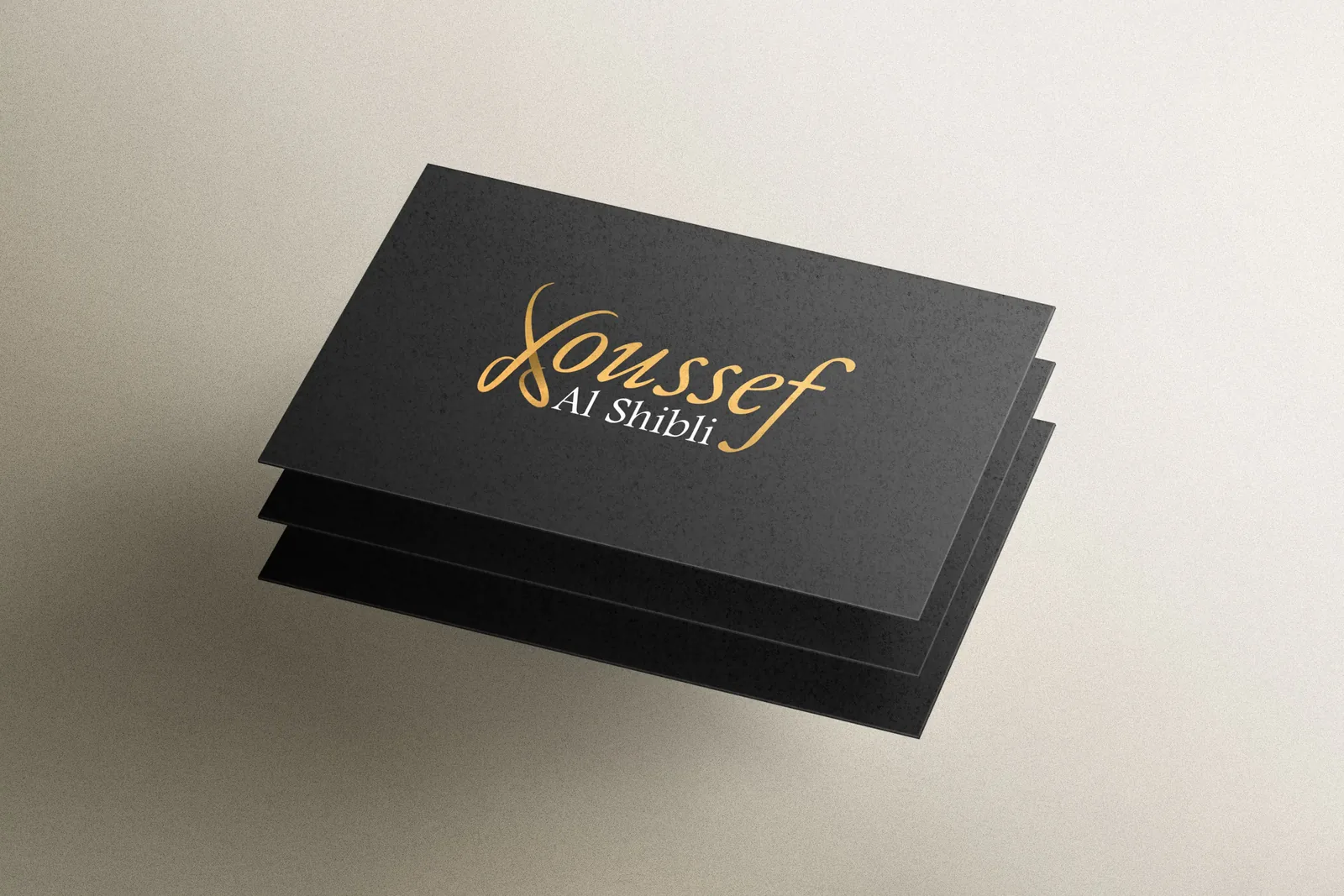
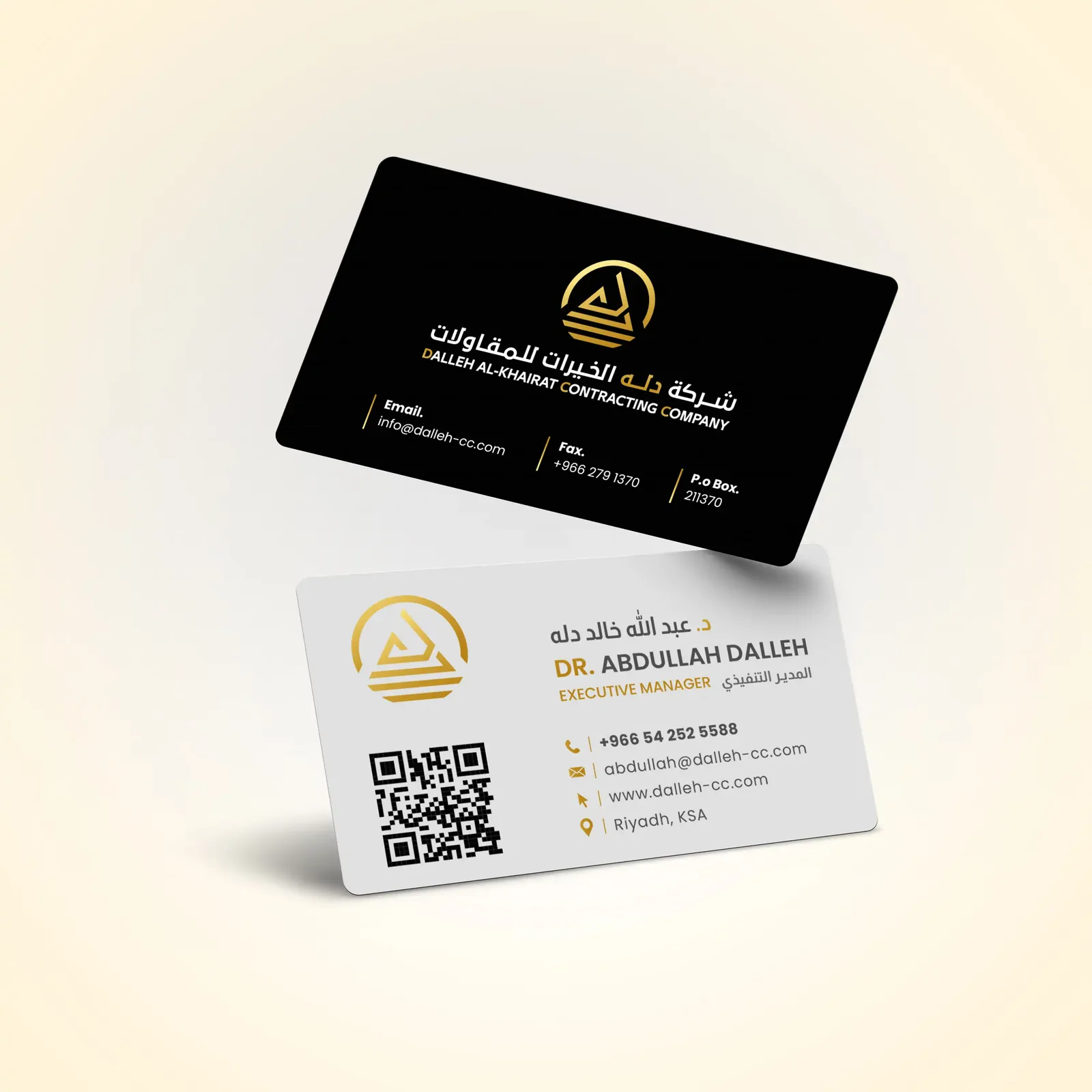
For a clinic and for personal brands, one colour or one gradient does the work of a whole palette. Dr. Bukai’s clinic card uses a lilac gradient. Youssef Al Shibli’s card is gold on black, and another gold-on-black card carries Arabic on one side and English on the other. The NEXT card is minimal and shown on stone, and GamerX, a brand for a PC builder, appears on a set of coasters.
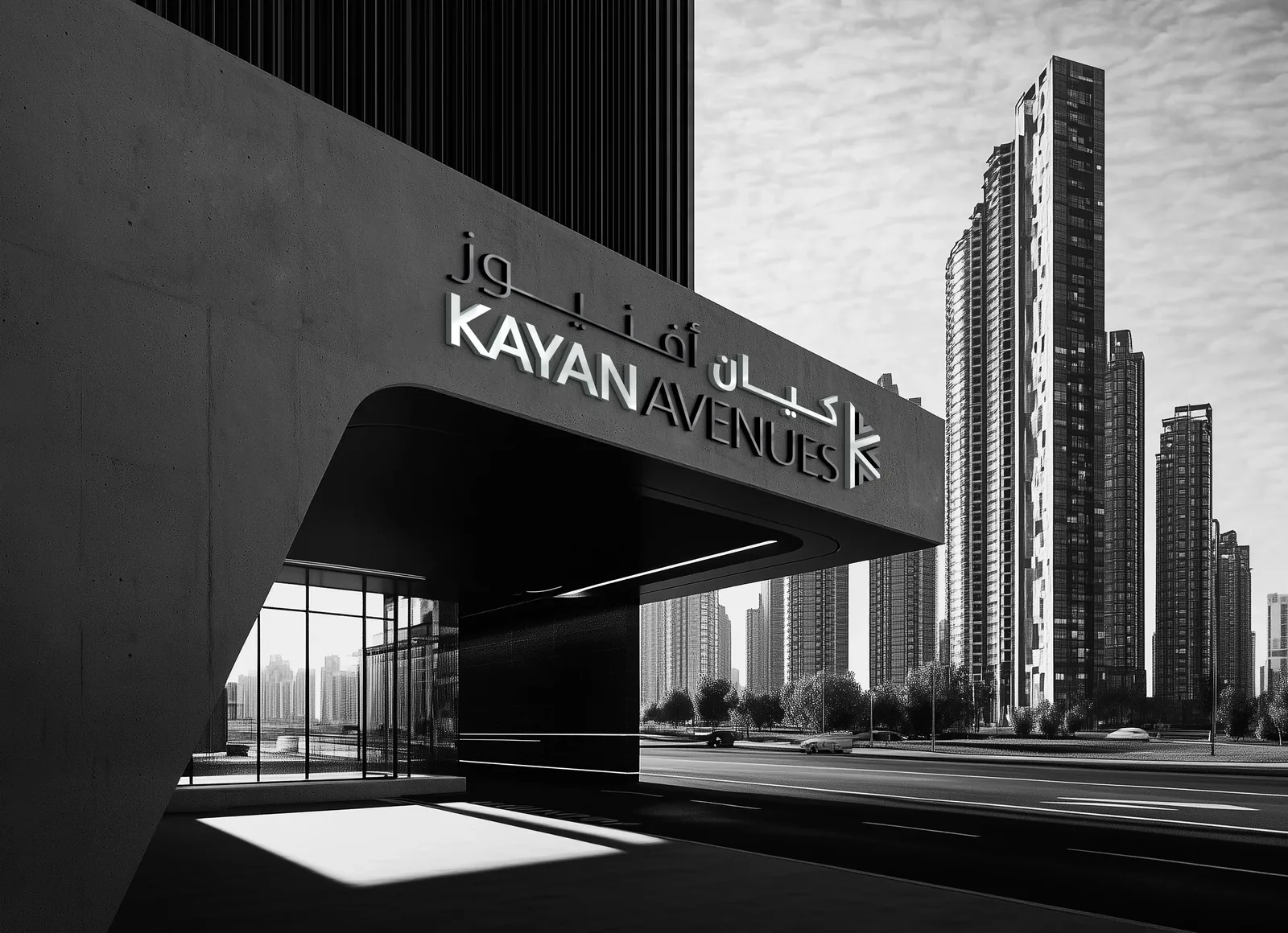
Brands of this size often live on one card, one sign and one social media account, so the brand identity design has to be recognisable from a single colour and a single mark.
Motion for Charli Hotels
For Charli Hotels in Jeddah we extended the identity into a motion piece: the mark, the signage and the hotel facade animated for screens and social media.
Motion tests an identity in a different way from print. The mark has to hold together while it builds on screen, and the signage and facade have to read within a few seconds on a phone.
What brand identity design has to survive
A logo passes through several hands after the designer: the sign maker who cuts it in metal, the printer who runs it in one colour on a stamp, the embroiderer who stitches it on a uniform, the developer who turns it into a favicon, and whoever crops it for a social media story. We drew every mark on this page with those uses in mind. Each has a silhouette bold enough for metal, a one-colour version that does not depend on a gradient, a simplified icon for small sizes, and clear-space rules that stop it being squeezed.
Bilingual use is the second test. The Arabic and English wordmarks share the same visual weight and x-height, so a business card, a letterhead or a facade reads balanced in either direction and neither language dominates.
One mark at every size
The sizes in these projects run from the facade of an office tower and a sign on a building down to a stamp, a business card and a coaster. A mark is not redrawn for each of them. It has a set of planned versions: a full one for facades, a reduced one for small sizes and a one-colour one for stamps and embossing. Drawing those versions together, at the start of the brand identity design, is what keeps the identity consistent when the size changes.
Signs on buildings
Three of these identities appear on buildings: the Wakan leaf cut in metal on a glass tower, Palms Investment on a white building and a shopfront, and the Kayan Avenues system on a black building. Each sign works with the colour of the facade behind it. Gold reads on glass and on white, and the black and white of Kayan Avenues makes the sign part of the building. Signs are seen from a distance, at an angle and often from a passing car, so they use the full version of the mark with clear lines.
Colour and material, decided together
Gold on charcoal for a business-services firm, a gold palm for an investment company, a lilac gradient for a clinic: each palette was chosen together with the material it would sit on, because a colour that glows on a screen can look dead on brushed steel. Swatches were matched to physical references before the guideline was written, and the signage drawings specify the finish as well as the colour.
Questions about cost, timing or the next step? Ask Kenania on WhatsApp.
Chat on WhatsAppSocial media and motion
For Turbo Line the social media template is part of the identity, and for Charli Hotels the identity continues into motion. Many people meet these brands on a phone before they see a sign or a card, so the template and the motion piece use the same colours and type as the rest of the brand identity design.
The guideline at the end of each project
Each project closed with a guideline: logo versions and clear space, colour values for print, screen and signage, typography for both languages, and mock-ups of stationery, signage, uniforms and social templates. That document is what lets the client’s suppliers carry out the brand identity design without calling the designer each time.
Scope
- Logo mark, wordmark and bilingual lockups
- Colour system and typography
- Stationery: cards, letterhead, envelopes, stamp
- Signage and vehicle guidelines
- Social media templates and motion intro on request
- Brand guidelines document
See what is inside a brand identity package and our published design fees, or start with a short brief.
More from our work
- La Joya Poly Clinic brand identity: a full identity and guideline for a Dubai clinic
- Casa Rio beauty salon branding: identity carried into a built shopfront
- What a brand identity package contains: the deliverables list explained
- Branding and creative design services: scope and process for a new identity
- Stationery and print design: letterheads, cards, envelopes and signage files ready for the printer
Working on a new identity? Send a short brief about the company and where the brand will appear, and we will reply with a scoped proposal for the brand identity design.
Brand identity design: common questions
What does a brand identity design project include?
A logo mark, a wordmark and bilingual lockups; a colour system and typography; stationery such as cards, letterheads, envelopes and a stamp; signage and vehicle guidelines; social media templates and a motion intro on request; and a brand guidelines document.
How do the Arabic and English wordmarks work together?
We draw them to the same visual weight and x-height, so a card, a letterhead or a facade reads balanced in either language. Palms Investment is an example: its two wordmarks share the cards and the signage.
Does every logo need a one-colour version?
Yes. Stamps, embossing and metal signage carry one colour or none, so each mark here has a one-colour version that does not depend on a gradient. The Wakan leaf embossed on leather is one example.
Can a brand identity be extended to motion?
Yes. For Charli Hotels in Jeddah we animated the mark, the signage and the hotel facade for screens and social media.
Do you design the exterior signage as well?
Yes. This page shows the Wakan leaf on a glass office tower, Palms Investment signage on a white building and a shopfront, and the Kayan Avenues signage system on a black building. The signage drawings specify finish and size as well as colour.
What happens to a logo built on a gradient?
The gradient stays for cards and screens, as on the lilac Dr. Bukai clinic card, and we draw a one-colour version alongside it for stamps, embossing and metal signs.
Which markets are these identities for?
Companies in Saudi Arabia, the UAE and Egypt, including Palms Investment in Riyadh and Charli Hotels in Jeddah.
Ready to start? Send Kenania a photo, a plan or a short brief on WhatsApp.
Chat on WhatsApp