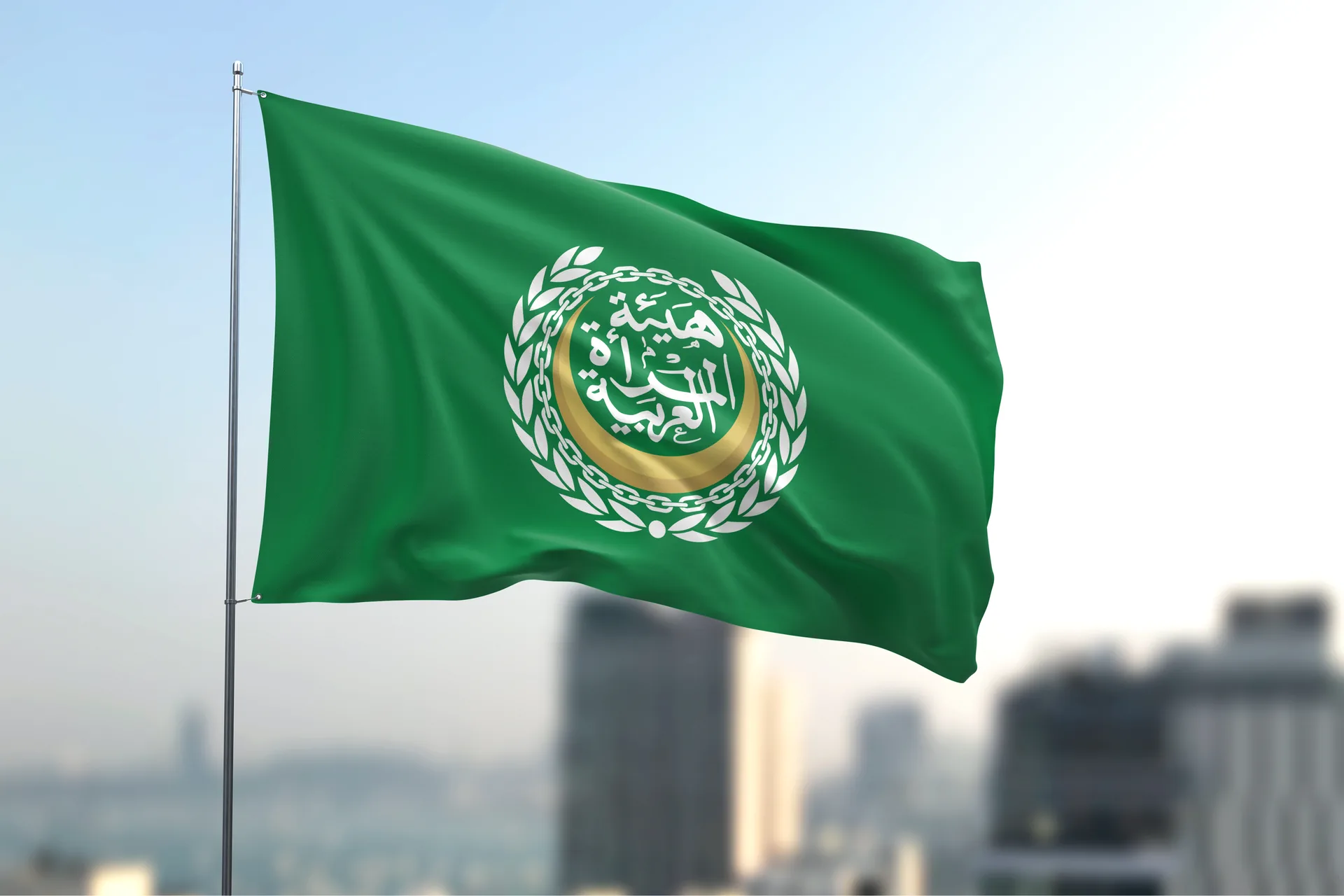
Arab Women Authority Logo, Winner of the Best Logo Design Award 2026
Location: United Arab EmiratesYear: 2025–2026
In 2026 the Arab Women Authority logo received the Authority’s Best Logo Design Award. Kenania designed it pro bono for the UAE-based Authority, along with the calligraphy, the seal and the flag that make up the rest of the identity.
The project at a glance
The Arab Women Authority (هيئة المرأة العربية) is based in the United Arab Emirates. Kenania designed the Arab Women Authority logo and the identity around it pro bono: the emblem, a custom Arabic calligraphy of the name, Arabic and English lockups, a seal and a flag.
Table of Contents
The emblem
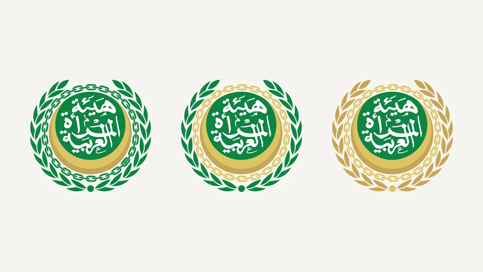
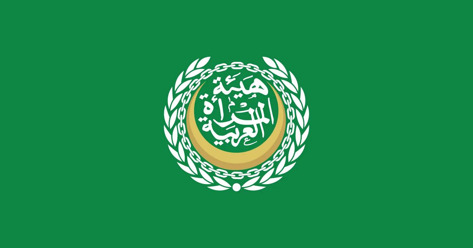
The emblem at the centre of the Arab Women Authority logo places the name, lettered in Arabic calligraphy, on a green disc cradled by a gold crescent. A chain ring and a laurel wreath close the circle. Together they give the mark the presence of an official seal, so it holds up on a flag, on the front of a building and on a letterhead. It is supplied in full colour, in green with gold, in gold alone, and in white for dark and green backgrounds.
Have a project like this in mind? Message Kenania directly on WhatsApp.
Chat on WhatsAppCalligraphy that carries the name
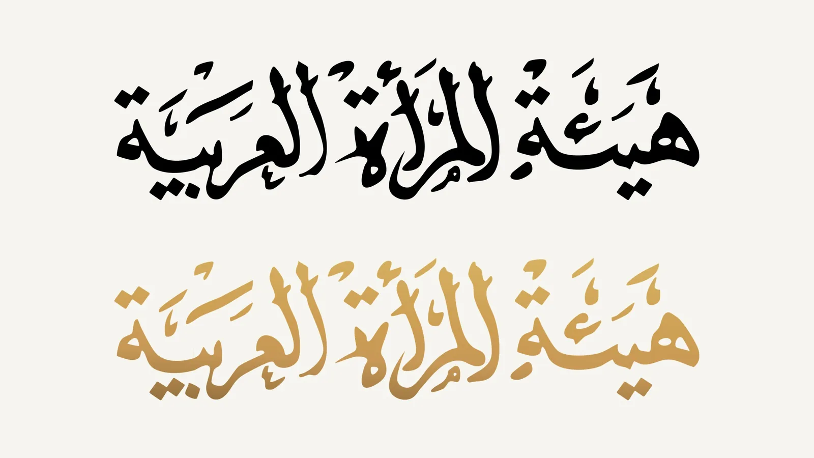
The Authority’s name is drawn as a custom calligraphic composition. Its letters are stacked so the name reads as one unit inside the emblem, and the composition still holds together when it stands alone as a wordmark in black or in gold.
Arabic and English lockups
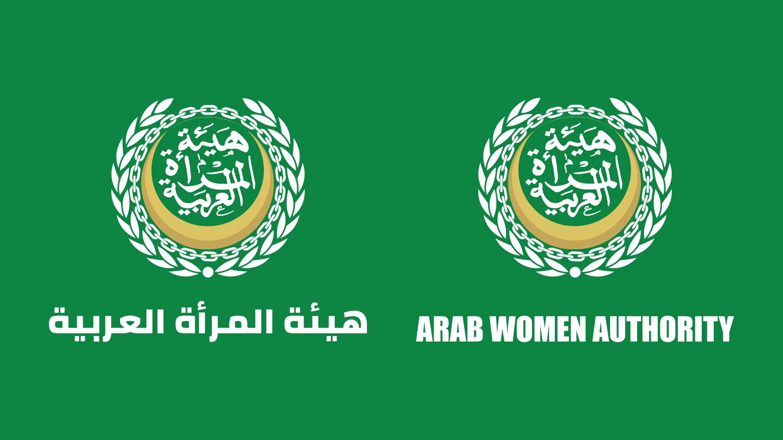
For bilingual use the emblem is paired with the name in Arabic and in English. The emblem stays identical and only the name line changes, so the two versions can sit side by side on documents, event backdrops and digital channels without competing.
Seal and flag
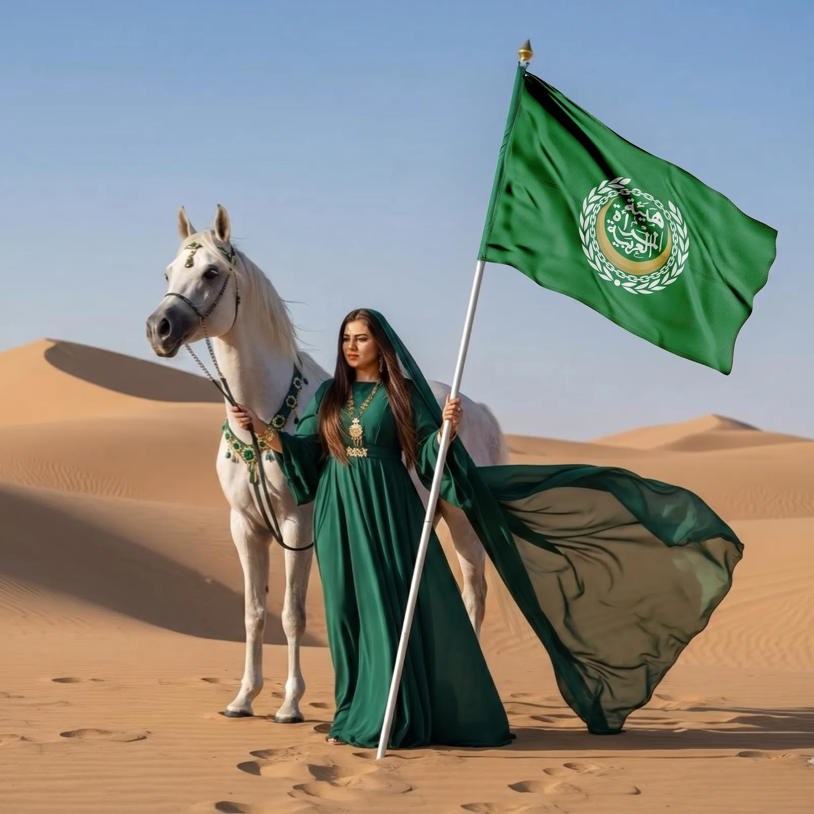
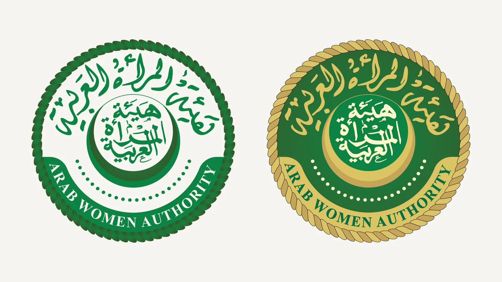
A seal version sets the name around the ring in Arabic and English for official stamps, and the flag places the emblem at the centre of a green field.
The identity at full scale
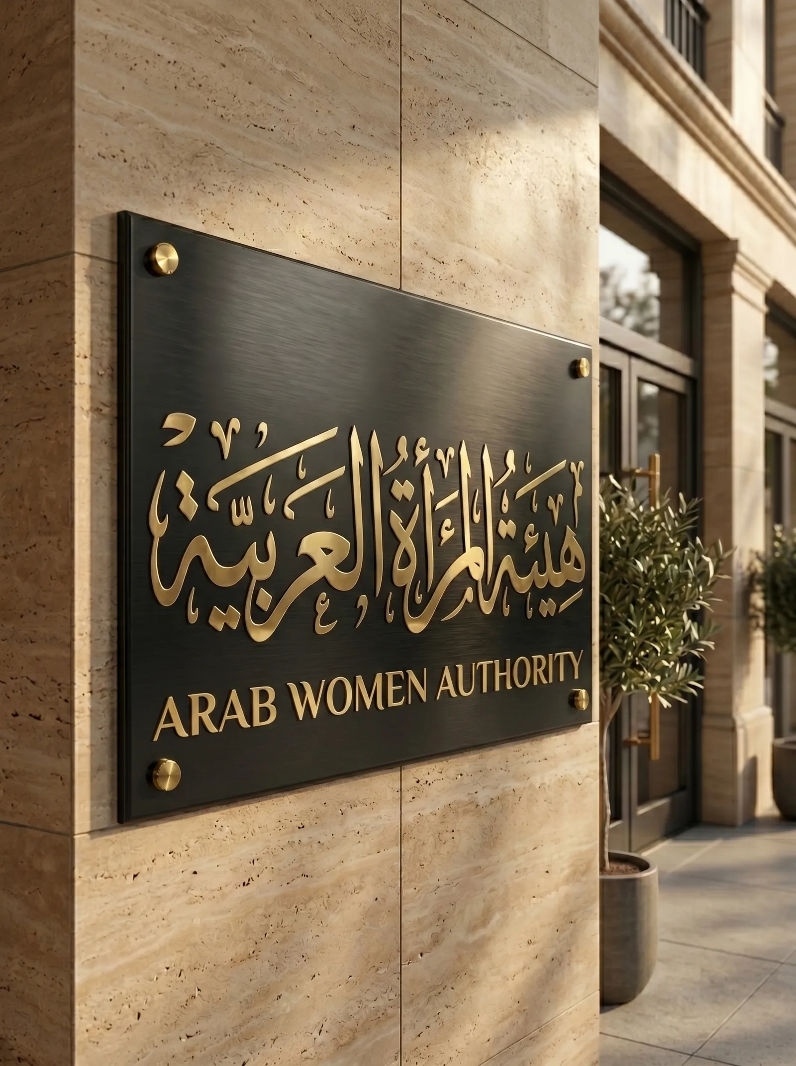
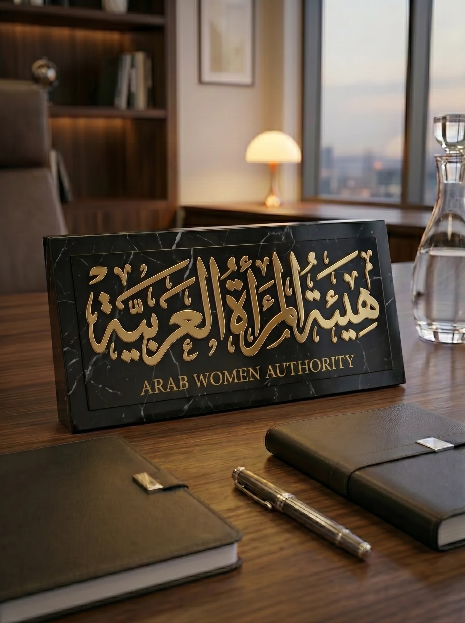
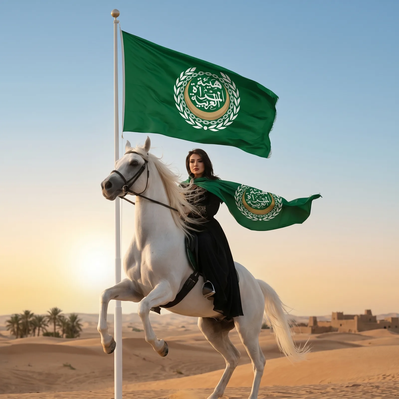
The visuals below are renders we prepared to show the Arab Women Authority logo at full scale: the name in gold on a dark marble wall, a desk nameplate in gold on black, and two concept images of the flag in the desert, one carried by a rider at sunset and one beside a white horse.
One mark from a stamp to a flagpole
An authority’s logo is used at every scale: a stamp on a document, an embroidered badge, a flag on a pole, a sign at the entrance. For that reason the Arab Women Authority logo is a centred circular emblem with a clear outer ring. It comes in colour, single-colour and white versions, and the name is available in Arabic calligraphy and in English.
How the Arab Women Authority logo was designed
The Authority asked for a mark that would represent Arab women as a group, carry the standing of an official body, and work as a seal, a flag and a digital avatar without being redrawn. We started from the name. In Arabic the name is the Authority’s identity, and a calligraphic composition can be read as an emblem in a way a typeset name cannot. A name set in an off-the-shelf typeface can also be repeated by anyone who owns the font. So the Arab Women Authority logo is built around custom calligraphy, with the letters stacked so the name reads as one unit.
The rest of the emblem is arranged around the calligraphy: the green disc, the gold crescent that cradles it, and the chain ring and laurel wreath that close the circle. The crescent gives the mark a horizon and a direction, while the wreath and the ring give it the closed outline of an official seal. Green and gold were chosen for their meaning in the region and for their contrast. The green disc reads at a distance, and the gold details read up close on a document. Keeping to two colours also means the single-colour version keeps the same shape and weight as the full-colour mark.
We tested the approved calligraphy in two places. Inside the circle the stacked letters have to read as a single block; outside it, the same composition has to stand on its own as a wordmark in black or in gold.
Testing the Arab Women Authority logo at every size
The Authority uses its logo on a 12-millimetre stamp and on a flag several metres wide, so the Arab Women Authority logo is drawn for both. At small sizes the calligraphy has to stay legible, which fixes the minimum stroke thickness and the spacing of the wreath leaves. At large sizes the crescent and the ring have to keep their proportions, and that sets the geometry of the circle. The result is recorded as a minimum size: the smallest the mark can be printed, in millimetres, or shown on screen, in pixels, and still be read.
We check every institutional logo against four reference uses: a black-and-white photocopy, embroidery, where any detail finer than a millimetre disappears, a small circular avatar on a phone, and a flag seen from a distance. The design starts from the stamp, because a mark that stays legible at stamp size also works on a flag and a screen. The single-colour version, used for photocopies, stamps and engraving, is tested before the colour version is approved. The white version was drawn for dark and green backgrounds and for flags, where the full-colour mark would lose its disc. A logo that passes all four uses does not need a “simplified” version later.
Arab Women Authority logo lockups, seal and flag as one system
A lockup is the emblem combined with the name in one language. In the Arabic and English lockups the emblem stays identical and only the name line changes, so the two versions can sit side by side on bilingual documents. The seal sets the name around the ring in both languages for official stamps, and the flag places the emblem at the centre of a green field. Every version was delivered as print-ready PDF and high-resolution PNG, with the colour values and the clear-space rule.
Clear space is the margin around the mark that no text or other element may enter, set as a proportion of the mark’s size. With these files the Authority can hand the artwork to any printer or embroiderer without further design work. The Authority presents its identity on its own website, arabwomena.org.
Why the identity was designed pro bono
Kenania designed the Arab Women Authority logo without a fee because the Authority’s work speaks to the region Kenania comes from and serves. The pro bono project followed the same process as paid work: a brief, exploration, presentation, refinement and a full file delivery. In 2026 the Authority gave the identity its Best Logo Design Award.
Questions about cost, timing or the next step? Ask Kenania on WhatsApp.
Chat on WhatsAppHow an authority’s logo differs from a company’s
A company logo competes on a shelf or a screen, so it is drawn first to stand out. An authority’s logo represents a group of people and an official body. It has to look right on an official decree as well as on a flyer, and it is read as a seal before it is read as a brand. That is why the Arab Women Authority logo takes the form of a closed circle with a wreath and a chain, the outline official seals have carried for centuries, and why it uses only two colours.
Use differs as well. A company controls most of what it prints, while an authority’s logo is used by members, branches and partners in different countries and through different suppliers. A common result is an English version with a different emblem from the Arabic one. The short guideline delivered with the files prevents that. In a few pages it fixes the versions, colours, sizes and clear space, and lists the uses that are not allowed, so anyone can apply the mark correctly without asking the designer.
What the Authority received
The handover of the Arab Women Authority logo covered every version in full colour, single colour and white, each as print-ready PDF and high-resolution PNG, together with the Arabic and English lockups, the seal and the flag artwork. Colour values for print and screen, minimum sizes and the clear-space rule are set out in the guideline.
Square and circular avatars were added for social profiles and messaging apps, and the files were signed off after a test print at stamp size and a test view at avatar size. An office, a printer or an embroiderer can now use the mark on paper, fabric and screens without going back to a designer.
Using the identity after handover
Day-to-day use is what makes a logo familiar. We advise placing the Arab Women Authority logo in the same position on every official document, using the Arabic lockup on Arabic correspondence and the bilingual version at international events, and keeping the seal for official papers and the flag for stages and halls. On digital channels the circular avatar shows the emblem without the name, because the account name already appears beside it, and the white version goes on green and dark posts.
When the Authority needs an application nobody planned for at handover, such as a sign in an unusual size or embroidery on dark fabric, we remain available. Both the Authority and Kenania hold the original files.
How a brand identity project runs with us
A brand identity project at Kenania begins with a written brief: what the organisation does, where the mark will be used, and which languages it needs. We present two or three directions as emblems at real sizes, refine the chosen one, then build the system around it: lockups, seal or stamp, flag or banner where relevant, stationery and digital avatars. Delivery includes a short guideline with the colour values, minimum sizes and clear space. For an authority or an organisation the scope stops at the emblem system and its guideline. For a company or a clinic we add stationery and signage, and the timeline is fixed in the written proposal.
Scope
- Primary emblem in full colour, green with gold, gold and white
- Custom Arabic calligraphy of the Authority’s name
- Arabic and English lockups
- Seal with the name in Arabic and English
- Flag artwork
- Print-ready PDF and high-resolution PNG files for every version
Kenania designs brand identities for organisations, companies, clinics and restaurants for clients across the Gulf, the Middle East and Southeast Asia.
Related projects and services
- Branding and creative design services: logos, seals, guidelines and brand collateral
- What a brand identity package contains: the deliverables behind an identity like this one
- La Joya Poly Clinic brand identity, Dubai: another UAE identity by Kenania
Planning a new identity for your organisation? Send a short brief and we will reply with a scoped proposal.