BM Legal: Law Firm Brand Identity Design, Logo and Stationery
Location: Giza, EgyptYear: 2026
Law firm brand identity design for BM Legal: a monogram that turns the B into a classical column and the M into a signature stroke, a full stationery design in editable Word, and a guideline that keeps the identity consistent on every letter, invoice and sign.
The project at a glance
BM Legal is a law firm in Giza, Egypt. Kenania designed its identity in October 2026: the BM monogram and wordmark, the colour and type system, editable Arabic and English stationery, receipt and payment vouchers, and a brand guideline that keeps everything consistent after handover.
Table of Contents
The logo
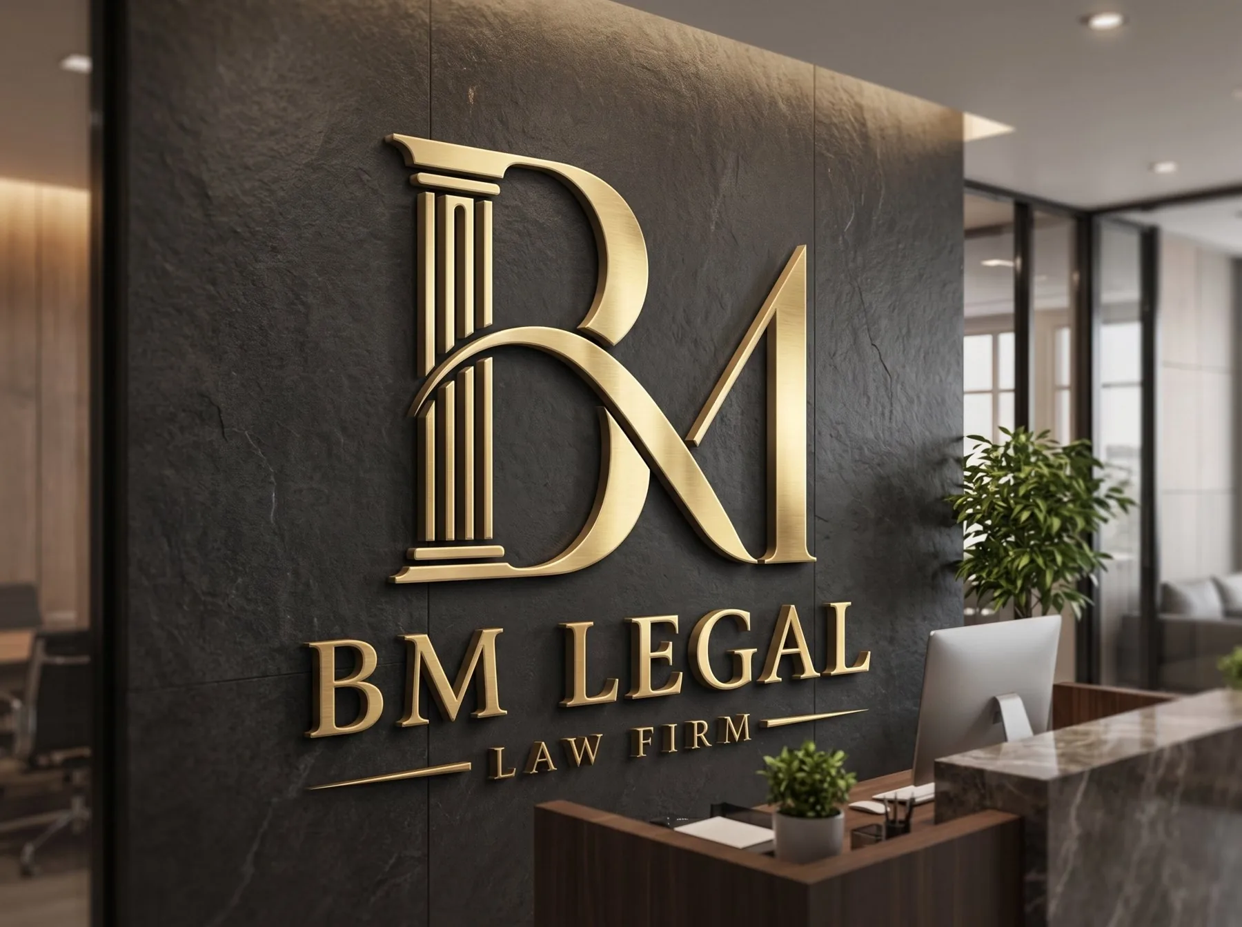
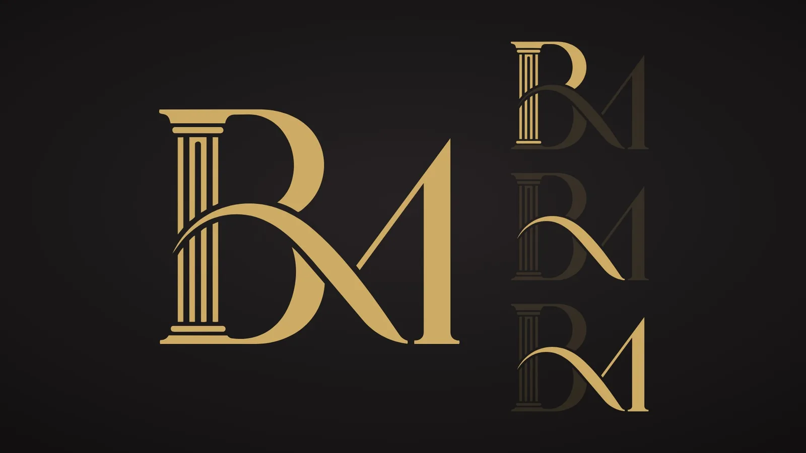
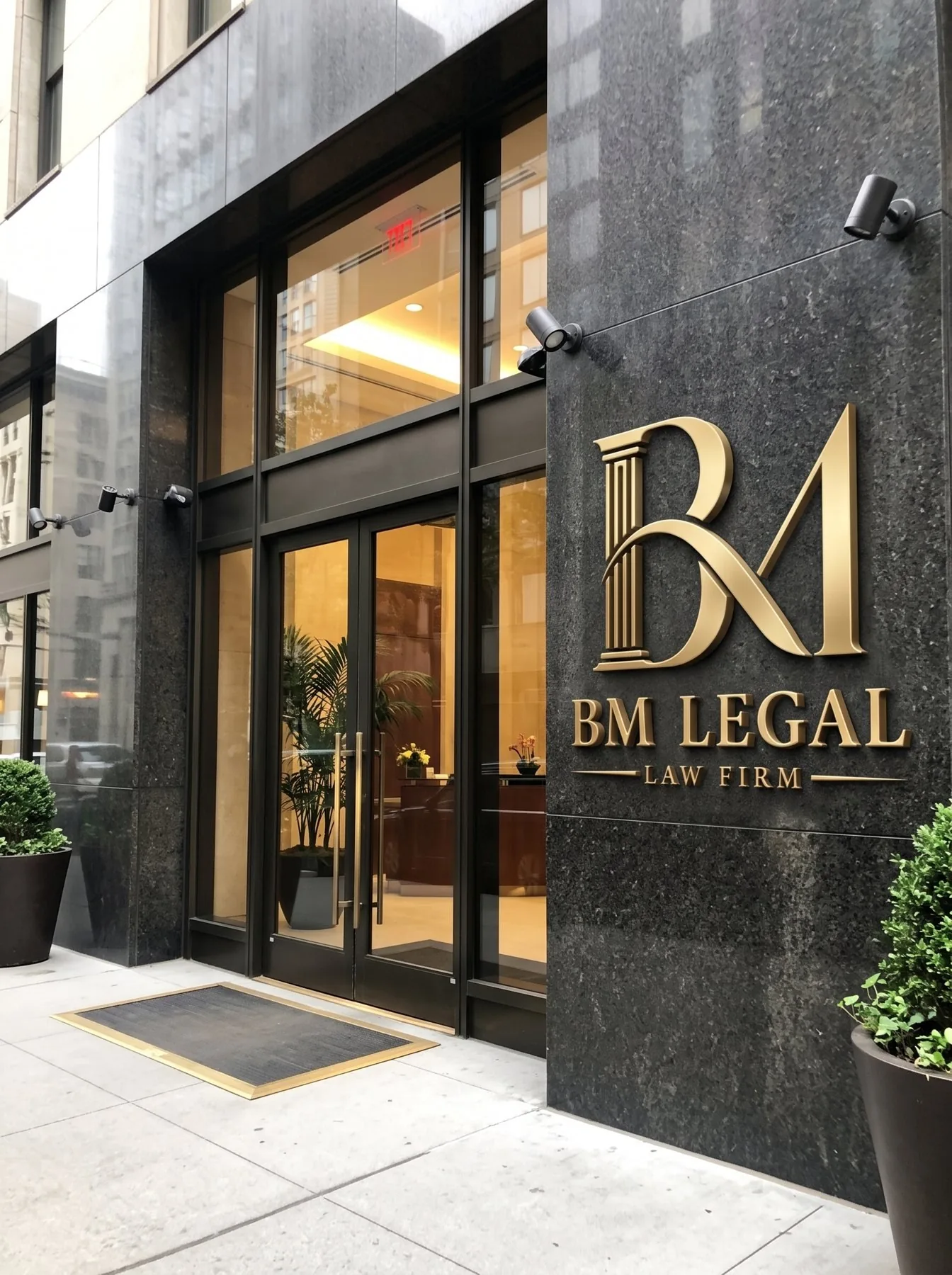
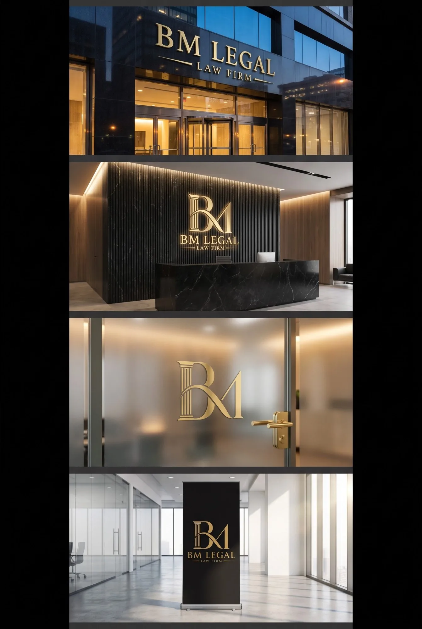
The logo joins the two initials into one mark. The stem of the B is a fluted classical column, the oldest image of law and of the courts. A single swash leaves the column, crosses the bowl of the B and becomes the first stroke of the M, like a signature drawn without lifting the pen. Under the monogram the name is set in Roman capitals, with LAW FIRM between two hairlines.
Have a project like this in mind? Message Kenania directly on WhatsApp.
Chat on WhatsAppThree ideas in one monogram
Each element of the monogram carries a part of the story: the column stands for the stability of the law, the swash for the movement of a case from its first hearing to its ruling, and the rising peak of the M for ambition and reaching the right outcome.
Stationery design the office edits itself
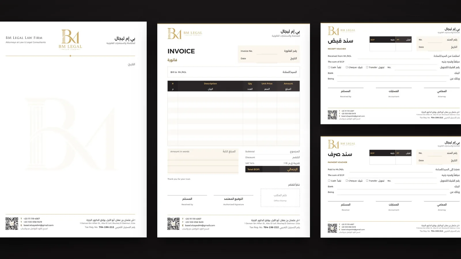
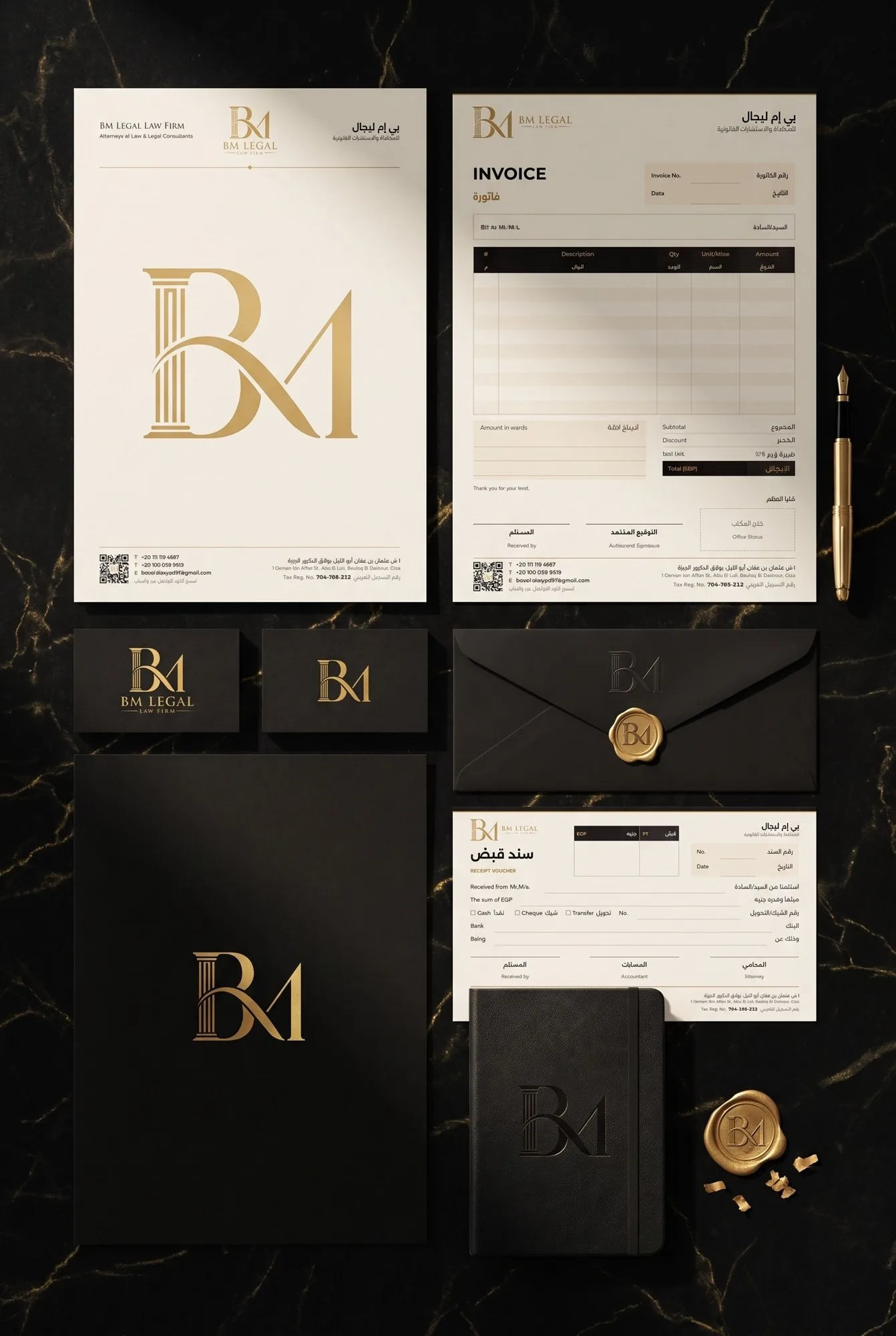
The letterhead, invoice and vouchers were delivered as Word files the office fills in itself. The header and footer sit behind the page as artwork, so typing never moves the logo, and every page carries the phones, the email, the address, the tax registration number and a WhatsApp QR code.
The identity at full scale
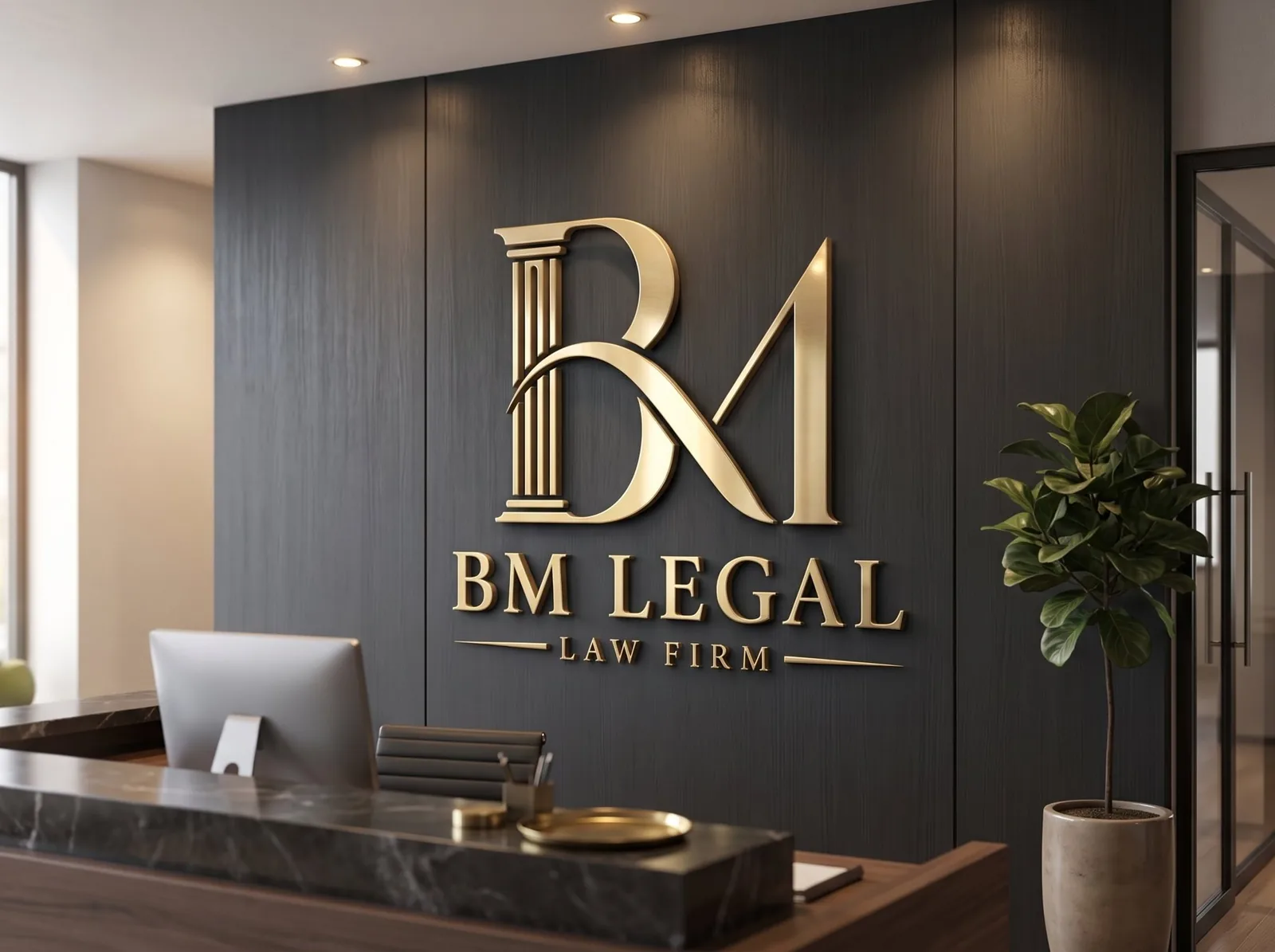
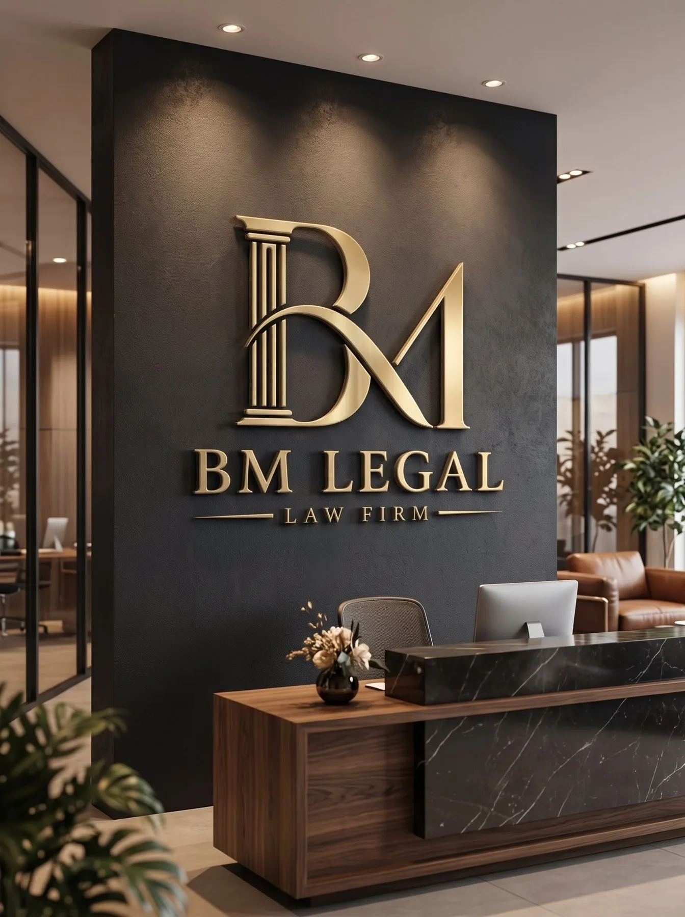
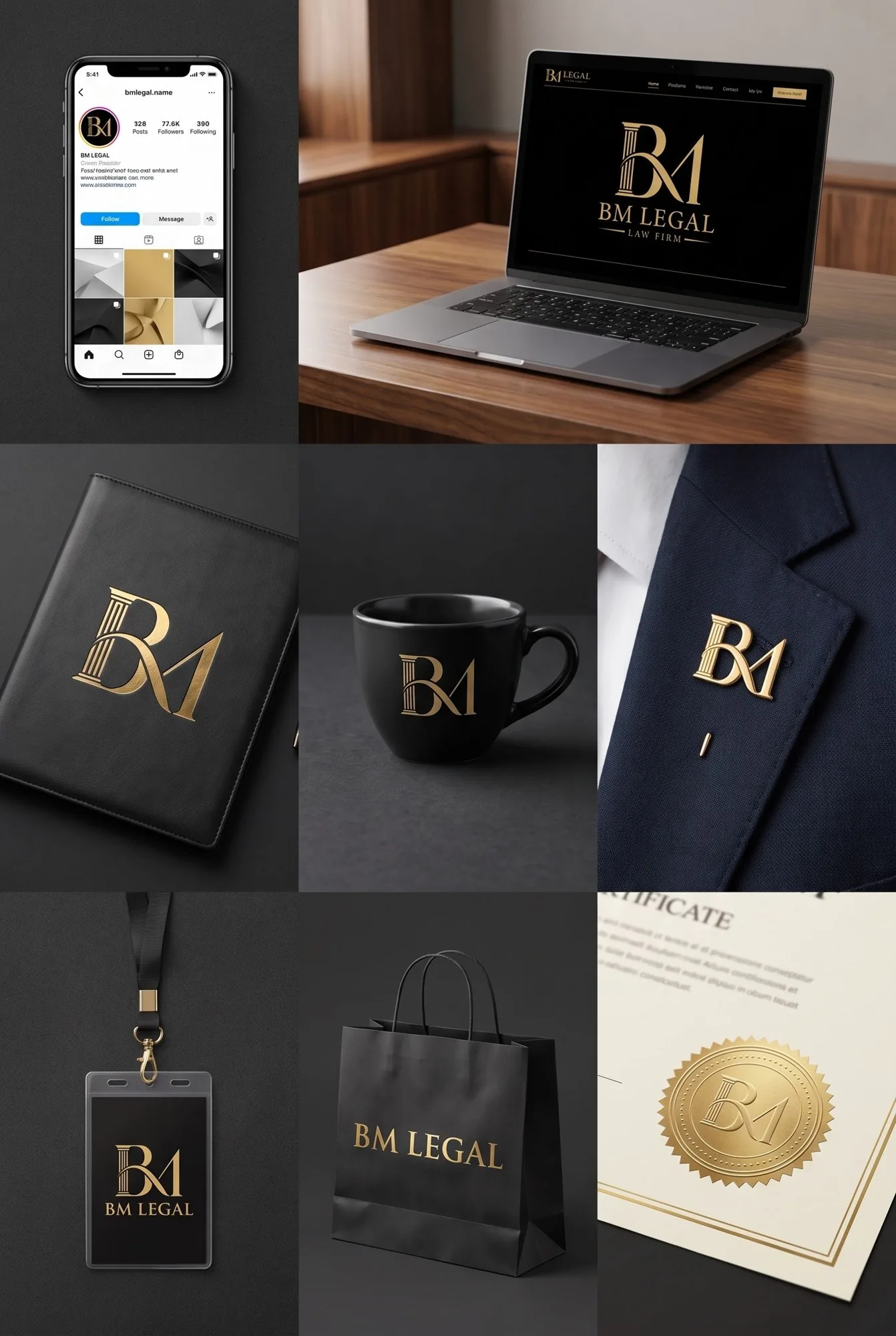
The visuals below are renders prepared to present the identity at full scale: a stationery set, the logo in brushed gold, a reception wall, an entrance sign and a signage board.
What law firm brand identity design has to achieve
A law firm sells trust before it sells a service. A client meets the firm through a business card, a letter, an invoice or the sign at the door long before a case is won, so law firm brand identity design has one job above the others: to look settled, serious and precise on paper. Gold and black, classical letters and a calm layout are not decoration here; they tell the client that the firm is established and careful with detail.
The second job is practical. A law office produces paper every day: letters to courts and clients, fee invoices, receipts for retainers and payments to experts. If the identity lives only in a logo file, every new document drifts. That is why this project treated stationery design as half of the identity, not as an extra.
From three rounds of concepts to one monogram
We explored the logo in three rounds. The first turned single letters into symbols: a B whose stem became a sword, a portico built from both letters, and a pen nib inside the M. The second tried emblems: a shield split by a sword, a balance with the two letters as its pans, a notarial seal and a Roman gateway. The third went modern: a single swash leaving the B and becoming the first stroke of the M, set in a high-contrast Didone.
The final direction kept the strongest idea from each round: the classical column from the first, the authority of an emblem from the second, and the continuous swash from the third. The result is a monogram that reads as BM at a glance, carries a clear image of the law, and still feels contemporary next to the firm’s name.
Typography and colour for a law firm identity
The name is set in Trajan Pro, a typeface drawn from Roman inscriptions, which matches the column in the monogram. It is used only in capitals and with generous letter spacing, for the logo and for English headings. Everything the office types — letters, invoices, vouchers, social posts — uses Alexandria, one modern family that covers Arabic and English, so a bilingual document never mixes styles.
The palette is short on purpose. BM Gold (#CEAB65) carries the logo and the hairlines; Legal Black (#231F20) carries backgrounds and body text; a Deep Gold (#8A6A2E) is kept for small gold text on white, where the lighter gold would lose contrast; and an Ivory tone fills boxes and table rows on documents. For premium print such as business cards and folders, the guideline recommends gold hot-foil stamping instead of gold ink.
Stationery design that survives daily use
The stationery set was designed for an office that will fill it in every day, not for a single print run. Each document is a Word file with the header and footer placed behind the page as 300 dpi artwork, so typing never pushes the logo or the footer out of place. The tables are flat and built to the rules Word and Google Docs respect, the font is embedded, and the page margins follow the artwork exactly.
- Letterhead in Arabic and English, with the logo centred between the firm’s name in both languages and a faint monogram watermark.
- Invoice with a description table, subtotal, discount, a 14% VAT row and total, amount in words, two signature lines and an office-stamp box.
- Receipt voucher and payment voucher on A5 landscape, with EGP and piastre boxes, cash, cheque and transfer options, and signatures for the recipient, the accountant and the attorney.
- A footer on every page with both phone numbers, the email, the address, the tax registration number and a WhatsApp QR code tested to scan.
The brand guideline
The identity was handed over with a 16-page brand guideline in PDF. It explains the logo concept, shows the primary, horizontal, monogram and wordmark versions, the white, black and on-gold versions for single-colour printing, the clear space and the minimum sizes (22 mm for the primary logo, 9 mm for the horizontal one, 7 mm for the monogram), the colour values, the typefaces, the misuse rules and the stationery, followed by presentation renders. A printer, a sign maker or a social-media designer can work from it without calling us.
Questions about cost, timing or the next step? Ask Kenania on WhatsApp.
Chat on WhatsApp5 rules for law firm brand identity design
- Start from trust: classical letters, a restrained palette and calm spacing say more about a firm than an illustration of scales.
- Give the monogram one clear idea per part, as the column, the swash and the rising M do here, so it can be explained in a sentence.
- Design the stationery with the logo, not after it; the letterhead and the invoice are where clients see the identity most.
- Deliver editable documents with fixed artwork behind them, so the office can type without breaking the layout.
- Write the rules down in a short guideline with sizes, colours and misuse examples, so the identity stays the same in five years.
Brand identity design and print design terms
- Monogram
- a mark built from initials, here B and M joined by a shared stroke.
- Wordmark
- the name set as a fixed piece of lettering.
- Lockup
- a fixed arrangement of monogram and wordmark, stacked or horizontal.
- Clear space
- the empty margin around the logo that no text may enter.
- Hot-foil stamping
- a print finish that presses metallic foil into paper, used for gold on cards and folders.
- Letterhead artwork
- the header and footer placed behind an editable document so the layout never moves.
Scope
- BM monogram, primary stacked logo, horizontal logo and wordmark
- Gold, white and black versions with print-ready vector files and transparent PNGs
- Colour palette and type system
- Arabic and English letterhead in editable Word
- Invoice, receipt voucher and payment voucher in editable Word
- WhatsApp QR code on every document
- A 16-page brand identity guideline in PDF
- Signage, stationery and application renders
Kenania designs brand identities for law firms, clinics, companies and organisations from its offices in Dubai, Cairo, Kuala Lumpur and Damascus.
Related projects and services
More brand identity design and stationery design from Kenania:
- Brand identity design and print design services — logos, stationery design, guidelines and signage
- What a brand identity package contains — every deliverable behind an identity like this one
- Brand identity design portfolio — logos, stationery and signage for other clients
- La Joya Poly Clinic brand identity, Dubai — a professional-services identity in gold
Planning a brand identity or new stationery for your firm? Send a short brief and we will reply with a scoped proposal.
Questions about law firm brand identity design
What does law firm brand identity design include?
For BM Legal it included the monogram and wordmark in four versions, gold, white and black colourways, a colour and type system, stationery design for the letterhead, invoice and two vouchers, and a 16-page brand guideline.
Can the office edit the letterhead and invoices itself?
Yes. Every document is an editable Word file with the header and footer fixed behind the page, so the office types its letters, invoices and vouchers without moving the layout.
Which typefaces does the identity use?
Trajan Pro for the logo and English headings, and Alexandria for every document in Arabic and English.
Do you design stationery and print for an existing logo?
Yes. Stationery design and print design can start from a logo you already have: letterheads, invoices, vouchers, business cards, folders and signage.