Hawa Al Sham: Website, Video and Print for a Syrian Dairy Brand
Location: Al-Sabboura, Rural DamascusYear: 2024–2025
Dairy brand website design for Hawa Al Sham, a Syrian milk and dairy maker: Kenania designed the bilingual website, its videos and banners, and the printed catalogue, in collaboration with BIGBANG IT Solutions.
The project at a glance
Hawa Al Sham (هوى الشام) has made milk and dairy products in Syria since 2014, from long-life and flavoured milk to labneh, ayran, cheese, juices and iced coffee, under the slogan «منحكي صحة» (We Speak Health). In collaboration with BIGBANG IT Solutions, Kenania took on the dairy brand website design, along with the brand’s product videos, web banners, product catalogue and brochure.
In collaboration with

Table of Contents
A website with the farm at the front
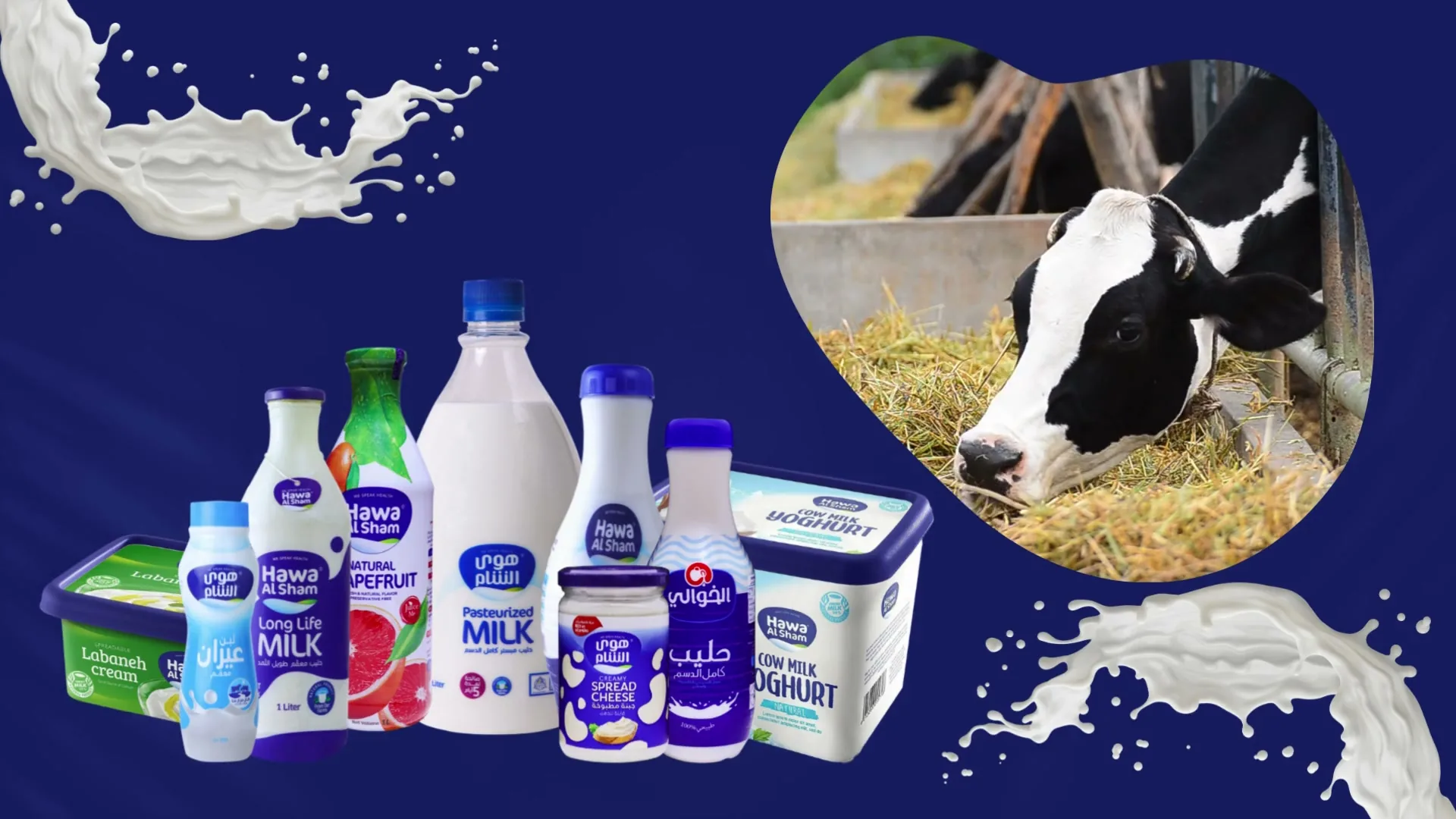
The home page opens on a video of milk splashes, a cow and the full product line-up, under glass panels that carry the brand’s promises of health and quality. Below it come the product families, a carousel of current ads, a protein range with 25 grams of protein per serving, recipes and news. The site runs in Arabic and English.
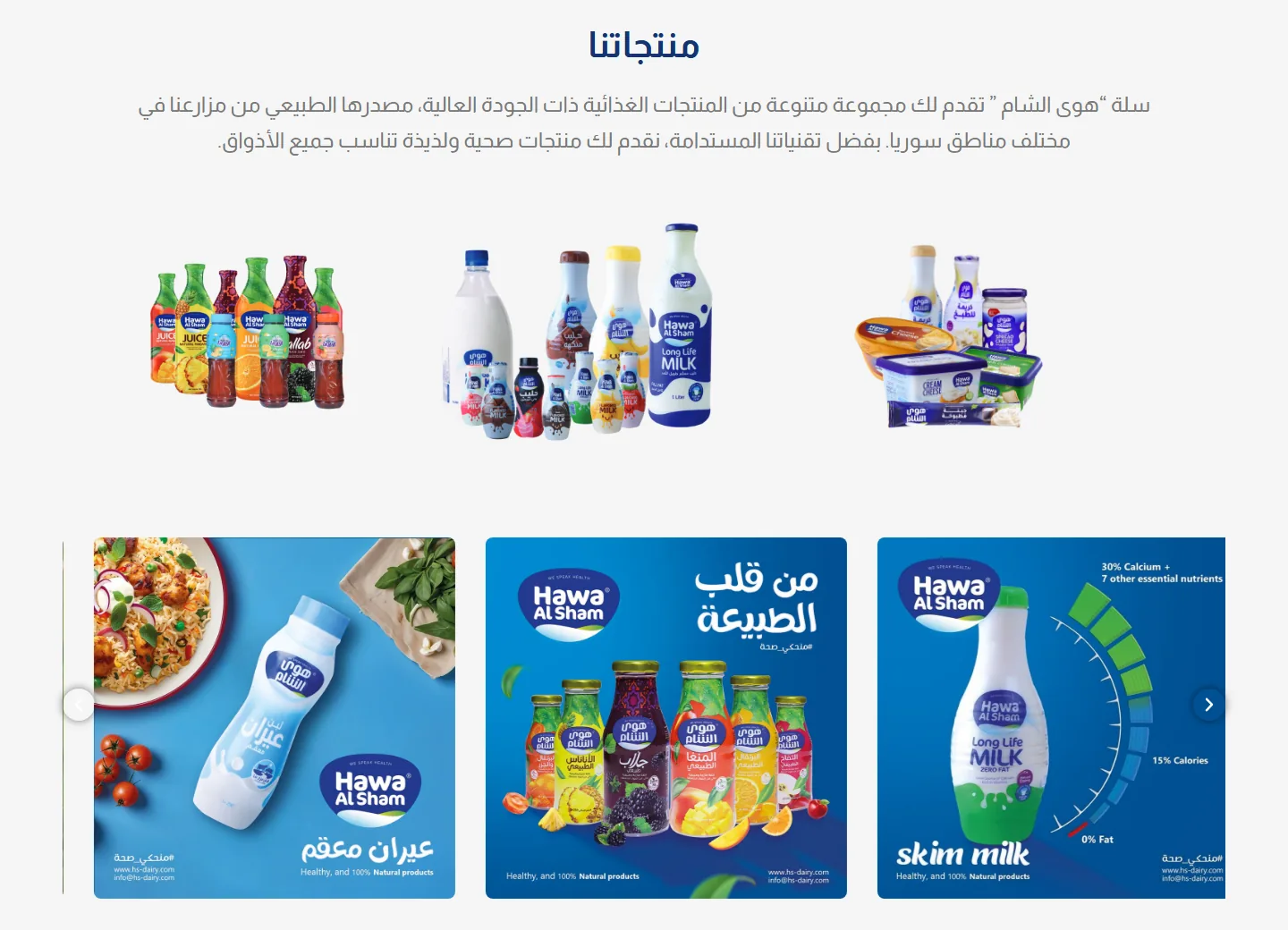
The catalogue lists 78 products in 14 categories that shoppers can filter, from plain and flavoured milk to labneh, cheese and cooking cream. Each product page gives the ingredients and the nutrition values per 100 grams, with related products and recipes that use it. Visit hs-dairy.com.
Have a project like this in mind? Message Kenania directly on WhatsApp.
Chat on WhatsAppBanners and video for the range
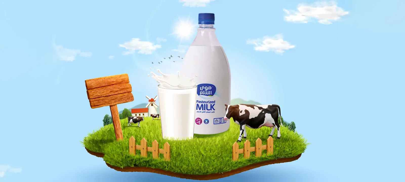
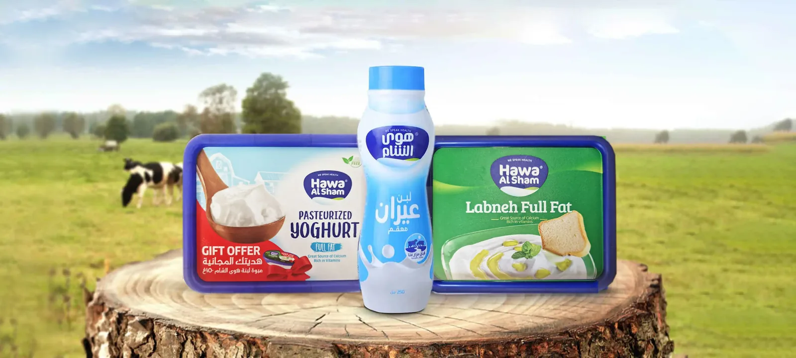
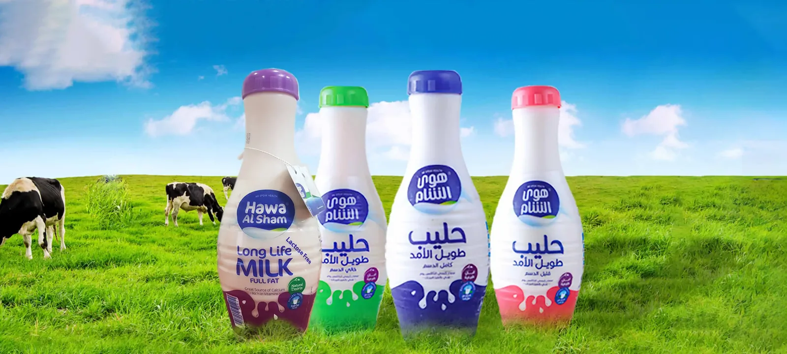
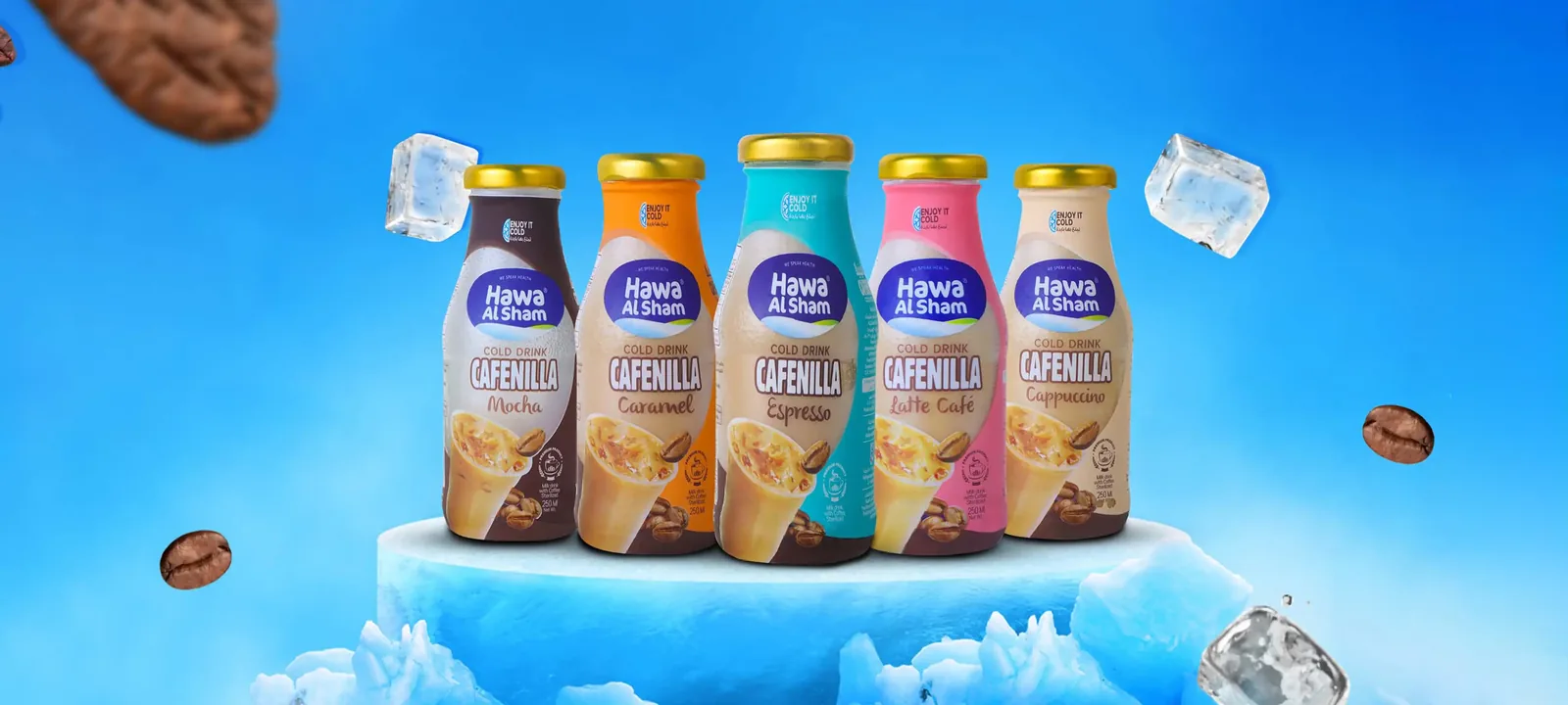
The web banners place the products in the brand’s world: bottles in a green field, a farm floating in a blue sky, labneh and ayran in a pasture, iced coffee on ice. The product videos use the same navy, milk and cow motifs as the home page, so the site, the banners and the videos read as one campaign.
A product catalogue and a brochure
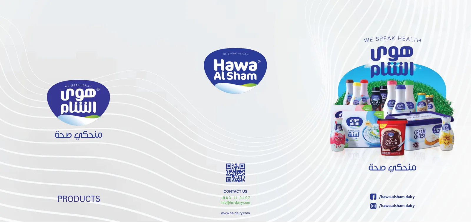
In print, a product-list catalogue and a trifold brochure present the whole range with the logo, the «منحكي صحة» slogan and a QR code that leads to the brand’s channels.
What should dairy brand website design include?
A dairy brand sells freshness and trust, so its website has to show where the milk comes from and exactly what is in each product. Shoppers need a catalogue they can filter by type, because a dairy range grows quickly across sizes and flavours, and a page for every product with its ingredients and nutrition values per 100 grams, which parents and athletes check before they buy.
Recipes show everyday uses, from breakfast to cooking cream in a main dish, and news of fairs and events tells distributors the company is active. Video shows pouring milk, the farm and the full line-up in a few seconds, which still images cannot. A downloadable product list and a map help shops and distributors order. The Hawa Al Sham website covers these in Arabic and English, with banners and print in the same visual language.
Dairy brand website design that opens on the farm
Milk is bought on trust, so the Hawa Al Sham home page starts with where the milk comes from. The hero video shows milk splashing, a cow and the full line-up, and the glass panels over it carry the brand’s promises of health and quality. The product families come only after that, followed by the ads carousel, the protein range, recipes and news. The page argues in that order: the source first, then what the brand stands for, then what there is to buy.
A video does this faster than a still photo. A few seconds of milk, farm and line-up say what a paragraph would, before anyone scrolls. On a phone a hero video has a cost, so in dairy brand website design it has to be compressed, play without sound and fall back to a still frame on slow connections.
The slogan «منحكي صحة» (We Speak Health) sits in the hero and comes back on the catalogue and the brochure, so a shopper meets the same line online and on paper. Repeating one line across every channel costs nothing, and it is how people come to recognise a dairy brand.
A catalogue of 78 products that stays easy to use
A dairy range keeps growing: a new milk flavour, a bigger labneh tub, a protein line. Seventy-eight products in one list would be hard to use, so the catalogue is split into 14 categories with filters, from plain and flavoured milk to labneh, cheese, ayran, juices, iced coffee and cooking cream. A shopper who wants cheese filters to cheese and sees that shelf alone.
Every product page gives the ingredients and the nutrition values per 100 grams, then related products and the recipes that use it. Parents check those figures, buyers of the protein range compare grams per serving, and shops use the page when they write their orders. Dairy brand website design that hides this information in a PDF, or leaves it out because it is printed on the pack, loses those readers.
Filters serve people who are already on the site. Someone searching Google for labneh or long-life milk needs a page with its own title to land on, so when we plan the catalogue in a dairy brand website design we treat category pages and filters as two separate jobs.
Recipes, news and the protein range
Recipes give the products a use, from breakfast to cooking cream in a main dish. Because each product page lists the recipes that use it, the recipe section and the catalogue lead into each other. News keeps the site current with the brand’s activity.
The protein range, with 25 grams of protein per serving, has its own place on the home page. It speaks to a different buyer, one who compares grams of protein rather than flavours, and a functional line like this reads better with its own heading than mixed into the milk categories.
These sections keep the site alive after launch. Each new recipe or news item adds a page for search engines in the brand’s own words, which a fixed catalogue cannot do however good it looks, so in dairy brand website design we plan them from the first page map.
Dairy brand website design carried into banners, video and print
We designed seven web banners for the range, and four of them are shown above. Each gives one product family its own setting: long-life milk bottles stand in a green field, a farm floats in a blue sky beside a milk bottle and a cow, yoghurt, ayran and labneh sit on a tree stump in a pasture, and Cafenilla iced coffee bottles rest on ice. The product videos reuse the navy, milk and cow motifs of the home page.
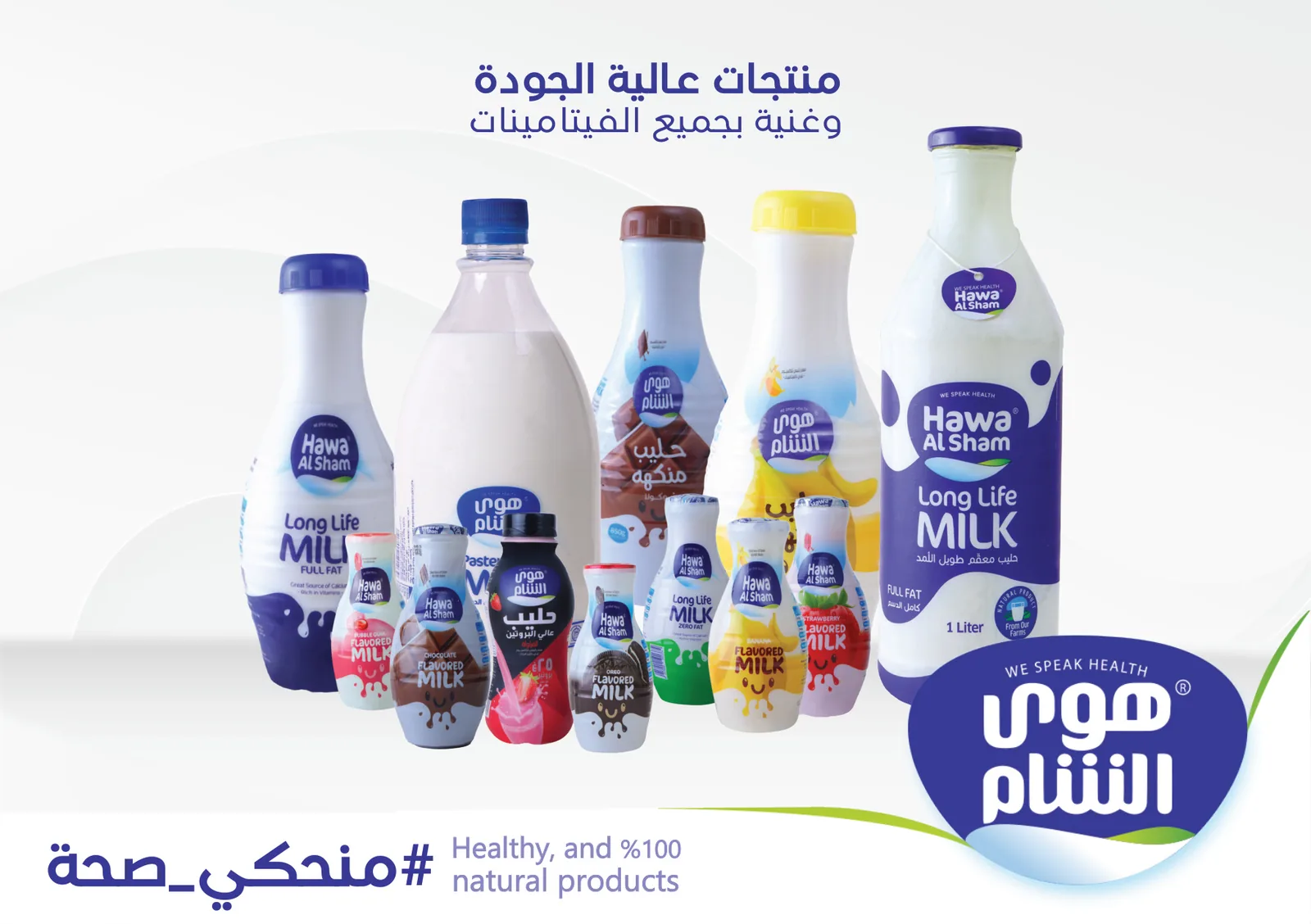
In print, the product-list catalogue lays out the milk range under the «منحكي صحة» slogan, and the trifold brochure carries the logo, the products and a QR code that takes a reader from paper to the brand’s channels. Because the site, the banners, the videos and the print share one visual language, each piece makes the others more familiar.
Six best practices for dairy brand website design
These come from the Hawa Al Sham project and apply to most dairy brand website design work, and to fresh-food brands with a large range.
- Open on the source of the milk and the brand promise, and put the catalogue after them.
- Split a large range into categories with filters, so a shopper sees one shelf at a time.
- Publish ingredients and nutrition per 100 grams on every product page, in the same order on every page.
- Give recipes their own section and connect each recipe to the products it uses.
- Treat a protein or other functional line as its own section, written for the buyer who compares numbers.
- Design the banners, video and print from the site’s visual language and slogan.
Questions about cost, timing or the next step? Ask Kenania on WhatsApp.
Chat on WhatsAppHow a dairy brand website design project runs with us
We begin with the product list by category, the packaging files and whatever photography and video already exist, and we agree the languages: Arabic for the home market, and English where the brand exports or sells to hotels and restaurants. We design the home page, one category, one product page and one recipe for approval, then the remaining templates, the banners and the print pieces. The catalogue is loaded with the real range before launch.
What we check before and after launch
Before launch we test the filters on a phone with the full range loaded, check that every product page shows its nutrition values in the same order, and confirm that the QR code on the catalogue and the brochure opens a page that works on a phone. Every page gets its own Arabic title and description, the English version gets its own, and the site map goes to Google on launch day. The brand’s team learns how to add a product and a recipe.
After launch we watch which categories and recipes draw the most visits, which searches bring people in, and whether the hero video slows the page on real phones. Those figures steer the next recipes, the next banners and any change to the order of the home page.
Other food brand websites we designed with BIGBANG
Kenania designed the websites of two other Syrian food brands with BIGBANG IT Solutions, Sidi Hisham and Massa Foods, and worked on the launch of Golden Potato.
Scope
- Dairy brand website design in Arabic and English: home with a video hero, products with category filters, product pages, recipes, news, gallery, about and contact
- Product videos for the home page
- Web banners for the product range
- Product-list catalogue and trifold brochure
- Delivered in collaboration with BIGBANG IT Solutions
Related projects and services
- Website design in Syria: company websites and product catalogues in Arabic and English
- Sidi Hisham website, Syria: a food company website, with BIGBANG IT Solutions
- Massa Foods: website, social media and content: a snack brand, with BIGBANG IT Solutions
- Golden Potato: website and social media: a chips brand launch, with BIGBANG IT Solutions
- UI/UX and website design services: websites, platforms and apps
Planning a dairy brand website design project, or a website for another food brand? Send the product list with categories, the nutrition sheets and any photos or video you have, and we will reply with a written proposal, a fixed fee and a timeline.
Questions about dairy brand website design
Does a dairy website need an online shop?
Rarely in the Syrian market, where dairy sells through distributors and the fridges in shops. An order button or a WhatsApp number on the product page is enough for the trade, and a cart can be added later on the same structure for areas with chilled delivery.
How should nutrition values be shown?
In our dairy brand website design work they go in one table per 100 grams (energy, fat, protein, carbohydrates, calcium), in the same order for every product. We build the fields and the manufacturer fills them from its approved sheets, because the figures have to be verifiable.
Does a video at the top of the page slow the site down?
Not if it is compressed, plays without sound and is kept short, with a still frame as a fallback for slow connections. We measure page speed on a phone before launch and adjust.
Who updates the recipes and news after launch?
The brand’s team, through a simple control panel that we hand over with a short guide, or we can take it on under a monthly content agreement.