Manjam Deals: Bidding App Design for Group Deals, Built for Like Card
Bidding app design for Manjam Deals: join a deal with points, watch the joiners meter fill, bid against the clock and pay in two taps.
The project at a glance
Manjam Deals is a shopping app for Like Card built around group deals. A product opens to buyers who join with points; when enough people have joined, live bidding starts and the price moves with every bid until the countdown ends. Kenania designed the app with BIGBANG IT Solutions: a bidding app design of 21 screens in Adobe XD, from the welcome slides to orders, returns and ratings.
In collaboration with

Table of Contents
A new way to buy needs a short explanation
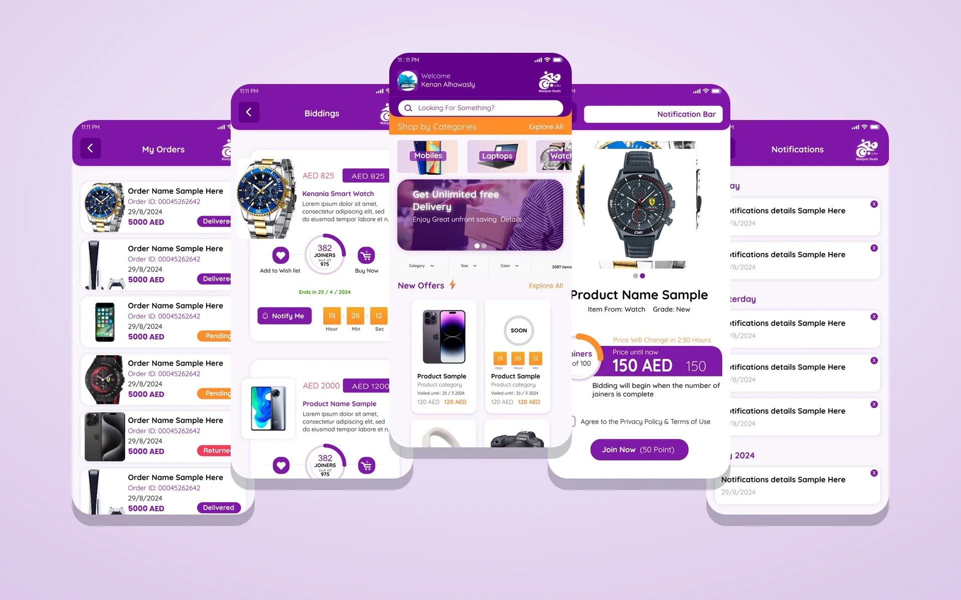
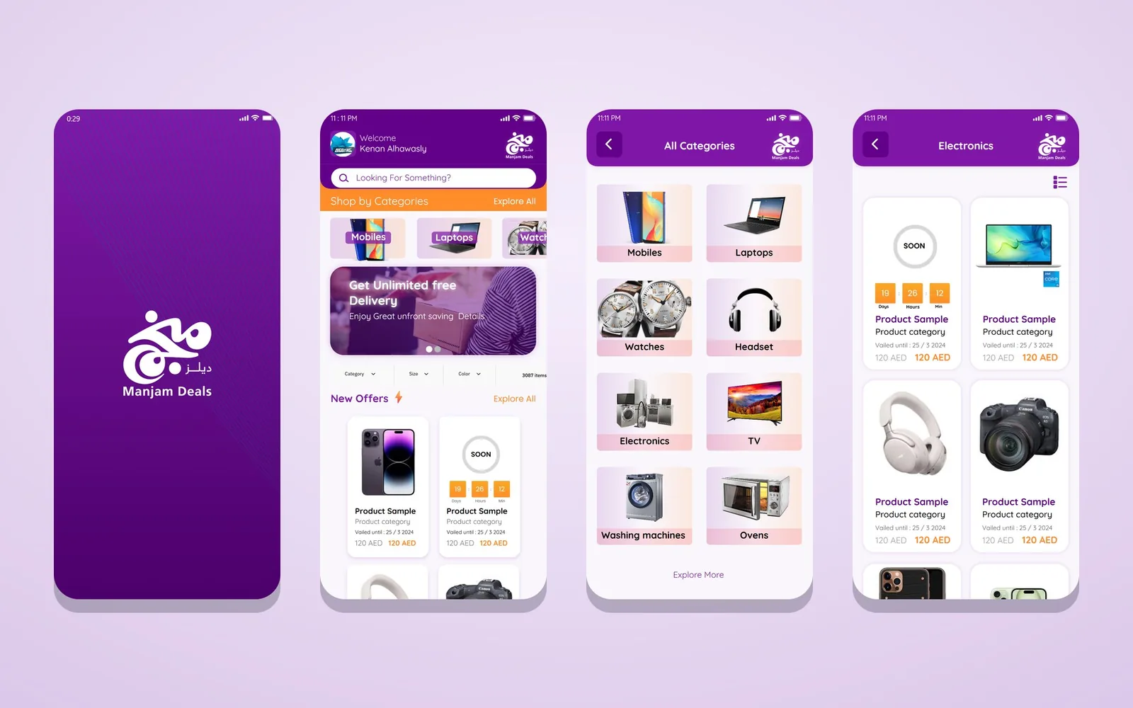
Group bidding is unfamiliar to most shoppers, and the bidding app design handles that with three opening slides that show the joining and bidding screens inside a phone and explain the rules in one sentence each, with Skip on every slide for people who already know. The home screen then looks like a familiar shop: a greeting with the user’s name, a search field, categories with product photos (mobiles, laptops, watches), a delivery banner, filters by category, size and colour, and a grid of new offers with their prices and countdowns.
Have a project like this in mind? Message Kenania directly on WhatsApp.
Chat on WhatsAppThe joiners meter on every deal page
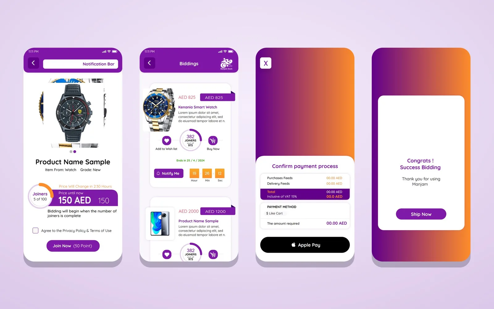
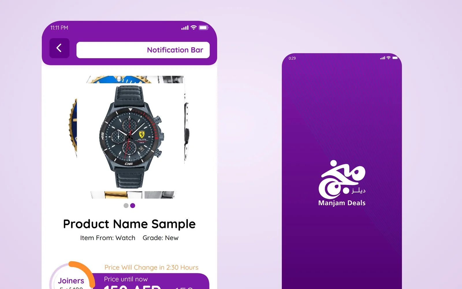
Every deal page carries one round meter that shows how close the deal is to starting. «Joiners 5 of 100» sits next to the current price, a line says that bidding will begin when the number of joiners is complete, and a second line says when the price will change.
The Join Now button shows its cost in points, and a checkbox to accept the privacy policy and terms sits right above it. Normal products, bought at a fixed price, use the same layout with a Buy Now button, so users never have to learn two kinds of page. That shared layout was the main decision of the bidding app design.
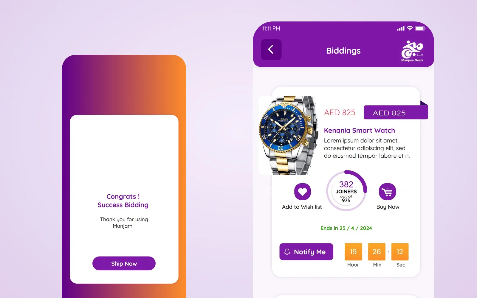
The Biddings screen lists live deals as cards: the starting price struck through, the current price in a dark tag, the joiners out of the total in a ring, a countdown in hours, minutes and seconds with the end date, and three actions, add to wishlist, notify me and buy now. The countdown is always orange and always in the same place, so a user scrolling quickly can compare deals by time alone.
Paying in two taps
When a deal is won, a bottom sheet confirms the payment: purchase fees, delivery fees and the total, the payment method, here the user’s Like Card balance, and a large Apple Pay button. The winner never goes through a long checkout page: everything needed before confirming is on that one sheet. A success screen, «Congrats! Success bidding», follows with a single action, Ship Now. The queue confirmation screen tells users who joined a deal that is not yet full where they stand, so nobody thinks their place was lost.
Orders, returns and ratings
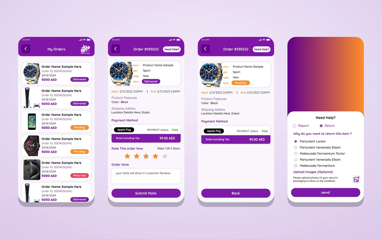
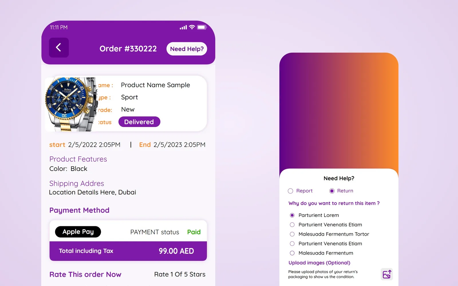
My Orders shows each purchase with its photo, order number, date, price and a coloured status, delivered, pending or returned. The order page lists the product features, the shipping address, the payment method and status, and the total including tax, and asks the user to rate the order with stars and a note that will appear in customer reviews. «Need Help?» opens a report or return form with reasons to choose from and an optional photo upload, and a confirmation screen promises that the problem will be solved.
Menu, locations and notifications
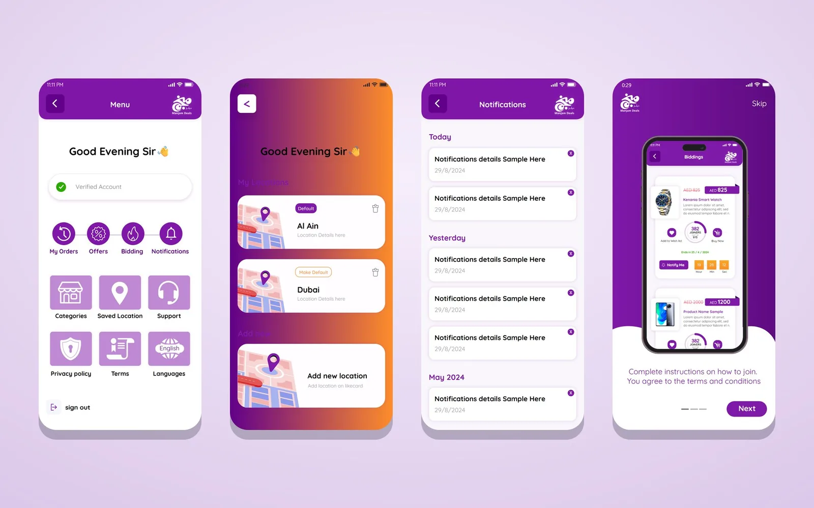
The slide menu greets the user and shows a verified-account badge, then four round shortcuts, my orders, offers, bidding and notifications, and a grid for categories, saved locations, support, privacy policy, terms and languages. The four shortcuts are what a returning user opens every day, so they sit at the top and the rest waits in the grid. Saved locations are cards with a map thumbnail, which is quicker to recognise than two lines of address, and one carries a default badge so the user does not pick an address on every order; notifications are grouped by today, yesterday and month, and three About Manjam screens explain the service.
Colour and cards in the bidding app design
The palette comes from the Manjam Deals logo: a deep purple for headers, prices and primary buttons, and a warm orange reserved for time, countdowns and the buy button, so urgency always has the same colour. White cards with soft shadows hold the products, prices are set large in AED, and every list uses the same card so the app feels like one product from the first slide to the last screen.
Bidding app design starts with the rules of the deal
An auction asks people to commit before they know the final price. That only works when the rules are visible at every step: how many people must join, when the bidding opens, when it closes and what happens if nobody wins. Most of bidding app design is information design for that reason. Every number on Manjam’s deal page, from joiners and price to time and points, answers a doubt that would otherwise stop a user before Join Now.
Smaller details carry the same message. The menu opens with a verified-account badge, the starting price stays visible with a line through it next to the current one, the end date is written under the countdown, the order page marks a paid order in green, and the rating form tells users that their note will appear in customer reviews. None of this is hidden in a help screen.
Pace is the other problem. Deals move in hours and minutes, so the interface has to show time without making people anxious. Time has one colour and the countdown one position, and every deal uses the same card, which lets a user scan the list in seconds and come back when a deal is about to close.
Two ways to buy, one layout
Manjam sells group deals and fixed-price products side by side. The bidding app design uses one product layout for both and swaps only the middle block: a joiners meter and Join Now for a deal, a price bar and Buy Now for a fixed-price item. Colours, sizes and shipping time sit in the same place on both pages, so moving between them does not feel like switching apps.
After the winning bid
The bidding app design carries on past the moment a deal is won. The order page shows the payment status and the total, asks for a rating, and gives a clear route to report a problem or return a product. Each order status has its own colour. A report offers ready-made reasons to pick from, with an optional photo of the problem, and every request ends on a thank-you screen that tells the user what happens next, so nobody is left wondering whether the report arrived. These screens decide whether a first-time winner comes back.
Actions within reach of the thumb
People open deal apps in short moments: on the way somewhere, during a break, before sleep. The main actions therefore sit where a thumb reaches them. Join Now is in the middle of the deal page, the pay button at the bottom of the payment sheet, and wishlist, notify and buy share one row under each card. Prices and countdowns are large enough to read without zooming, and a tap on a product photo opens the product. A bidding app design has to assume that a deal can be decided in seconds.
Notifications that bring users back
Deals keep moving while the user is away from the phone. The Notify Me button on each card asks for an alert when a deal is close to starting or ending, and the notifications screen groups alerts by today, yesterday and month, each with a small delete button. Users can follow a deal without keeping the app open.
Questions about cost, timing or the next step? Ask Kenania on WhatsApp.
Chat on WhatsAppReady for Arabic
The screens were designed in English with a languages option in the menu, and the layout leaves room for Arabic, right to left. The joiners ring keeps its place, prices keep a fixed position next to the currency, and only icons that point in a direction are mirrored. That keeps this bidding app design ready for a bilingual launch in the Gulf without redrawing the screens.
Numbers to watch after launch
Once the app is live, a few figures show which part of the bidding app design needs attention: how many users join after opening a deal page, how many deals fill before their time runs out, how many winners pay within minutes, and how many orders come back and for what reason. If many people open a deal and leave without joining, the rules and the points cost on the deal page need another look. If deals expire before they fill, the way the home screen presents them and the timing of alerts are the place to start.
What the development team received
The design was handed over as an Adobe XD file of 21 linked screens, with the states a developer needs: delivered, pending and returned orders, a deal before and after it fills, the payment sheet and its success screen, a report and its confirmation, and offers shown as a list and as a grid. The same components repeat from the product card to the joiners meter, so the team can build one component library and use it across the whole bidding app design.
Scope
- UX flows: onboarding, browse, join, bid, pay, orders, returns and account
- Bidding app design for 21 screens in Adobe XD
- Joiners meter, countdowns and live bidding cards
- Fixed-price product pages that share the same layout
- Payment sheet with Like Card balance and Apple Pay
- Order details, ratings, reports and returns with photos
- Menu, saved locations and grouped notifications
- Delivered in collaboration with BIGBANG IT Solutions
Related projects and services
- UI/UX design and digital products: research, flows and interfaces for apps and platforms
- Multi-vendor marketplace: a customer app and an admin dashboard
- Oscar water delivery app: repeat orders, cash or card and live tracking
Planning a deals, auction or marketplace app? Send a short brief and we will reply with a plan for the screens.
Questions about bidding app design
How does a Manjam deal work?
Buyers join a deal with points. When the number of joiners is complete, live bidding opens and runs until the countdown ends; the winner pays and the product ships.
How do users pay?
The payment sheet shows the fees and total, uses the Like Card balance as the payment method and confirms with Apple Pay.
Can users return a product?
Yes. From the order page, Need Help opens a report or return form with reasons and an optional photo, followed by a confirmation.
Who built the app?
Kenania did the bidding app design, from the UX flows to the interface; the project was delivered in collaboration with BIGBANG IT Solutions for Like Card.
Do you design other marketplace and auction apps?
Yes. We design marketplaces, auction and deal apps, and their admin dashboards, in Arabic and English.