Multi-Vendor Marketplace UI/UX — App & Dashboard, Saudi Arabia
Table of Contents
Multi-Vendor Marketplace — UI/UX for App and Admin Dashboard
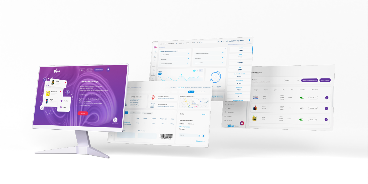
Kenania Inventive Arts designed the user interface and user experience for a multi-vendor commerce platform in Saudi Arabia. The scope covered a customer-facing mobile app and a full administrative dashboard used to run sales, vendor stores and warehouse operations across both B2B and B2C channels in a single system.

🎨 Design Approach
A multi-vendor platform has to serve people whose jobs have almost nothing in common. A retail customer wants to find a product and check out in under a minute. A vendor wants stock levels, orders and payouts. A warehouse operator wants picking lists and dispatch status. An administrator wants oversight of all of it. Designing one visual system that holds all four without becoming cluttered was the central problem.
Serving four audiences in one system
We built the interface around role-based views: every user signs into the same platform but sees only the screens, data and actions their role requires. This kept each interface focused while allowing the design language, components and navigation logic to stay consistent across the whole product.
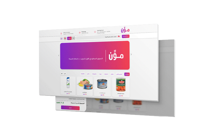
Core interfaces designed:
Customer mobile app — browsing, search, cart and checkout for B2C buyers
Vendor portal — catalogue management, order handling and payout tracking
Warehouse module — inventory, picking, packing and dispatch workflows
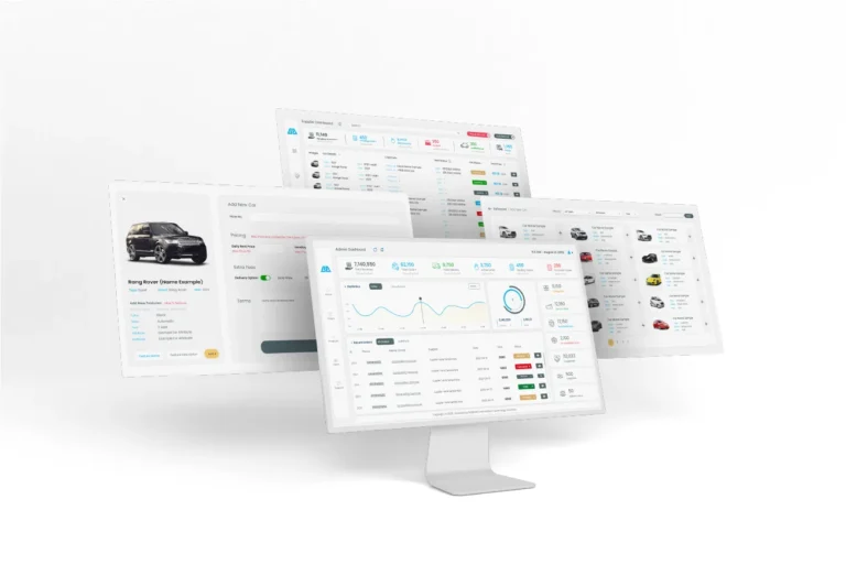
Admin dashboard — platform-wide oversight, vendor approval and reporting
💡 Dashboard: Sales, Stores and Warehouses
Sales performance across vendors and channels
Store-level management for each vendor on the platform
Warehouse stock levels and movement tracking
Separate B2B and B2C order pipelines in one view
Reporting views built for decisions, not just data display
Planning a marketplace or a platform of your own? See our UI/UX and digital product services or talk to our team.
🛠️ Execution & Implementation Stages
The project ran in phases. We began by mapping every user role and the tasks each one performs, then wireframed the critical flows — checkout, order fulfilment and stock movement — before any visual design started. Once those flows were validated, we built a component library so that new screens could be assembled consistently, and delivered the high-fidelity designs for the app and dashboard in stages that matched the development team’s build order.
Have a project like this in mind? Message Kenania directly on WhatsApp.
Chat on WhatsApp📸 Project Highlights
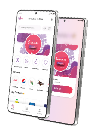
A customer app built for fast product discovery and a short path to checkout.
A vendor portal that puts catalogue, orders and payouts in one place.
A warehouse module designed around real picking and dispatch workflows.
📸 Dashboard Highlights
An admin dashboard that surfaces sales performance across every vendor.
B2B and B2C order pipelines handled side by side without duplicate screens.
Inventory views that make stock movement legible at a glance.
The design system uses a restrained palette and a strict typographic scale, so dense data screens stay readable during long working sessions. Colour is reserved for status and action rather than decoration — an approach that matters more in an operations dashboard than in a consumer app.
Every component was designed responsively. Warehouse and vendor staff frequently work from tablets and phones on the floor rather than at a desk, so the layouts had to hold up at small sizes without hiding critical actions behind menus.
The result is a single platform that serves customers, vendors, warehouse teams and administrators from one consistent design language — built to scale as more vendors join without the interface becoming heavier.
Questions about cost, timing or the next step? Ask Kenania on WhatsApp.
Chat on WhatsAppRelated digital product work
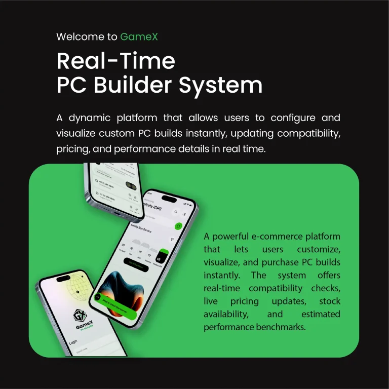
- PC builder e-commerce UI/UX: inside the GameX configurator — a configurator-driven storefront with live compatibility checks
- What a brand identity package should actually contain — the identity layer a marketplace is built on
More multi-vendor marketplace projects and services
More multi-vendor marketplace work from Kenania, and the services behind it:
Reference: for the standards behind this multi-vendor marketplace work, see Nielsen Norman Group.
Ready to start? Send Kenania a photo, a plan or a short brief on WhatsApp.
Chat on WhatsApp