Sidi Hisham: Food Company Website Design in Syria
Location: SyriaYear: 2022
Food company website design for Sidi Hisham, a Syrian pantry brand with 24 product categories. Kenania designed and developed the Arabic website in collaboration with BIGBANG IT Solutions.
The project at a glance
Sidi Hisham (سيدي هشام) is the food brand of the Al Akkad Industry and Trade Company (شركة العقاد للصناعة والتجارة) in Syria, with a range that runs from rice, pulses and tea to olive oil, tahini and canned goods. Kenania handled the food company website design and the build, in collaboration with BIGBANG IT Solutions.
In collaboration with

Table of Contents
A catalogue organised around the pantry
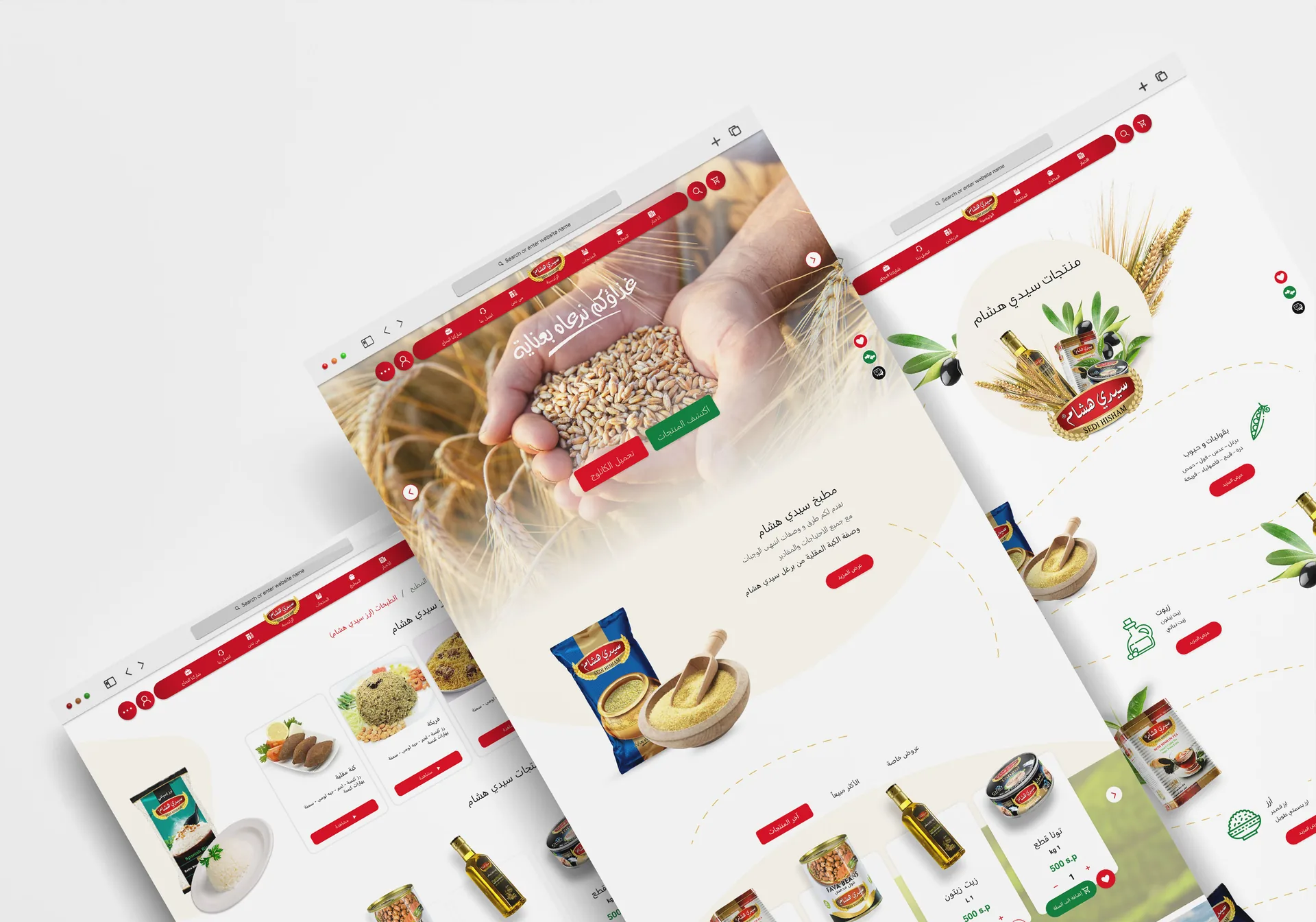
The site is written in Arabic and built around the range: 24 product categories, from pulses, rice and tea to spices, jams and olive oil, each with its own product pages. A kitchen section groups recipes that use the brand’s products into seven collections, and a news section follows the company at trade fairs such as the Damascus International Fair and Gulfood in Dubai.
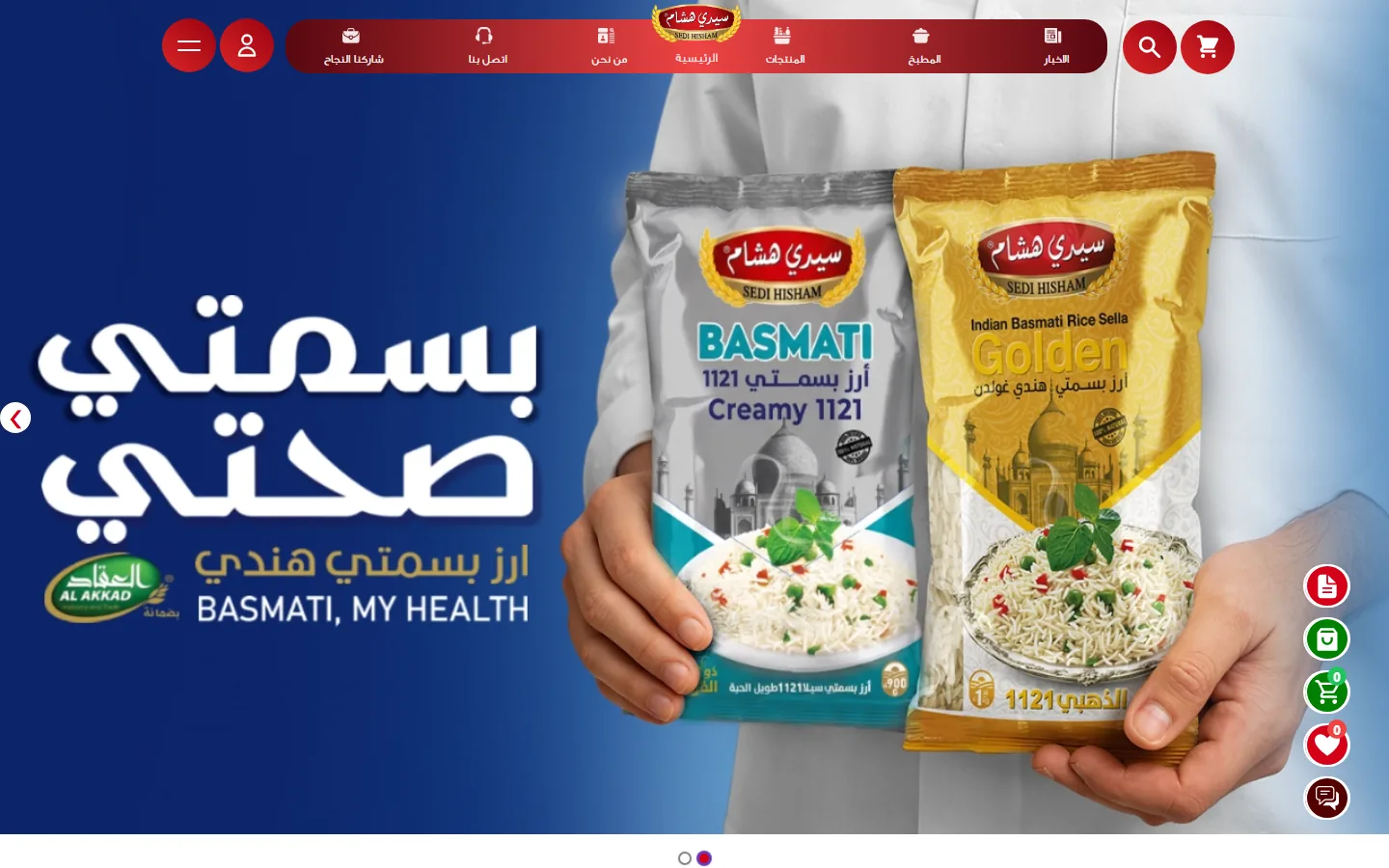
A red, pill-shaped header keeps the logo at the centre, with search, account and wishlist buttons beside it, and floating buttons open the product catalogue and chat from any page. A careers page takes applications for sales and quality roles. Visit sedihisham.com.
Have a project like this in mind? Message Kenania directly on WhatsApp.
Chat on WhatsAppThe same design on a phone
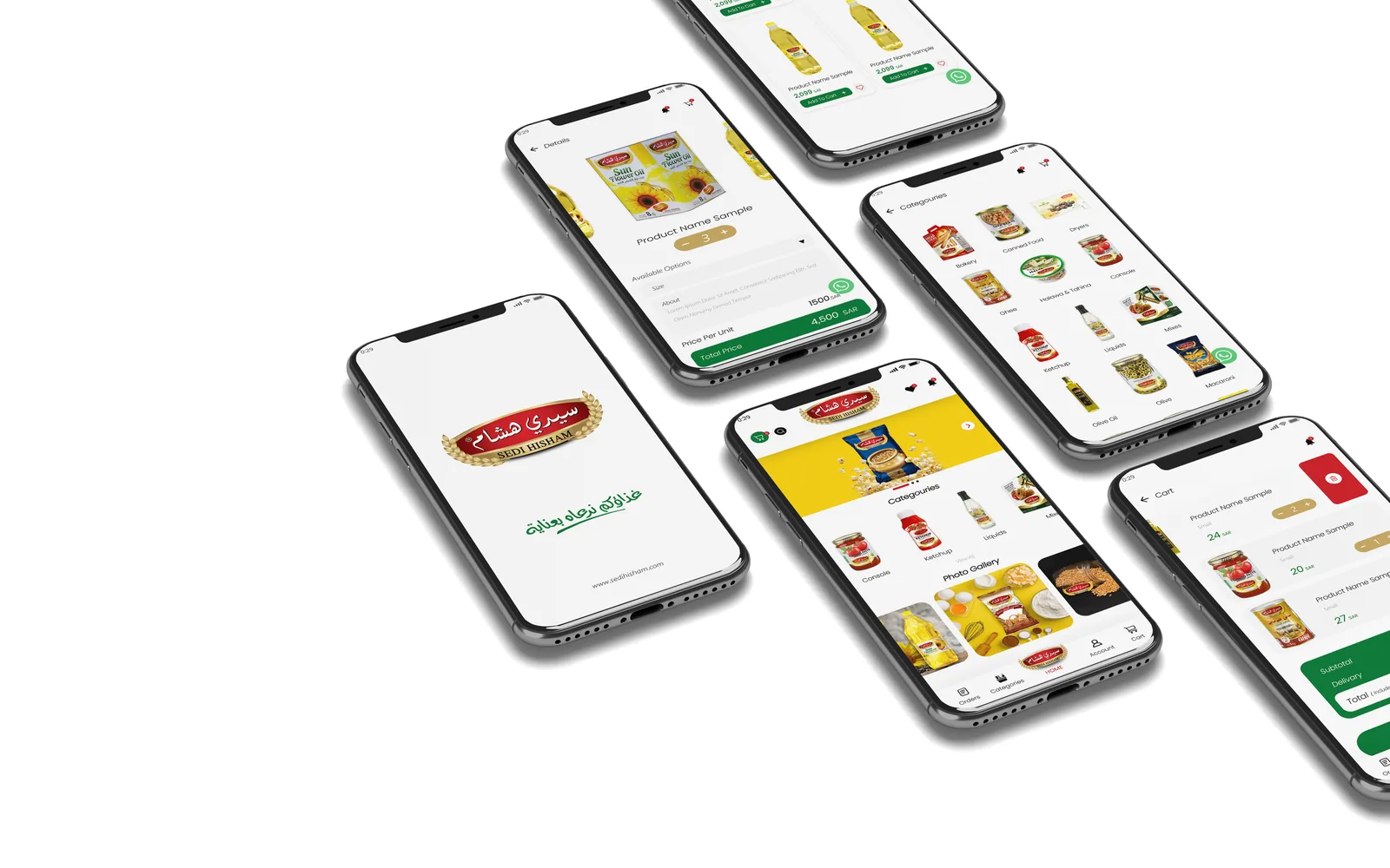
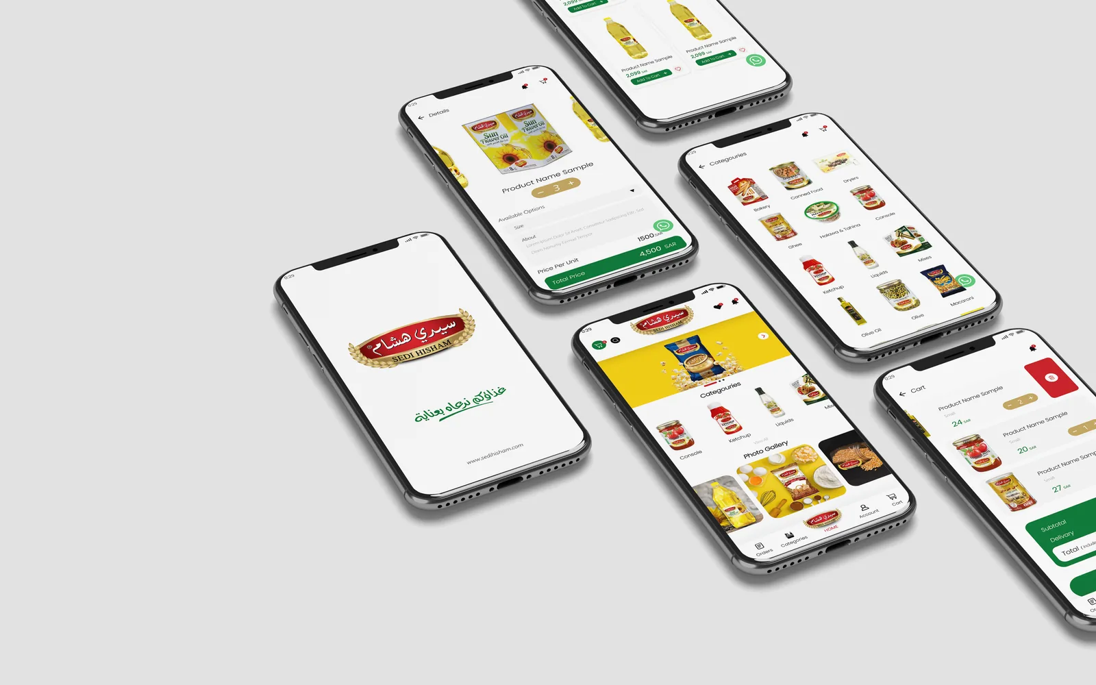
The design carries over to phones, with screens for the start page, the categories and the product lists in the same red and gold.
What should food company website design cover?
Food company website design has to serve two audiences: families deciding what to cook, and shops and distributors deciding what to stock. Both need a catalogue sorted by category, the way people shop, with a page and a clear pack photo for every product. Recipes give families a reason to come back and show the products in use.
News from trade fairs, launches and in-store events tells distributors that the company is active. Wholesale buyers also need plain contact routes: branch addresses, WhatsApp and a downloadable catalogue. A company that hires sales staff can take applications through a careers page on the same site. The Sidi Hisham website brings these together in Arabic, for the household shopper and the trade alike.
Food company website design in Arabic from the first sketch
We designed the Sidi Hisham site in Arabic from the start and drew every layout right to left, instead of mirroring an English template at the end. Menus, category names and recipe steps use the words Syrian households have for food, which a literal translation of English labels rarely gets right. The header follows the same logic. The logo sits in the middle of the red pill, with search, account and wishlist on either side, where an Arabic reader looks for them.
The site then splits its two readers early. Someone at home deciding what to cook goes to the catalogue and the kitchen section. A shop owner or distributor deciding what to stock reads the news, contact and careers pages. Each route stays short, and neither reader has to scroll through content meant for the other.
How 24 categories fit into one catalogue
A pantry brand with 24 categories can lose a visitor inside its own range, so in food company website design for a brand like this the category order is settled first, before colour or photography. We ordered the categories the way a kitchen cupboard is filled: staples such as rice and pulses first, then tea, spices, olive oil and tahini, then jams and canned goods. Each category has its own page and product list, and every product page comes from one template with a photo of the actual pack. The products page in the gallery above opens on a basket of the brand’s packs before the list begins.
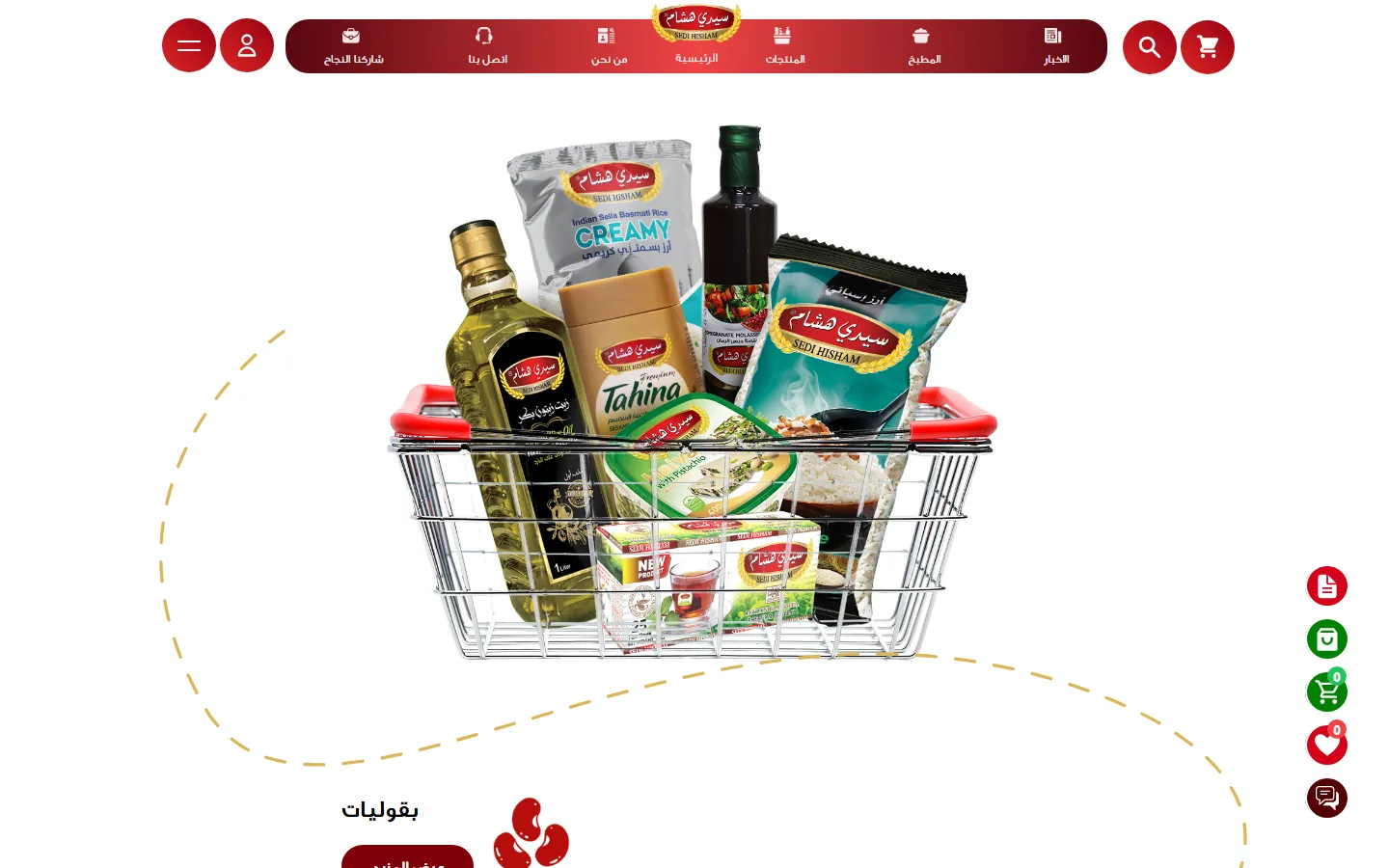
Category pages matter for search as well as for browsing. When someone types “olive oil” or “tahini” into Google, a category page with its own title and product list can rank, while a filter inside a single page cannot. A downloadable PDF catalogue is useful to wholesale buyers, but it is no substitute for these pages: search engines index it poorly and it is hard to read on a phone.
There are three ways to reach a product. The search field sits in the header, the category grid sits on the home page, and the floating catalogue button stays on screen on every page. People arrive with different habits: some type a name, some browse, and some tap the first pack they recognise. The floating chat button follows the same rule, so the contact route is never buried at the bottom of a contact page.
The home page opens with the red header over a banner for the brand’s basmati rice and leads straight into the categories. The red and gold carry through every template, so a product page deep in the catalogue still looks like Sidi Hisham.
Recipes, news and careers around the catalogue
The kitchen section gives people a reason to visit between purchases. Its recipes are grouped in seven collections and all of them are built on the brand’s own products, so a reader who came for a dish leaves knowing which rice or which tahini to buy. When each recipe links to the products it uses, the kitchen becomes a second route into the catalogue.
The news section is written for the trade. It follows the company at fairs such as the Damascus International Fair and Gulfood in Dubai, which is what a distributor wants to see before taking on a brand. The careers page, «شاركنا النجاح» (Share our success), takes applications for sales and quality roles, so the website also works as a hiring channel for the factory.
These sections also give search engines something new to index. The catalogue is a fixed set of pages, while recipes and news add pages over time, in the brand’s own words and around the ingredients people search for. That is why recipes belong in food company website design from the first page map.
Why the site was built in Next.js
Sidi Hisham runs on Next.js, a framework that can build pages in advance on the server instead of assembling them on every visit. Pages built that way load quickly on the mobile connections many visitors in Syria use, and the catalogue can grow without slowing the home page, because each new category or product simply adds a page.
Speed is as much a part of food company website design as colour: a home page loaded with animation and sliders is the first thing to lose a visitor on a phone. The phone screens shown above carry the same design in the same red and gold, in the order a visitor moves through them: start page, categories, then product lists.
Six best practices for food company website design
These come from the Sidi Hisham build and apply to most food company website design projects for brands that sell through shops and distributors.
- Write the site in the language your customers cook in, and draw it right to left from the first sketch.
- Order the categories the way a kitchen is stocked; the factory’s internal product codes mean nothing to a shopper.
- Give every product its own page with a clear photo of the real pack. Distributors read these pages as closely as shoppers do.
- Publish recipes built on your own products and link them to those products, so people come back between purchases.
- Keep search, the catalogue and a chat button within reach on every page, on the phone first.
- Build on a fast framework and let your own team add products and recipes from a control panel, without a developer.
Questions about cost, timing or the next step? Ask Kenania on WhatsApp.
Chat on WhatsAppHow a food company website design project runs with us
We start from the range: a spreadsheet of products, categories, pack sizes and ingredients, plus whatever photography exists. From it we draw the page map, the list of every page on the site and how they link, which fixes the size of the job before any design starts. Then we design the home page, one category page and one product page in Arabic, and in English too if the brand exports. Once those are approved we design the remaining templates and the recipe and news layouts, and hand the set to development.
The product page is a single template because there are as many of them as there are products, and a change to it reaches the whole catalogue at once. The site goes live with the real catalogue loaded. Launching with placeholder products that will be replaced later leaves half-empty pages for Google to index as they are.
What we check before and after launch
Before launch we open each category page on a phone over a mobile connection with the real catalogue loaded, test search with the names shoppers actually use, colloquial ones included, and confirm that the chat and catalogue buttons appear on every screen. Every page gets its own Arabic title and description, the two lines that show under the link in search results. The site map goes to Google on launch day, and the brand’s team learns how to add a product and a recipe.
In the first months we look at which products and recipes draw the most visits, which searches bring people in and where phone visitors leave. Those figures decide what the brand publishes next: if rice recipes bring visitors, more rice recipes follow, and if distributors search for wholesale pack sizes, those go onto the product pages.
Scope
- Food company website design in Arabic: home, 24 product categories, product pages, kitchen and recipes, news and events, about, contact and careers
- Mobile screen designs
- Website development in Next.js
- Delivered in collaboration with BIGBANG IT Solutions
Related projects and services
- Website design company in Syria: company websites and product catalogues in Arabic and English
- UI/UX and website design services: websites, platforms and apps
- Massa Foods: website, social media and content: another food brand, with BIGBANG IT Solutions
- Hawa Al Sham: dairy brand website: website, video and print, with BIGBANG IT Solutions
- UI/UX case study: three digital products: car rental, payments and a marketplace
Planning a food company website design project? Send your product list with pack sizes, the logo and any pack photos, and we will reply with a written proposal, a fixed fee and a timeline.
Questions about food company website design
Does a food company need an online shop or a catalogue?
Most food manufacturers in Syria sell through distributors and shops, so a catalogue with an order button or a WhatsApp number is enough to start with. A cart and payment can be added later on the same structure if the sales model changes, which is why our food company website design work builds product pages from day one with the fields a shop would need.
How many products can the website hold?
There is no practical limit. The Sidi Hisham site holds 24 categories and the Hawa Al Sham site holds 78 products in 14 categories, on the same kind of structure. What limits a range online is the quality of the photos and the product data.
Who writes the content?
On a food company website design project we write the page structure, the interface text and the introductions, and edit the ingredients, nutrition values and recipes you supply so the whole site reads in one consistent voice. Nutrition information stays the manufacturer’s responsibility, because it has to be verifiable.
What happens after launch?
We hand over a short guide to adding products and recipes from the control panel. We can also carry on with social media and content, as we did for Massa Foods, so the website and the channels keep one visual language.