Three Digital Products: Car Rental Platform, ODA Payment App and Mawen Marketplace
A UI UX design case study is only useful if it shows the decisions, not just the screens. Three products by Kenania, a car rental platform, a payment app and a grocery marketplace, with the reasoning behind each interface.
Three products, three different users, one design team. A car rental company needed a platform where several agencies list their fleets; a fintech needed a payment app that a shopper trusts in three taps; a grocery marketplace needed customer, vendor and driver interfaces that share one system. This case study shows the interfaces and the decisions behind them.
Car rental platform
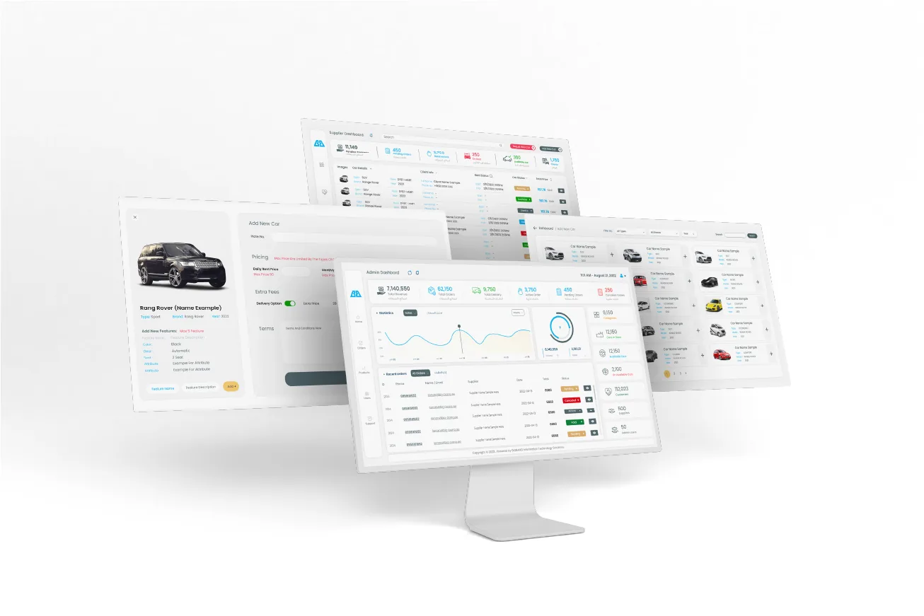
A multi-vendor system: each agency manages its own fleet, prices and availability from a web dashboard, while customers search across all agencies from one app. The admin dashboard shows fleet utilisation, bookings and revenue per agency at a glance, so the platform owner can see which partners are performing.
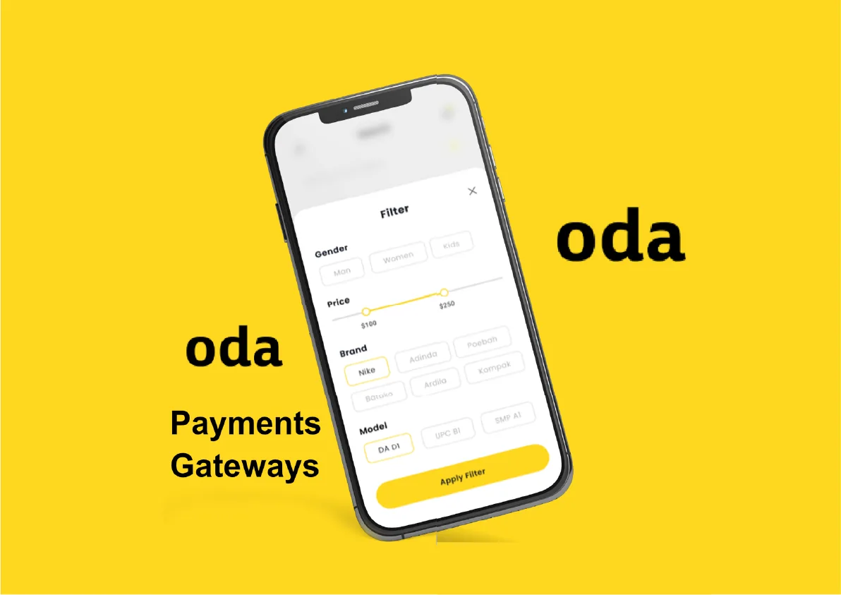
ODA payment app
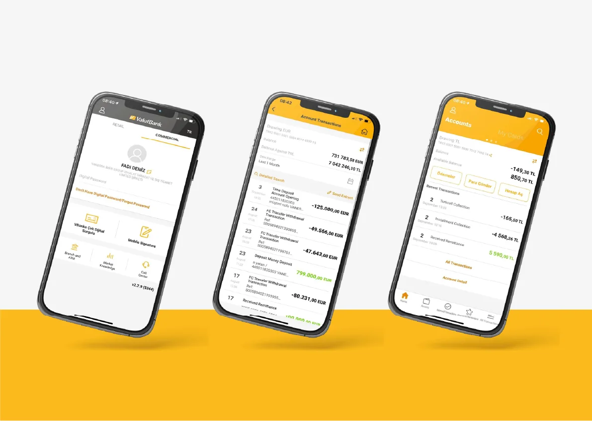
Payments are about trust. ODA uses one colour, a single card-shaped screen per step and large numerals, so the amount, the merchant and the confirmation are never in doubt. The gateway checkout was designed to sit inside other apps with the same visual language.
Mawen marketplace
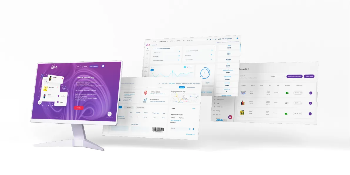
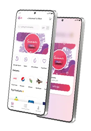
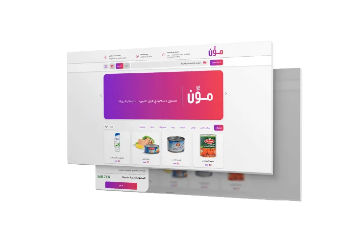
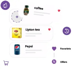
Mawen is a multi-vendor grocery marketplace in Arabic and English. The customer app leads with categories and offers; the vendor dashboard on the web handles products, orders and settlements; a component library of product cards, favourites and offer tags keeps all three interfaces consistent.

Related
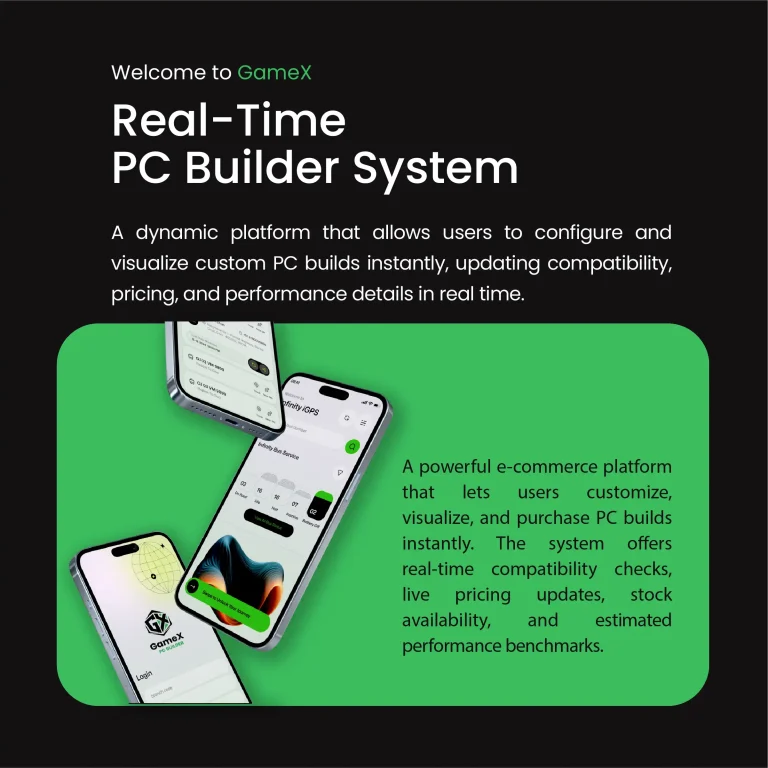
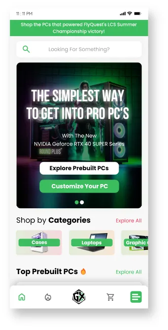
See the GamerX PC-builder e-commerce design for another marketplace-style product, and the machine-learning waste app for a utility product.
How this UI UX design case study was run
Each product started with the same three questions: who is the user in a hurry, what is the one action they must complete, and what would make them abandon it. For the car rental platform the hurried user is the agency staff updating availability at closing time; for the payment app it is a shopper at a checkout with a queue behind them; for the marketplace it is a driver with a phone in one hand. Every screen was then judged by whether it shortened that person’s path.
Wireframes were tested on real staff before visual design began, which is why the dashboards use dense tables where operators wanted them and the consumer apps use large, single-purpose screens where shoppers wanted those.
One design system, three products
A shared component library, buttons, forms, cards, status colours and typography, sits under all three products, so the marketplace’s customer, vendor and driver apps look like one company and the car rental admin can be handed to a new developer with a single reference. Colour is used as information: booking states, payment states and delivery states each have one fixed hue across every screen.
Measured, then refined
After launch the teams tracked completion time for the core action and the drop-off points, and two flows were simplified within the first quarter. That loop, design, ship, measure, revise, is the part of a UI UX design case study most portfolios leave out, and the part that decides whether the product earns its keep.
Scope
- User flows and information architecture per user type
- Wireframes and high-fidelity UI in Figma
- Component libraries and Arabic/English layouts
- Web dashboards for admin and vendors
- Developer hand-off with specs and assets
Kenania designs and builds apps, marketplaces and dashboards for companies in the Gulf and Egypt. See the UI/UX and digital products service page.
Related projects and services: ui ux design case study
More ui ux design case study work from Kenania, and the services behind it:
- Multi-vendor marketplace UI/UX for Saudi Arabia — an earlier marketplace app and dashboard
- UI/UX and digital product design services — how we scope and price product design
- Digital marketing services — launch campaigns for the products we design
- How to choose a design agency — what to ask before you brief a product team
Reference: usability testing followed the heuristics published by the Nielsen Norman Group, the standard reference for interface evaluation.
Planning a similar ui ux design case study project? Send the plan and a short brief for a scoped proposal.