PC Builder E-commerce UI/UX: Inside the GameX Configurator
PC builder e-commerce has a harder job than a normal shop: the customer is assembling a product while buying it, and the interface has to keep both tasks clear.
Most e-commerce work is a catalogue problem: show the thing, price the thing, sell the thing. GameX is not that. It is a real-time PC builder where eight components have to agree with each other before anything can reach a cart, and PC builder e-commerce UI/UX design lives or dies on how clearly the interface explains that agreement while the user is still choosing. Get it wrong and people open a second tab to price the parts elsewhere.
We designed GameX as a configurator-first store for the UAE market: prices in AED, Apple Pay at checkout, delivery to addresses like Al Ain. The work sits in our UI/UX and digital product practice, and like everything we do, it was delivered remotely. Here is the desktop build screen. Every element on it is doing a job.
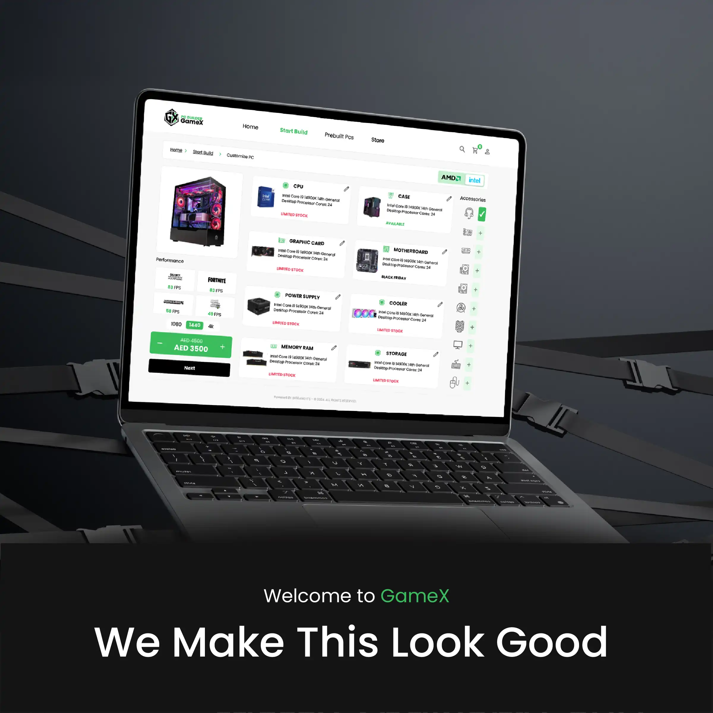
Table of Contents
A configurator is a harder problem than a catalogue
In a normal store the product page is the end of a decision. In a builder it is the middle of one. The user is assembling something, and every choice narrows the next. That means three questions have to stay answered at all times, not one after the other:
- Does this part fit with what I have already chosen?
- What does the build cost right now, at this exact moment?
- What will it actually do when I turn it on?
Hide any one of the three behind a tab, a modal or a scroll, and the user stalls. The layout above is a direct answer to that: build column on the left carrying performance and price, component grid in the middle, accessories rail on the right. Nothing important is more than one glance away.
Have a project like this in mind? Message Kenania directly on WhatsApp.
Chat on WhatsAppCompatibility is where PC builder e-commerce UI/UX design gets decided
A compatibility checker that only blocks is a bad checker. Greying out an option teaches the user nothing except that the site is in their way. The rule we worked to: never leave someone holding an error they cannot act on. A refusal has to name the conflict, name the part it conflicts with, and offer the nearest thing that works. Failing helpfully is a design requirement, not an edge case.
The other decision here is where the messages live. Each slot on the build screen is its own card with an edit control, and the status sits inside that card — LIMITED STOCK in red, AVAILABLE in green, a BLACK FRIDAY tag where it applies. Availability and compatibility read at the component, never in a global banner at the top of the page. Global banners get dismissed, and then they are gone for the rest of the session.
Drag and drop is a convenience, not an explanation
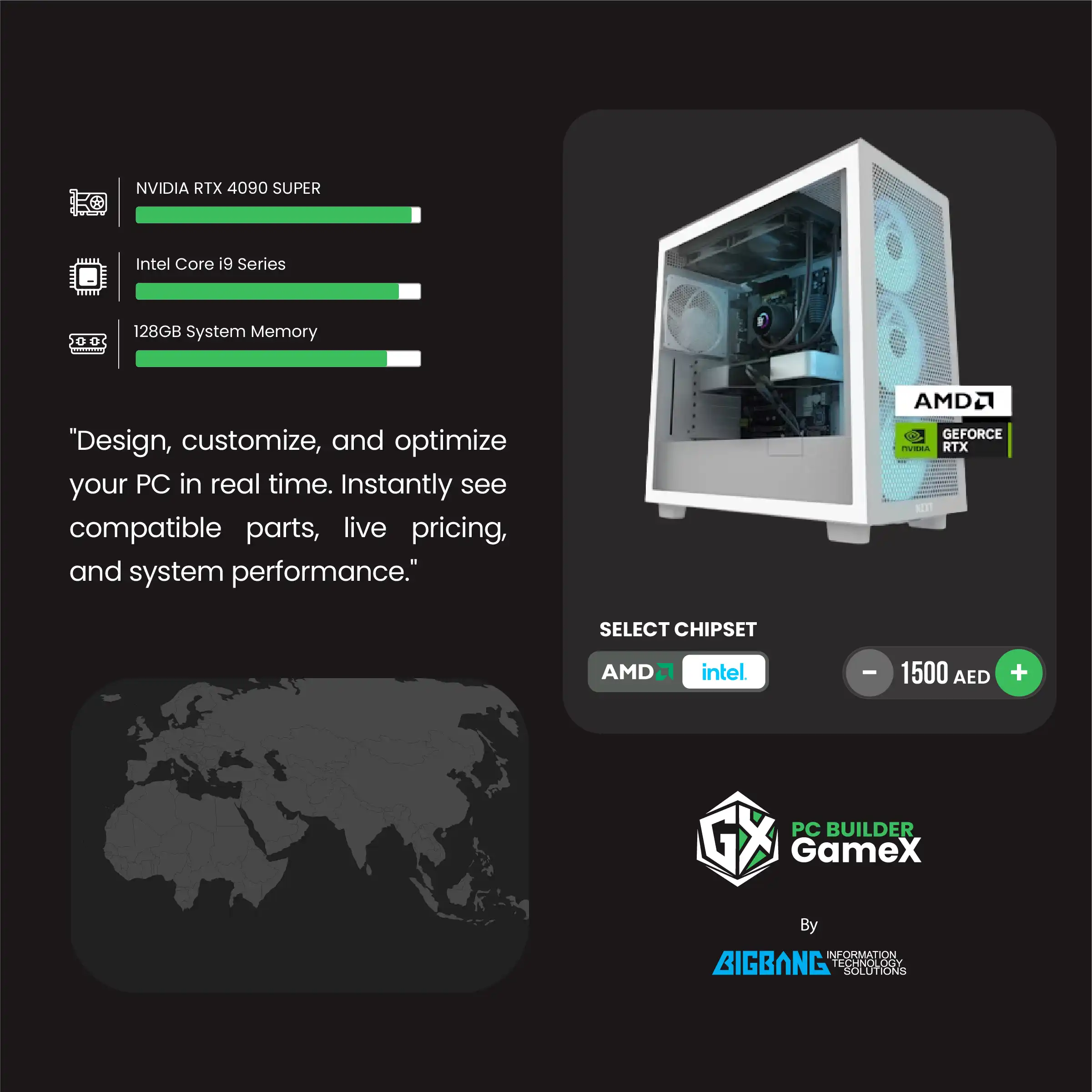
The brief called for a drag-and-drop build interface, and it earns its place: dropping a graphics card into a slot is faster and more satisfying than working a dropdown. But dragging tells you nothing about why the power supply is now marginal. The gesture is an input method. The reasoning still has to be written down somewhere the user can read it.
So drag and drop is never the only route. The same slot can be filled from the accessories rail, from a tap on mobile, or from the plus control on the card. On a phone there is no comfortable drag at all, and the interface has to behave identically without it. If a build cannot be completed with taps alone, the responsive version is broken before it ships.
Live price and stock, without the page jumping
Live pricing is easy to build and easy to ruin. Every recalculation is a chance for content to shift under a cursor that is already moving. The fix is unglamorous: reserve the space, animate the number, never the layout. On GameX the price sits in a fixed green control at the foot of the build column, struck-through old price above the current one, with the Next action pinned directly beneath it. It updates constantly and it never moves.
Consistency at that level only holds if the states are decided once, centrally. Cards, buttons, order chips, promotion tags and the performance panel were all specified in a single system sheet before any screen was assembled.
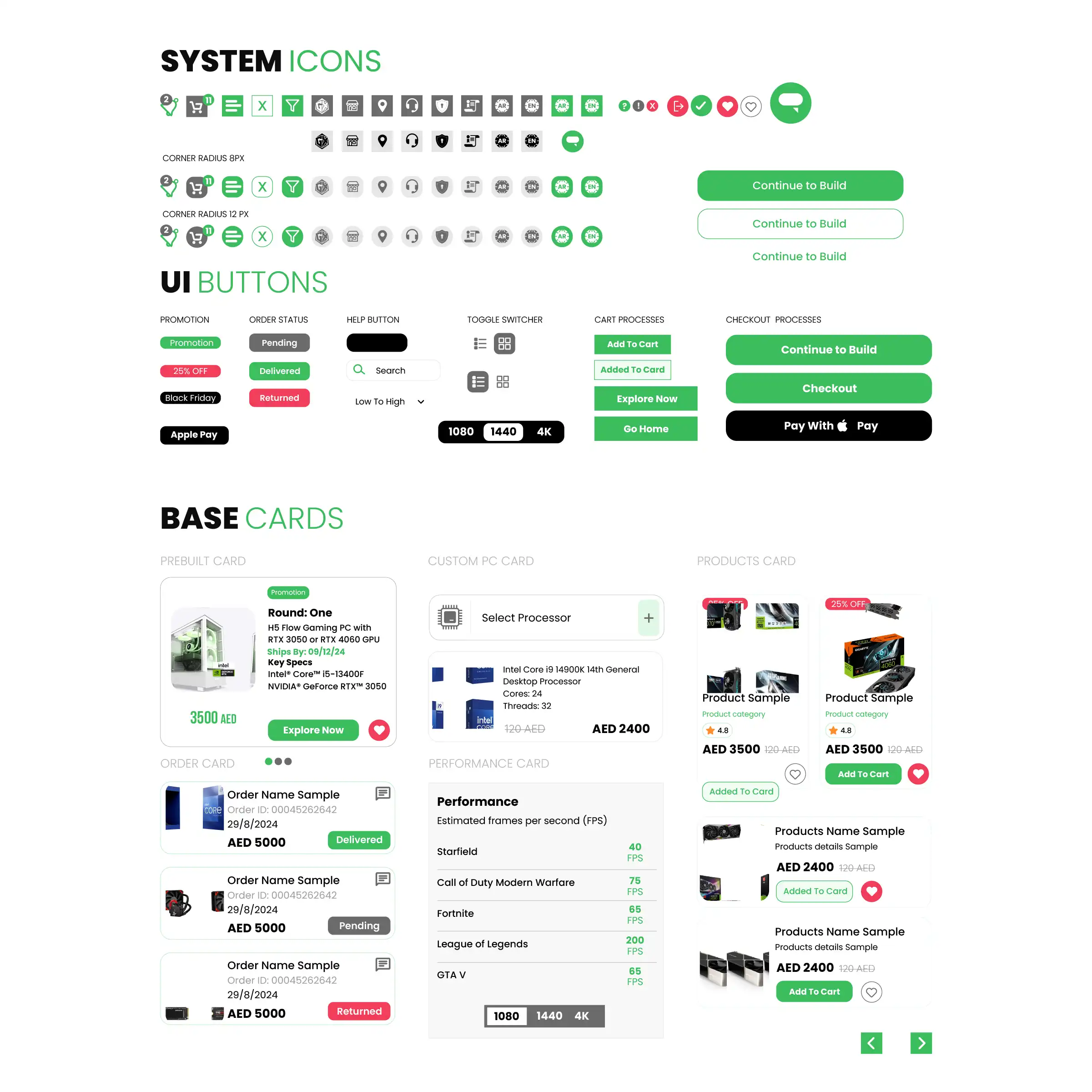
The performance estimator deserves a note. It answers the only question a buyer really has — will it run the game I play — by listing estimated frames per second per title against a 1080 / 1440 / 4K toggle. Ranges by resolution are honest. A single headline score is not, because it hides the assumption that produced it. The same argument applies whenever an interface reports the output of a model rather than a fact, which is a problem we worked through in detail on Binko, our machine-learning waste-sorting product.
Questions about cost, timing or the next step? Ask Kenania on WhatsApp.
Chat on WhatsAppOrder tracking belongs to the product, not to support
Configurator projects tend to spend their design budget before checkout and leave the post-purchase screens to whatever the platform ships by default. That is backwards. Someone who has just spent thousands of dirhams on a machine they specified themselves is at their most anxious after paying, not before.
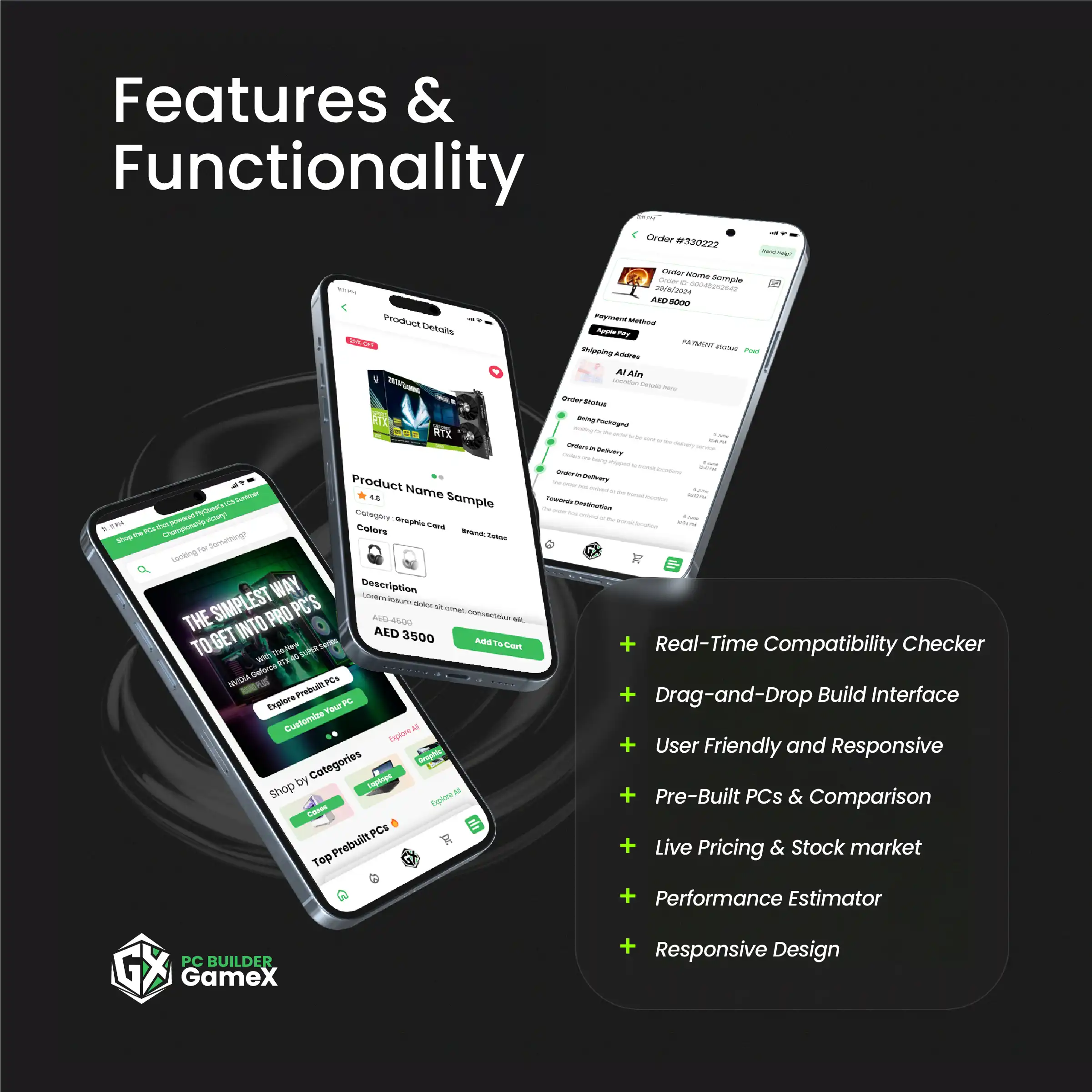
The tracking screen carries the order number, the item, the payment method, the payment status, the shipping address and a staged delivery timeline with a timestamp on every step, plus a Need Help control in the header. Same cards, same green, same typography as the build. It reads as the same product because it is.
What transfers to any configurator
Very little of this is specific to gaming hardware. Modular furniture, vehicle trims, insurance tiers, service packages — anything where the customer assembles the product runs into the same wall.
- Constraints must be explained at the point of conflict, in the component, not in a banner.
- The running total is a fixed landmark. It changes value, never position.
- Every gesture-based shortcut needs a plain equivalent that works on a phone.
- Estimates should be shown as ranges with their conditions attached.
- The screens after payment are part of the design, not a handover to support.
The complexity is rarely visual. It is in the rules underneath, and in deciding which of them the customer needs to see. We hit a comparable problem on a multi-vendor marketplace in Saudi Arabia, where stock, pricing and fulfilment came from separate sellers and still had to read as one coherent basket. More of this kind of work sits in our portfolio.
If you are scoping a configurator and the rules are already more complicated than the catalogue around them, that is the normal starting point, not a warning sign. Send us the constraints and we will tell you which ones the interface should carry. Get in touch and you will have a reply within a day.
More pc builder e-commerce projects and services
More pc builder e-commerce work from Kenania, and the services behind it. Every pc builder e-commerce project we publish carries its drawings, so the reasoning behind each pc builder e-commerce decision can be checked:
Reference: for the standards behind this pc builder e-commerce work, see Nielsen Norman Group.
Ready to start? Send Kenania a photo, a plan or a short brief on WhatsApp.
Chat on WhatsApp